Increase the width of posts on Google+

Google launched a new layout for its social networking service Google+ recently that introduced several interesting features but also a Pinterest-like layout that I think does not really work well when the emphasize is on text and not images.
Sure, you find lots of photo posts on the site and that's great and all, but I'm not really interested in those posts. One of the complaints that I have with the new design is that the two post layouts that you can switch between do not really work for me. The default one displays posts in columns exactly like it is done on Pinterest. I do not like this one as it makes it difficult to read textual contents fast on the site.
The one column layout is great on the other hand, but uses only little space so that you end up with lots of whitespace on the left and right side of the single column. I do not really know why Google did not make the width dynamic here as it would resolved that issue for all screen sizes.
Anyway, look at the following two images and let me know which you prefer.
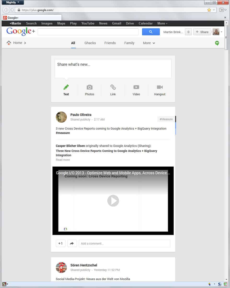
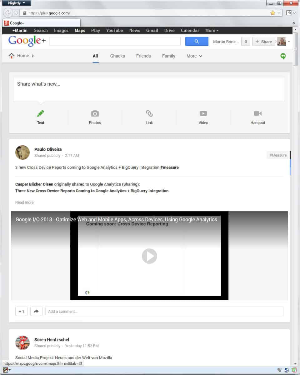
If you prefer the second layout - I do - then read on to find out how you can fit Google Plus posts to a larger width.
- What you need is the Wider posts on Google Plus user style.
- You need the Stylish extension for Firefox before you can install the style in the browser.
- Google Chrome users also need to install the Stylish extension first.
- Opera users can check out this blog post that explains how to install user styles in the browser.
- Internet Explorer users can try IE7 Pro which comes with userstyle support. It has not been updated for a while and may not be compatible anymore though.
Once you have installed the style in your browser of choice, you will notice that posts on Google+ will use a width of about 900px now.
You can modify the script if you want to use a different width. Firefox users can do it the following way:
- Load about:addons in the browser's address bar.
- Switch to User Styles.
- Click on the Edit button next to Wider posts on Google Plus.
- Locate all elements with 900px and increase or decrease the value as you see fit.


I prefer the wider, fully extended format! Looks better and more professional!
I’ll apply the style right after this post!