Hotmail's Redesign, Microsoft Goes all in on Metro

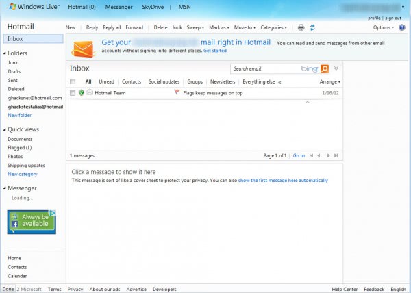
I'm not a huge fan of Hotmail's current layout and design, as I feel it is rather messy, and that this is keeping me from working effectively with the web mail client. There are simply to many links and options displayed on a single page, some even hidden beneath arrows that you need to click on to display them.
News broke a couple of days ago that Microsoft is working on a Hotmail redesign that is taken care of the interface. It at the same time will bring a Metro-like design to Hotmail, probably to bring all major web services in line for the upcoming release of the Windows 8 operating system.
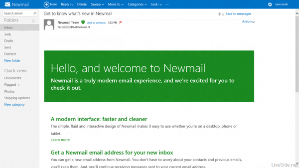
Leaked screenshots of an experimental version of Hotmail - called Newmail in the screenshots - show a cleaner interface that is making use of an improved font typography and a new top bar that is highlighting the most important options on the screen (screenshots are courtesy of Liveside).
The bar looks like Google's toolbar on first glance, but makes available a different functionality after all. Instead of linking to other Microsoft services it displays service related options. For Hotmail, those are options to compose a new email, reply or delete the selected email, or move emails to another location. The settings and user account are now easily accessible from that toolbar as well.
If you compare the new page above with the current layout on Hotmail, you will notice the much cleaner look.
The introductory email that is automatically placed in the inbox lists the major changes of the new Hotmail, including options to connect Facebook or Twitter to the Hotmail account to receive notifications right in Hotmail and use the service's chat functionality there as well.
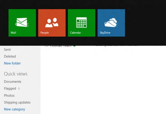
When you tap - or click - on the Hotmail logo you will see a listing of other Microsoft services in Metro-style.
It is very likely that these services too will be redesigned to fall in line with the new Metro-style that Microsoft seems to favor these days. For SkyDrive, it is very likely that we will see a redesign, considering that the service is tightly integrated into Windows 8 just like the Mail app is.
It is obviously not possible to judge a book from its cover, as I can't really say anything about speed or how intuitive the new interface is after all. From the looks though it feels as if this is a step in the right direction that Hotmail users will benefit from.
No word yet though on general availability, it is however likely that the design will go live before the release of Windows 8, or maybe even at the exact date, but not later than that.
So what is your take on the Hotmail redesign?
Advertisement











Looks fake.
I totally agree that hotmail current interface is a right mess: confusing and sluggish.
It’s the first email I have ever had (1989) but I rarely use it anymore.
My preferred webmail remains Yahoo while I never really liked Gmail either both for the interface and all the privacy concerns.
The real news here is that hotmail still exists.
I like it about as much as I like the Ribbon interface.
I hope they get it right.
Without “feeling the UX” it still seems quite clear and slick.
Competition to Google might be nice for us all.
I think it’s cleaner, but the biggest difference is the elimination of the Preview pane, at least in the screenshot above. If that’s the case, they’re moving toward Gmail’s interface (though Gmail has a preview pane “Lab”).
I always was a desktop mail client guy, even ran my own mail server, until a few years ago I surprised myself by switching to Gmail on the Web. It was a major move toward simplicity. Then that led to using Opera’s M2 client, which offers desktop functionality from within the browser. Now that M2 had html composition (which was an absurd Opera holdout for years) it’ brought me back to Opera.
I’m invested in gmail now, so it’s going to take some doing to pull me away. Google would have to really botch privacy or something for that to happen. But I think this is a step forward for hotmail.
It looks a bit like a metro version of the WordPress Dashboard!
thank god for Thunderbird…. I’ll rarely, if at all, have to deal with metcrap.
I haven’t logged into homtail in a while. Since I can use Thunderbird to get my mail, I don’t have to, and that’s just how I like it.
I also prefer using a desktop client over web mail.