Is Google Making Another Homepage Layout Change?

Google is running yet another design test on their homepage currently. With the frequency of layout changes increasing, it feels as if the search giant does not really know what they really want anymore. As of right now, at least two designs are life for all users. First the single button menu interface with a gray header area, and then the black bar.
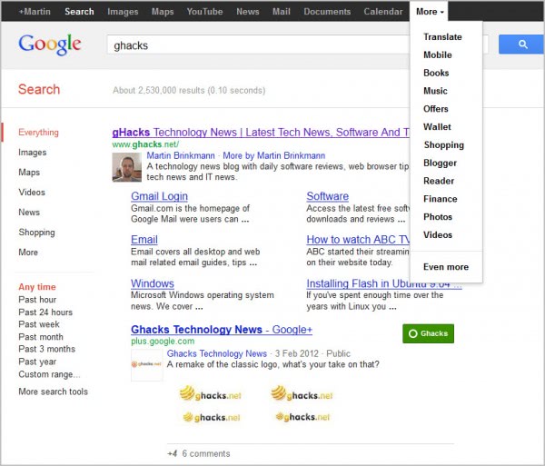
Yesterday a third design was spotted that combines the black bar with the menu structure of the single menu bar.
The new bar displays Google's most popular services directly again on the bar for quick access. The More link leads to additional services. Users of the gray bar design will notice that the black bar has been moved on top of the design. Everything else, with the exception of the Google logo menu has remained the same.
The Google Operating System blog has posted instructions on how to enable the new Google bar design.
- Open google.com in your web browser of choice.
- In Google Chrome, press Ctrl-Shift-J
- In Mozilla Firefox press Ctrl-Shift-K
- In Internet Explorer press F12 and select console
- Paste the following code into the form
document.cookie="PREF=ID=381502750b6e9119:U=aaee74aefea7315a:FF=0:LD=en:CR=2:TM=1328391998:LM=1328392000:S=yPtlCgLbEnezu5b4; path=/; domain=.google.com";window.location.reload();
- Press enter and close the console again.
- Local users need to replace the domain in the information (google.com) with the country code domain, e.g. (google.de)
The page should refresh automatically, and you should see the new layout on the Google page. Please note that it will only be active for as long as the cookie remains on your system.
Users who want to return to the old Google homepage layout can repeat the steps, by loading the following code in the console.
document.cookie="PREF=; path=/; domain=.google.com";window.location.reload();
My personal opinion? Google should give users more choice when it comes to the services that are displayed on the homepage. I'm for instance not using Google News, so why should it be there that prominently on the page? Google furthermore needs to select a design and stick with it, instead of confusing users with different designs and layouts. Some users, depending on the browser they use to access Google, have reported that they are seeing different layouts on the same computer.
What's your take on this, and what's your favorite bar so far?
Advertisement








That was an interesting exercise, but annoying because it was simply _adding_ the black bar instead of _replacing_ the gray bar with it. If Google would simply consolidate *all* of the menu items into one thin bar instead of wasting my limited vertical screen real estate with the immensely fat things they’ve got now I’d be happy. Sorry, the menu should *not* be the biggest thing on the page; it should stay out of the way until wanted!
I definitely agree that we should have more control over which products we display on the bar too; but in the meantime, well, that’s what bookmarks are for! Speaking of which, why on earth do they not include Google Bookmarks anywhere at all in any of their menus?!?
I don’t mind the black bar, but I never figured out how to easily access Advanced Search with the later layout. Until I found a user script that gives me that access, I was ready to make Bing my primary search engine.
I dislike the black drop down menu.
I have been removing it by deleting the
Google PREF cookie whenever it appears.
The change lasts a few days, sometimes longer,
until Google apparently updates the PREF cookie
on their own on what seems to be a random schedule.
My biggest issue with the drop down menu
is it mucks up Google Reader with oversized
header spaces so it is not just the menu itself.
Overall I give a thumbs down to most of Google’s
recent interface look changes and Google is
losing its “look” and becoming bland.
I think Larry Page should take some holidays, working too hard sometimes leads to hysteria (perfectionism) when a cooler approach like that of Eric Schmidt’s was IMO more adequate with the concept of a solid company.
I want easy access to Google Scholar. How can I use it if its buried where no one can find it?
I have the same issue – I’d like to customize the menu bar for easy access to specific products that I use more frequently, such as Google Scholar. My hack (if you can call it that) is that I added a bookmark for Google Scholar Advanced Search (my preferred G Scholar start page) to my homepages that open whenever I start Chrome. If you find a way to customize the menu bar, or a better hack, please let me know. Thanks.
I like the single button menu. It’s cleaner and nicer to the eyes.
My favorite Google bar is no bar, and it’s easily obtained using “Element hiding helper for AdBlock Plus” addon in Firefox :)