Firefox 3.7 and 4.0 Design Mockups
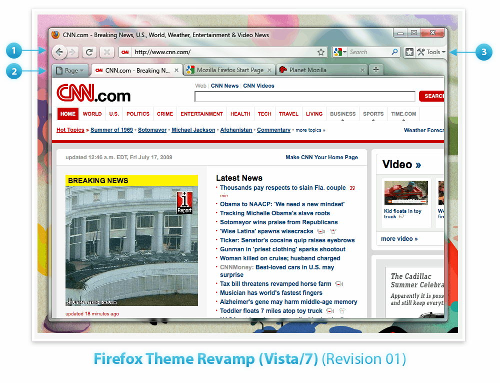
How could version 3.7 and version 4.0 of the Firefox web browser look like? That's something that the Mozilla development team tried to answer by posting design mockups of Firefox 4 and Firefox 3.7 to the Mozilla Wiki website.
Firefox users who run version 3.6 or another version of the browser are curious about those new versions as Mozilla made it clear that the next major version of Firefox will introduce major changes.
Firefox 3.7 is obviously the next major release of the Firefox 3 branch while Firefox 4 will be the next big release that succeeds Firefox 3.
A new design can be the source of all sorts of problems including usability issues which is probably one of the biggest concerns of Firefox users at this point in time. Other issues may include compatibility problems with add-ons or themes.
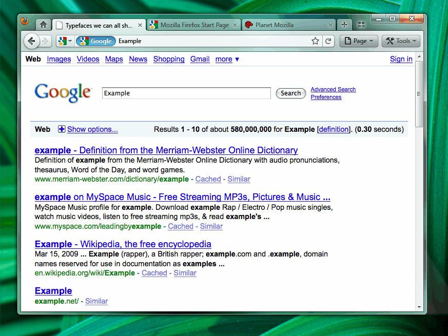
Firefox 3.7 Design Mockup:
The design mockup of Firefox 3.7 look like they are making use of Aero Glass in Windows Vista and Windows 7.
The RSS and bookmark icons have been moved out of the Firefox address bar and the two new entries Page and Tools have been added to the header. Page apparently contains functions and options that are directly related to the active page while Tools will be used for changing the UI of the web browser. Tabs are now slightly rounded as well.
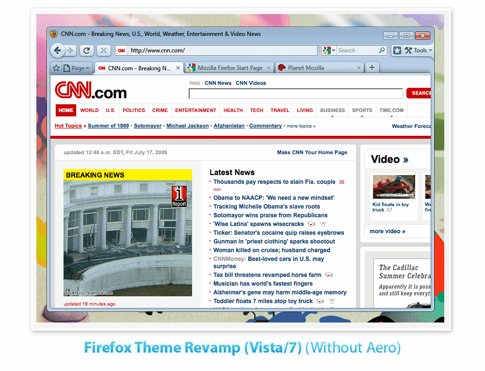
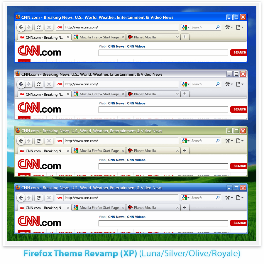
The design for Windows XP is basically the same as for Windows Vista but without the Aero Glass effects.
Firefox 4.0 Design Mockups:
Two different design mockups that you see below have been posted for Firefox 4. The main difference is the location of the tabbar.
Firefox 4 version a comes with the tabbar in the usual place while version b moves the tabs to the top of the web browser similar to the tabs in Google Chrome.
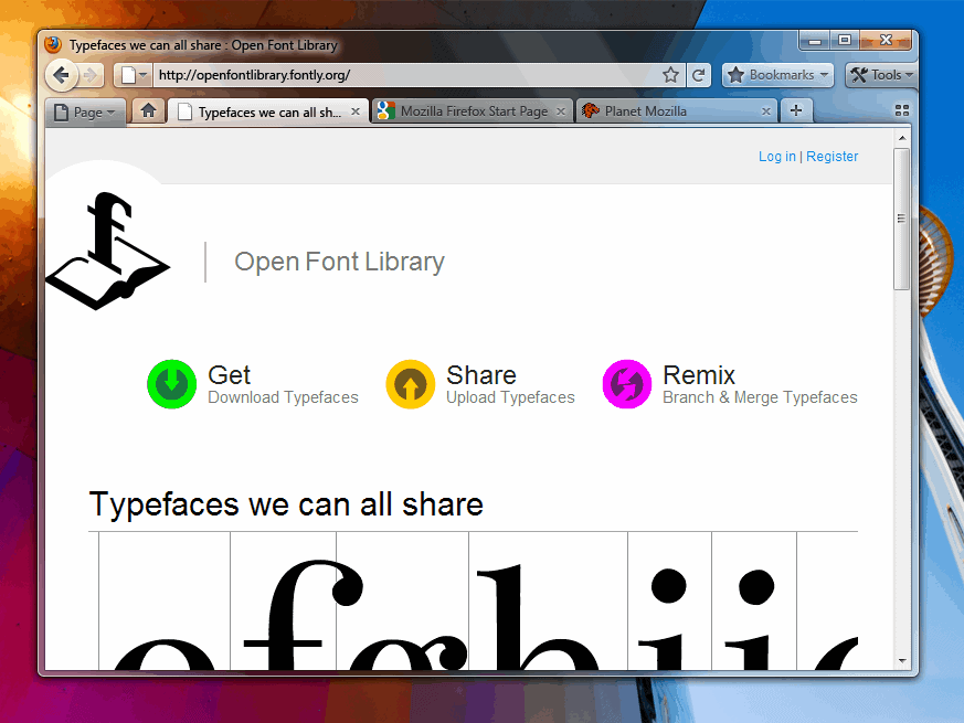
Some of the most obvious changes include the absence of the status bar, the unifcation of the address bar with the search bar and a big new bookmarks button.
Version b seems to have drawn several design inspirations from the Google browser. It does not come with a title bar anymore which could be a problem for long page titles. The bookmarks button is gone in this release and the page and tools buttons are placed in the tabbar next to each other.
The Mozilla team added a pro and con list to the second design mockup which is addressing all these concerns.
Verdict: Many of the changes proposed can already be done with add-ons which is probably a better way of handling changes.
Add-ons allow users to remove the status or title bar, move the tabs on top or combine the address field with the search field. The biggest risk will be design changes that most Firefox users do not like or do not want to cope with. It is possible that the Firefox community will create add-ons that address these problems. It can also be that Firefox users decide to look at alternative browsers instead.
Advertisement







If the screen is 7-9″, it’s not a laptop.
> As soon as Firefox removes the file menu, I remove it from all of my
> systems, no compromises.
Actually, I currently remove the menu bar from Firefox and use and extension to put the menu under a single icon in the addressbar. It saves a lot of space, critical on this laptop.
As soon as Firefox removes the file menu, I remove it from all of my systems, no compromises.
If it aint broke, dont fix it! Geeez….leave it alone before it becomes as bad as IE!! PLEASE dont make me have to switch browsers….I love Firefox just as it is.
Am I the only one who thinks this looks a lot like IE7?
If they add the tab bar on Top like Chrome browser,i’ll switch to Opera.I find it very uncomfortable , to move the mouse longer.
Oh, yes. My versions always look like Noia 2.0 (extreme) :)))
And I’m used to status bar. I don’t want any dramatic UI changes.