Vivaldi 3.7 with major performance improvements released
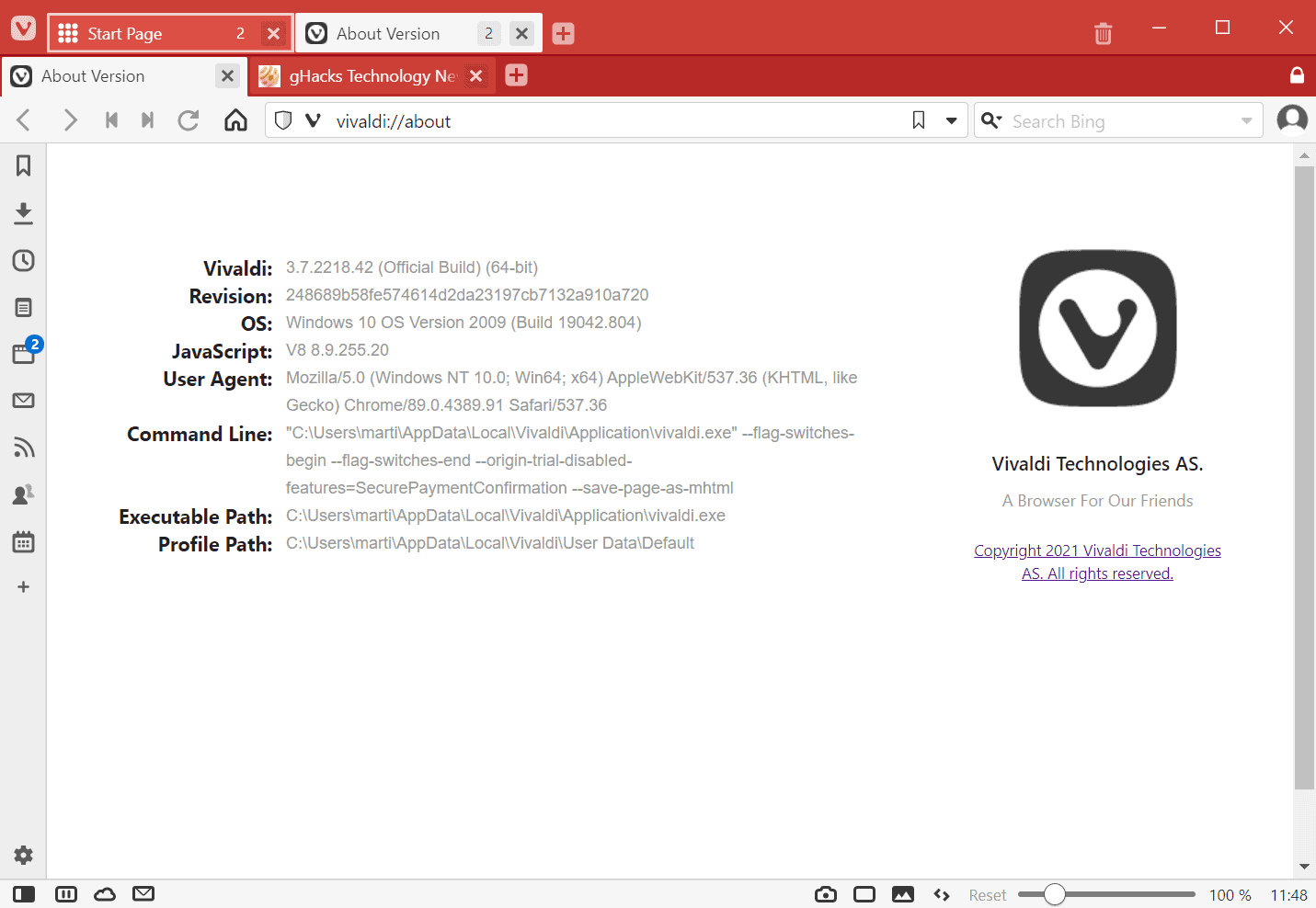
Vivaldi Technologies released a new stable version of the company's web browser. Vivaldi 3.7 focuses to a large extent on improving the performance of the browser in several areas. One point of criticism that Vivaldi faced ever since it introduced the browser was that the performance of the web browser was not as good as that of Google Chrome or many other Chromium-based browsers.
Vivaldi 3.7 is already available. It is offered via in-browser updates, which happen automatically on most systems, but also as a direct download from the official Vivaldi website.
vers
Vivaldi 3.7 is the first stable version of the browser that supports Apple's latest ARM-based M1 processors natively. The new chips give all applications a performance boost, and Vivaldi Technology states that users who run the browser on M1 processor hardware will get two times the performance on Mac devices.
Performance has improved in several other areas. All desktop versions of Vivaldi open tabs (up to) twice as fast as before according to the release notes when compared to Vivaldi 3.6, the previous version of the browser.
Opening of tabs is faster now — facilitating a better user experience and increasing speed up to 2x as fast as the previous version (based on our internal benchmarks*).
Vivaldi itself loads faster as well in version 3.7. The company notes that the browser opens new windows 26% faster on average than before. Mileage may vary depending on the hardware of the machine Vivaldi is run on and the operating system.
Engineers have added other features to the browser, many of the amp up usability in one department or another:
- The periodic reload feature is now also available for Web Panels. Web Panels are displayed in the sidebar in the browser when used. Tabs featured the periodic reload option already, automating page refreshes. Ideal for auction sites, news sites, and sites that post new content regularly.
- A new tab stack creating option; this one creates tab stacks by host, ideal to put all those pages from Ghacks into a single tab stack for easier handling.
- The right-click context menu that appears on web pages can be customized now, similarly to how other menus of the browser can be customized. Just open Settings > Appearance, select one of the new menu options under Menu Customization, and add, remove or edit the menu entries. The menus are divided into types, e.g. audio and video, links, or text fields.
- Quick Commands bold the keyword that you searched in the new release, and it is possible to use the periodic reload feature here, by typing "periodic reload 2" to reload the active tab every 2 minutes.
- The process of updating silently on Windows has started.
Closing Words
Vivaldi Technologies is listening to its user base by improving the performance of the web browser and adding more customization options to it. The ability to edit context menu items in the browser is a welcome addition, as it allows users to create custom context menus that are perfectly suited for them.
Now You: have you tried the new version of Vivaldi already? Describe your experience!










It’s apparent the redesign of Ghacks homepage is a much more interesting topic than one more release of Vivaldi browser. Grasping that fact obviously is intellectually challenging for someone like you.
Funny, the article is about a Vivaldi upgrade yet the overwhelming majority is commenters slam Martin for having redesigned the Ghacks homepage. Staying on topic is obviously too intellectually challenging for many.
Well, Vivaldi’s problem will always be how their non-native close sourced UI is never going to be as fast and good as native chromium stuff. Yes, they can add many fancy customization features but I used it, and then I stopped using it because it wasn’t worth it what you got while sacrificing performance especially when playing videos.
Plus while Vivaldi says they don’t care about users data so they are good for privacy, I don’t think Vivaldi does anything for Google to get people’s data, you know, the many features connected to google like extension’s updates.
So I don’t see a reason to use Vivaldi at all, especially when they started asking for phone numbers when you create and account to use the blog and email, it makes sense for spammers but that’s one more information you have to provide to Vivaldi, just like other companies.
Plus I saw Jon von Tetzchner joining the virtue signaling bullcrap stuff about everything is racial and blablabla. So I am even more biased not to support those type of companies that just want to join the other same companies that want to control the internet contents and people’s freedoms just because a small groups screams louder than the rest of the people who just want to live life and don’t live thinking about the ‘isms’ boogieman.
I must admit, it is good google is grabbing some features from Vivaldi, it would be good if natively we could get some stuff from Vivaldi, so browsers like Brave will eventually implement it and there will be less reason to use Vivaldi, while having a browser that at least does some work so google doesn’t get user’s data.
Let me add my voice to the chorus of haters of the new look. I don’t comment often, but ghacks is usually the first website I visit each day. Yesterday I landed on the new homepage for the first time, said “OMG! WTF!” and promptly left. Today I came back to see if I could get to the content I want to see without dealing with the home page, and quickly realized I could solve the problem by changing my bookmark to go straight to “Latest Posts”. I find the tile layout there to be rather cluttered, but this is a very minor quibble. The new home page, though, is very off-putting indeed. The home page is the first thing new visitors see, but if I had been a first-time visitor, I doubt I would have come back.
Hi Martin,
While you are making changes to the layout, it would be useful to have the ability to show/hide comments. Every article that mentions Firefox or Brave quickly become cluttered with rants and I for one would very much appreciate a one-click solution to that.
Thanks, cheers!
Huh? The comments are at the end of the document, if you don’t want to read them, stop scrolling at the end of the article.
Thank you all for illustrating nicely exactly what I mean. And I do mean all of you, not just Iron Heart. Grow the hell up.
Also, I’ve updated Vivaldi and seems to run a bit faster. I couldn’t really tell if it’s because of the update since I never had those performance issues a lot of people complain, but so far it seems to be running okay.
@thebrowser
It is you who should grow up if you think this website will get reshaped just to meet your whims and wishes.
@thebrowser
Less fanboyism = less conflict, no need to reshape this website… again.
Guilty conscience strikes, because you clearly know it is _your_ rants that are being referred to without even specifying, and are afraid you’ll be starved of attention that you crave when no-one
will read your walls of text in future if they’re hidden.
@Anonymous
I don’t think I have to justify myself before people who are already morally bankrupt, defending Censorfox (uhm, I mean “Firefox” of course) and inventing lies about me when it suits them. It’s this diehardism that is the problem here, not my comments.
Also, referring to someone without mentioning names is the action of a pussy. Face it and move on.
The interface speed has really improved, although in my opinion it is still a little worse than competitors who have a native interface.
P.S.
Well, since the section of comments to this news has turned into a topic for discussing changes in the site’s interface, I will try to add a little of my constructive (and not emotional, like many) criticism:
1. The search is hidden behind an additional click – now more actions are needed to gain access to the same set of features: saving screen space by wasting the user’s TIME (an irreplaceable resource) is bad practice. (The old search field, accessible without an additional click, is still available, but now you have to scroll down to access it, which is not obvious).
2. (regarding https://www.ghacks.net/latest-posts/) When new news is added, the old ones now change their location both horizontally (in a row) and vertically (when, as new ones are added, they move from one row to another). The previous option only shifted vertically, making it easier to keep track of new / already viewed.
3. (again regarding https://www.ghacks.net/latest-posts/) Screenshots for articles are still too small to really look at them, but at the same time they have become even larger (which means they began to take up even more screen space without any benefit from such a change). This change did not improve the usefulness, but decreased the effectiveness of the “information density on the screen” parameter.
4. The clickability of the “Latest Posts” title on the left of homepage is not obvious, and the NOT clickability of the exact samelooking “Popular Posts” title on the right is even more confusing, but all together it’s also counterintuitive.
5. There is a panel with categories at the top (under the logo) and at the same time on the page itself there are these same categories: in fact, these are two times the same functionality.
Something went wrong.
Thanks for the feedback (everyone else as well). We read all of it. Cannot say anything about the outcome yet but some good points have been made.
Interesting top header on the Deals link; it’s not so bad. From the way the layout reads, Martin is tired of constant whining by readers who don’t even use a program. For instance, if one doesn’t use FF, there’s little or no reason to make a comment or even visit the tab. Why is anyone making a comment on the layout–the article is about Vilvaldi.
Likewise with Windows versus Linux.
@Tom–I do like the header better – https://img.justpaste.me/image/2178
Let the Creator continue the process of evolution. The site is defintely more organized once one uses it.
With hope, the redirect will be blocked and readers can then decide if the information is more important than the layout.
Easy as all get out for me to navigate.
Nur meine Meinung, Martin and Ashwin and Mike.
>> Why is anyone making a comment on the layout–the article is about Vilvaldi.
Obviously, but there’s no announcement post or forum to discuss/complain/provide feedback on site design related matters. So when someone commented here about the new design, everyone responded, including you don’t forget.
Looking at the feedback so far it’s clear that very few don’t consider the new design to be terrible. Clearly Martin and the site owners need to rethink and improve a lot.
It was probably done by gHacks’ (not so) new owners.
Maybe. Easy enough to blame the soft target i.e. new owners, but most likely it is Martin’s own idea and he has approved this abomination. Sad.
Hmm, Softonic is a spanish company, right? I have a feeling this Luan Oliveira individual is responsible for this whole mess.
https://i.imgur.com/Ij2ciLB.png
Makes sense, home page has been butchered and the provided, alternative, the [LATEST POSTS] page, is tiles nonsense. I just don’t understand why would you want to hide everything from the 4th post onwards? How is the user supposed to know there’s any activity/user engagement in the, let’s say, 5th post.
Lazy generic design, probably copy/pasted on to many other websites they own.
Watch for the axe to fall on RSS…
For the last five years or so I visit this site on a daily basis, enjoying being up-to-date and learning a lot from the articles and the comments ; while opening the homepage I could immediately see what I did not already read before and the layout was minimalistic in the positive way.
This new layout is uncomfortable for my eyes and confusing for my brain. I hope eventually I will get used to it. If not, I will still visit the site but than probably monthly or so. Nur meine Meinung, Martin, und Grüße aus Belgien nach Essen :)
What an awful mess is this new ghacks lay out. I get so sick of those fancy useless changes which always make things worse. It is like a combination of Windows ribbons and the settings menu of Windows 10: useless crap. I will use the solution of Lunatic Customization Freak (thanks!) : https://www.ghacks.net/?s=
On topic: I was already wanting to use Vivaldi along with Brave but the bad performance held me back so I use Edge as my secondary browser for all things flowers and cats. Edge is a privacy nightmare but otherwise a surprisingly good browser.
Mozilla has become a censor woke club of hatred and intolerance. Firefox is the one and only browser I will never use.
So I will try out this new version. The new performance specs looks promising. Who knows I can ditch Edge for Vivaldi. I do not trust the recent developments of Brave so Vivaldi could become my primary browser if it is indeed faster.
Vivaldi 3.7 is significantly faster on my laptop compared to 3.6 – the tabs and windows load so much quicker.
@ShintoPlasm Thanks, good to read.
Hello all in the Ghacks team,
I do not like the new design of the home page. Everything is too large and it only shows three latest posts. Is there anyway to get all the categories combined in a single list like in https://www.ghacks.net/category/windows/?
Thanks.
@Alphatester, “[…] it only shows three latest posts.
Click on ‘LATEST POSTS’ and you’ll have them all, like before and even in a more suitable way given they’re displayed in a grid, which allows less scrolling and faster access.
Generally speaking the new layout, its organization is an invitation to (re)discover the myriad of articles published on Ghacks since maybe 15 years or so. One can always search (right from the homepage’s magnifying glass) but for those who appreciate visiting a site as documented as Ghacks with no specific aim but only to trigger curiosity as they visit the rooms (as in a museum so to say) then, IMO, this new organization is really welcomed.
Anyway, the content and the container : some bark against a new container but the main point I guess is to continue to appreciate the content, and that remains unchanged in quality, bringing as such peace to those who cannot bear a change to their automated habits.
The Latest Posts link is a little behind in recent articles. I checked and it’s about 3 articles behind from the main page.
This link shows all the recent posts in the old format:
https://www.ghacks.net/?s=
@John Wold, nice find.
It’s true that if I do like the new homepage’s layout I nevertheless prefer the old ‘Latest Posts’ format to the new one, not to mention that the latter is somewhat several articles behind (even if this is likely to be fixed). I’ve set a Redirector (Firefox extension) redirection rule to replace
https://www.ghacks.net/latest-posts/ BY https://www.ghacks.net/?s=
Nothing is perfect except our subjective preferences of course :=)
One could of course replace the very homepage by the old Latest Posts format… personally I’m fond of the .home-intro colors :=)
Whatever happened to this website is just a kick in the nuts.
It doesn’t make it better.
It’s like Firefox’ changes for the sake of changes.
Don’t “FIX” what isn’t broken.
FFS…
> Don’t “FIX†what isn’t broken.
So what you’re saying is that we shouldn’t invent cannons, trebuchet is already good enough? Why industrialize when we already have slaves? Etc, etc.
Sure, I’m not saying the site changes is the best idea, but being against change in general is just dumb. Just because something’s not broken doesn’t mean it can’t be improved.
On topic….The vivaldi browser is working great and does seem to be snappier.For me it’s now in the top 3 of best browsers.Because of the huge amount of customizations available and faster loading times.
Off topic….What the …. happened to this website? This is obviously made with phone and ipad users in mind.Screw people who still use a mouse right?
Not everyone wants to point at a screen,especially not laptop/desktop users.
>This is obviously made with phone and ipad users in mind
You would think that, but it looks horrible on phone as well. If anything on phone it looks even worse. Dock your browser to one side of the moitor and see for yourself. It’s exactly what I’m seeing on my Note10+ with a custom 300% scaling factor, which is quite a small scaling factor for a phone.
I think a browser window of equal or less than 1007px width (not counting the scrollbar) will trigger that view, which is completely broken. With a 3x scaling factor, my phone basically renders this page as viewed on a screen with a 480px width at 100% scaling.
I agree with Yuliya and will modify my bookmark in the same way. And I also would much prefer a list instead of tiles. This seems like change for the sake of change; hopefully, Mozilla hasn’t taken over this site :-)
What the hell happened to this site? Why is it always necessary to break stuff which works perfectly fine before? Has Mozilla redesigned the website? God damnit!
@Yuliya – Ditto
It seemed I was looking into the sun :(
Man, who’s responsible for this? https://i.imgur.com/wWjljyo.png This is terrible. This info is suposed to be on a sidebar or something. Now I get to see six article titles with no snippets. It also took me a while to realise [LATEST POSTS] is a clickable link. This somewhat returns you to sanity, but they’re tiles instead of a list, which is not really the end of the world, but a usability downgrade as now I have to track two direcctions.
Now I’ll modify my bookmark to https://www.ghacks.net/latest-posts/ but this also means clicking on the title will take me to the new useless homepage. Bad, bad, bad.
Nice work, Martin! New layout is smart(er), intuitive, quicker access to the ‘Ghacks Library” (with so many articles it definitely *is* a technology library), elegant with those orange nuances. After a first surprise, that of faithful readers, myself included, a few moments to find the rooms, and there we go : spring freshness a week before the calendar :=)
Talking about spring reminds me Vivaldi, article included. Hmmm. besides Firefox I don’t get around much anymore :=)
I forgot to mention this : why not have included the header in the orange declination? I believe the global impression would be smoother without that dark header, as if it remained in winter!
For instance : https://img.justpaste.me/image/2178
The artist has spoken.
@Yuliya
I agree. It’s shit. Way less intuitive and organized than before. A mess.
@Iron Heart: what’s your take on Vivaldi?
@Klaas Vaak
Great browser, for anyone who is into modifying the UI heavily. Also respects user privacy, but is not as active in this area as Brave or Bromite (e.g. no fingerprinting defenses in Vivaldi).
I am not into UI customization, and last time I tried the browser felt very heavy (might have changed now, would have to try it out again) and drained the battery, at least on macOS. That’s my reasons for not using it – which is not to say that it is a bad browser at all, it is just not for me.
@Iron Heart: thanks for your feedback, always interesting to get your point of view. I tried it twice when it was something like version 1.1 or thereabouts and got frustrated by its wonkiness. Indeed, its rich customization can be overwhelming, if not off-putting.
Anyhow, thanks a lot.
What if you want to keep your browser on one side of your monitor?
https://i.imgur.com/YthdZwV.png
Who crafted this mess?
I was experimenting a bit with userstyles and accidentally hit the search icon (magnifying glass) while testing.
Since no text was entered I landed on:
https://www.ghacks.net/?s=
Lo and behold, the old layout is back!
I’ve instantly added the following rule via ‘Redirector’ (extension):
gHacks Homepage Redirect
Redirect: https://www.ghacks.net/
to: https://www.ghacks.net/?s=
Example: https://www.ghacks.net/ → https://www.ghacks.net/?s=
Applies to: Main window (address bar)
Thank you Lunatic Customization Freak #23421! You have saved my sanity.
There is nothing wrong with good old black text on a white background.
Thank you, Lunatic Customization Freak, the https://www.ghacks.net/?s= link saved my sanity in COVID19 times. Sorry Martin new look not liking, almost left for others.
Thank you for the save. I too hate the new layout.
Lunatic Customization Freak #23421 It works! Exactly what I wanted!
@Lunatic Customization Freak #23421
If you load directly ?s= , it eventually redirects back to the home page with the ugly and had to use new redesing.
I try not to come up as someone who just hates everything, but in this case it’s really difficult, look:
https://i.imgur.com/fg0K2ye.png
Category view was never good on gHacks, and now you’re bringing it to homepage, removing everything useful. Look at it, it’s really easy to spot what’s wrong with category view. We’re in March, posts are simply not there, this has been an issue for ever, since I discovered gHacks in early 2010s.
Speaking of categories, if you click on [Windows] or any other category, you’re bought back to the good old list view. An [All posts] category would be handy in this case, for anyone who wants the list view back. The [LATEST POSTS] in homepage brings that tiled view right now…