Firefox 53: Tab title improvement
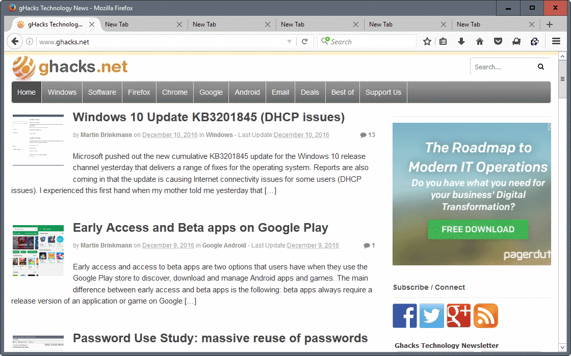
Mozilla plans to launch a change to the display of tab titles in the Firefox 53 web browser that gives title more room than it is currently the case.
I like Firefox's tab behavior better than that of Chrome. The core reasons are that Firefox won't reduce tabs to an unidentifiable mess when you reach a certain threshold, and that Firefox allows me to customize the display of tabs.
I have set a custom minimum width value for open tabs in the browser, and changed the general layout as well for instance in Firefox.
Firefox cuts off page titles if the tab width is not wide enough to display the full title text. The web browser does not just cut it off though, as it adds three dots to the end of the visible title to indicate that the title is not displayed in full.
The change in Firefox 53 sees the three dots removed from Firefox in favor of displaying a couple more characters of the page's title.
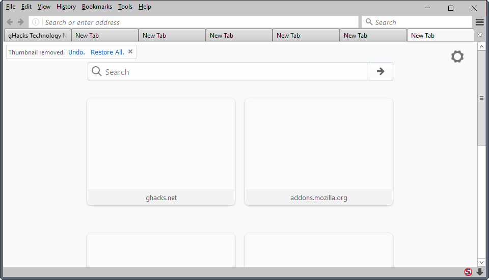
Check out the following two screenshots to see the difference. Please note that the width of the tabs in both screenshots is not identical.
The first screenshot highlights how too long page titles are displayed currently in tabs in the Firefox web browser. As you can see when you look at the first tab, three dots are displayed in this case that take up space.

The three dots are removed in Firefox 53 so that additional characters are displayed if a page title is too long to be displayed directly.
Fun fact: The bug suggesting the change was filed back in 2011:
Ala Chrome, using fadeout for text will probably give 1-2 more characters visible to the user, and just looks smoother.
It took this long because platform changes needed to be implemented first before it could be realized.
Firefox display tab titles like Google Chrome does when it reaches version 53.
Closing Words
Since most browsers display page titles no longer in title bars, tabs are the only visible browser UI source when it comes to the vital information. More information in tabs is always welcome, even if it means only one or two additional characters per tab.
The change benefits users the most who work with a medium or high number of open tabs at any point in time. (via Sören Hentzschel)
Now You: What's your take on the change?








I’ve been wondering why the tab close icon on every tab still exists. How about switching the close icon so that is appears instead of the favicon when the favicon is hovered? This way all the space occupied by the close icon is given back to page title.
This change must’ve been what caused a new dev Tab Mix Plus to come out, but now my tabs are messing up in Firefox 51 Beta 6. The newest developmental Tab Mix Plus must’ve changed something that screws up the tabs when moved. It makes the tab title so long, that it even cuts off other tabs. It happens to the active tab when you move it. It doesn’t appear to be happening with the latest Nightly 53, just Firefox 51 Beta 6. Anyone else seeing this? I can confirm it doesn’t happen with Tab Mix Plus disabled.
I saw this on Nightly with the stable TMP and the previous dev version, but the latest beta TMP has fixed it at least for Nightly
I do the same thing essentially, all my open tabs are slightly shorter than the width of two flavicons, I removed the close button to prevent accident closure of tabs, I simply use the ‘close tab’ selection in the right-click drop down menu when ever I want to close a tab
@XenoSilvano .. I just use control-w, I find it quicker
I think this change broke Tab Mix Plus. I’m not sure, but in the last couple days Nightly tabs have been displayed very weirdly when TMP is enabled.
Sounds promising. Personally I am using a css script where I get the “close” button on the left of the tab, it appears when I hover my cursor over the favicon. The right side is filled with text ending with “…” almost until the edge of the tab. This way I get a few characters more, as well as “close” button on the left side like I have on the rest of my interface.
Using Custom Tab Width, I have the max and min tab size set at 70 so the tabs are always the same size no matter how many tabs I have open. That does leave the partial tab title and the 3 dots, but when I hover my cursor over the tab I get hover-text that gives the full tab title. I use the scroll-wheel click to close the tabs. So this really is a non-issue for me.
Looks to me these two screenshots do not demonstrate the actual difference (with-without dots) as the first one also has site icons in the tabs, while the second one has no site icons.
Like many users, I rarely have more than four open tabs. On my wide-screen monitor with the tab bar in the default position (at the top) this means that to the right of the open tabs, there usually is a wide slab of gray unused space.
I’ve always wondered why Firefox (and other browsers) cannot simply use this empty right side of the tab bar to display the title of the focused tab in full. Wouldn’t be that hard to implement, I’d think!
“Ala Chrome”
Excellent rebranding choice.
Only one of the “…following two screenshots to see the difference…”
Thanks Dave, wonder what happened there.