Opera for Android redesigned
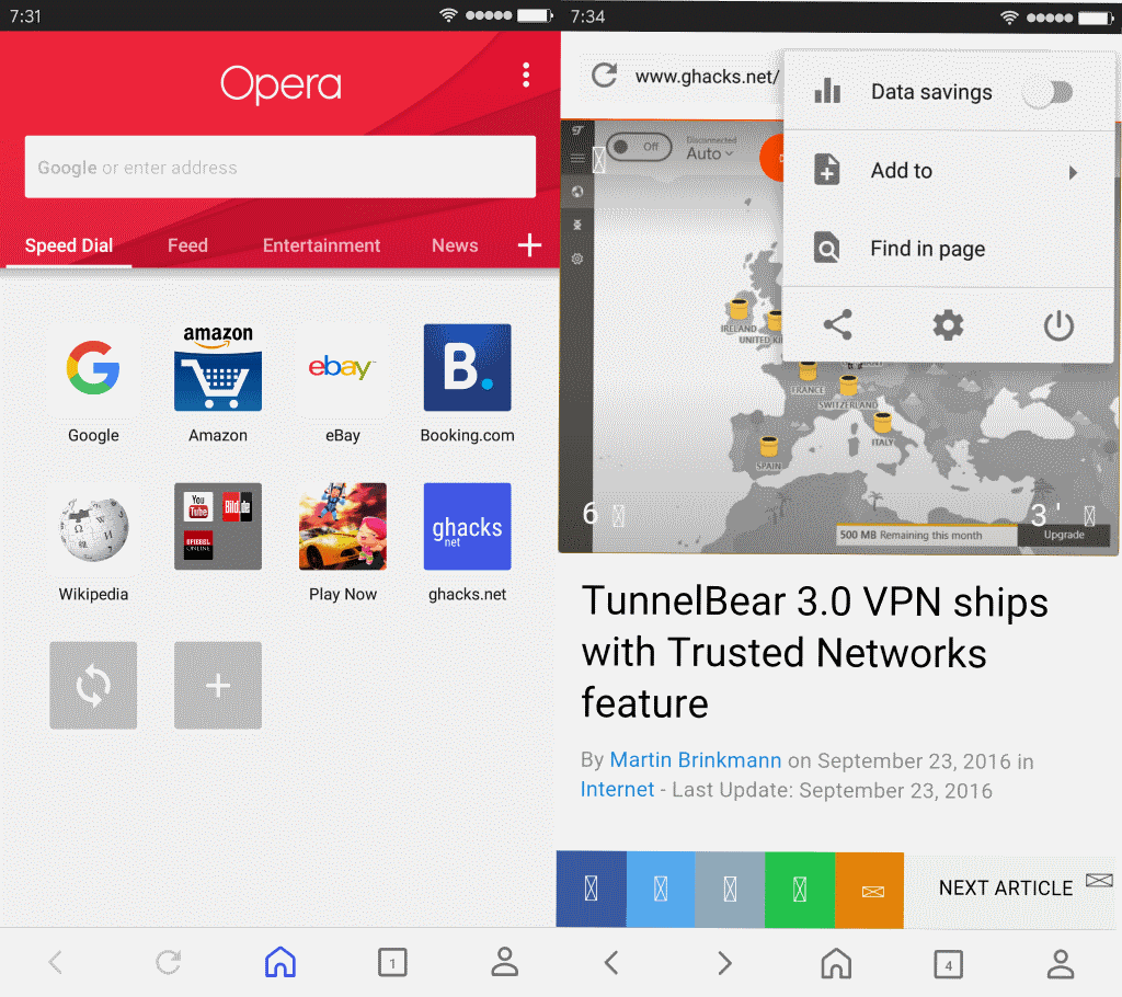
Opera Software started to roll out an update for its stable Opera browser for Android that ships with a redesigned user interface among other things.
According to Opera Software, the new look is "fresh, modern, and inspired by Android's material design".
The new version is not a complete redesign of the mobile browser though. When you start it you get the familiar look and feel of Opera on Android.
You may notice however some changes. There is the new bottom bar for instance that sports forward, back and reload buttons, the home button, the tab switcher, and a new user page.
Opera for Android redesigned

Another change that you may notice right away is that Speed Dial is now on the left next to Feed which is on the right.
The feed lists stories that you may be interested in. One new feature there is the ability to use reader mode when reading feeds.
You can enable this for individual articles, or set it to always enabled in the settings. If you want to do the latter, tap on the three dots, select the settings icon, and set "set reader mode as default" to enabled on the page that opens.
The bottom bar is permanently visible, and there is no option currently to hide it. It features a new personal corner icon on the right side which leads to bookmarks, offline pages, the browsing history and downloads.
You may also sign in from there to have data synced across devices (speed dial, bookmarks, tabs and typed history).
The main menu has changed as well. When you tap on it, you find options to add the page to speed dial, the bookmarks or offline pages, use find on page functionality, or share the actual page.
There is also the data savings option that you may enable. If you do, you are taken to a configuration page to configure features such as ad blocking, video compression, or the desired image and multimedia quality.
The new version of Opera for Android still rolls out to all users. This means that you may have to wait days or even longer before you get the update. If you want to play around with it right now, check out Opera Beta for Android instead.
Closing Words
The biggest change in the new Opera for Android version is the bottom bar. One issue that users may have with it is that it takes away screen space all the time since it cannot be disabled permanently.
The only option that you have is to enable full screen mode in the Opera settings. This hides the top and bottom toolbar when you start to scroll on pages.
Now You: What's your take on the redesign?








Was a regular user of previous versions of this on Android, but ditched it as their “ad-blocker” was anything but. Will give it another try, but switched to Ghostery’s browser and haven’t seen a single ad of any type in ages…
Agreed. The ad-blocker baked into Opera is terrible. The only way to enable it is by enabling their “Opera Turbo” mode which compresses all of the websites you visit. I found images on Opera Turbo with ad block activated to be pretty terrible looking. Even after I enabled the “high quality image” mode under Turbo they still looked awful.
This is why Firefox is the only Android browser I enjoy using. You can install uBlock Origin and improve your security and speed. Firefox isn’t the fastest Android browser in my experience, but the fact that I don’t run into websites serving malware ads more than makes up for it.
…first website visited, 5 ads (inline + popups). Pass.
Speaking of mobile browsing, I think Ghacks is absolutely terrible now on mobile. It acts like an app, with swipes to do different actions, but there’s no indication that it acts that way when every other website acts like a website. It’s jarring and I have no intention to visit the mobile site again while it’s like this. The theme – with red lines everywhere – isn’t great either.
Ghacks mobile on Dolphin browser is awful. The site is jerky and unresponsive and the side swiping nonsense is a disaster. On the android version of Palemoon with uBlock origin the layout is not quite right, but at least I can scroll the page smoothly and read it.
Does it still have the tablet layout?