Open Source Typeface Hack designed specifically for Code

The days of confusing 0 and O, l and 1, or Z and 2 while reading through pages of code late at night are finally over with the release of Hack, an open source typeface designed specifically for code.
While it is code that Hack has been designed for, its open source free for all nature enables you to use it in any program or web application that supports custom fonts.
Hack has been designed with legibility in mind, and it shows when you look at the supported characters.
If you ever had to debug code because of a reading error, confusing 0 and O for instance or l and 1, you know how time-consuming and hard to spot these errors can be.
The designer of the font Chris Simpkins lists the following design traits:
- Oval fill in the zero counter.
- Curved tails on select glyphs.
- Rounded square alphabetic points.
- Round analphabetic points.
- Semi-bold punctuation weight.
- Wide set punctuation.
- Angled vertical tails & extenders.
Hack is available as a True Type (tff) and Open Type (cff) download,and as a web font. The web font can be downloaded or used directly through a content delivery network.
If you want to use the font on your computer, you need to download one or both build formats from the official website.
Extract the contents afterwards to your computer. If you use Windows, right-click on the font and select install to add it to the system.
This may not always be necessary depending on the application you are using as you may reference it directly as well.
If you install it, you gain access to the font in many programs including web browsers such as Firefox, most text and code editors, email programs and more.
It is easy enough to integrate in most programs. You find the option -- usually -- in the program settings or style preferences.
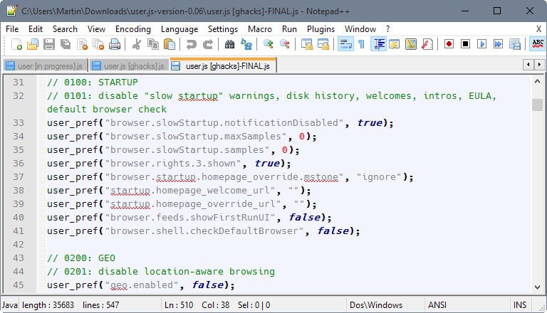
If you are using Notepad++ for instance, you find the option under Settings > Style Configurator. There you can select Hack as a global font or as a font for individual languages only.
If you are using Android Studio, you may use Hack as well. Select File > Settings > Editor > Colors & Fonts > Font.
If this is your first time there click on save as to save a new scheme. Remove the checkmark from "show only monospaced fonts" and pick Hack as the primary font. Click ok afterwards and you should get it as the primary font used in all your Android projects. (thanks Pants)









I installed this font on Manjaro Linux KDE and am using Sublime Text 2. It is brilliant. Thanks for sharing!
Who cares? This font is only a slightly (and sloppily) modified version of DejaVu Sans Mono.
It’s five years old now, but this is about the best comparison of programming fonts I’ve seen:
http://www.codeproject.com/Articles/30040/Font-Survey-of-the-Best-Monospaced-Programming
I use Liberation Mono myself. Dotted zeros! Lower case L and number one differ nicely. Extremely readable. My favorite between other top programming fonts including Consolas, Inconsolata, Source Pro, Lucida Console, etc.
There’s a huge collection of programming fonts here as well, though not quite so organized:
http://www.slant.co/topics/67/~what-are-the-best-programming-fonts
The Hack font is included in this second link, too.
I have been using this for a while:
Inputâ„¢ Fonts for Code, from Font Bureau
http://input.fontbureau.com/
That’s just an unnecessary fork/rip-off of BitStreamVera/DejaVu Sans Mono (which already solves how to distinguish those similar characters). So this “hack” is a solution to a non-existent problem.
notepad++
consolas in Waher-style
works perfect for me
TTF version looks bloody terrible in Notepad++ on my old MSI Wind U100 nettop running XP. Blotchy pixels everywhere. Shame.
IBM Plex is to my eye the most functional and pleasing font family available for the glyphs it includes. (Big time personal opinion) . It is available for free at sites like
https://www.fontsquirrel.com/fonts/ibm-plex .
I read somewhere this is a preview of what will be freely available in 2018.
I use the fonts in places like Skype for Desktop, Notepad++, GIMP, and Irfanview. With an old Chrome extension, I even use it to view sites like ghacks.net.
TTF version looks beautiful in Notepad++ on my new laptop running Windows 10. (I missed this article until today)
I was using Source Code Pro as my Skype IM default mono font, but “&” would not type. I tried Google’s free Noto Mono, but the zero is not dotted or slashed. Windows 10 at least has DejaVu Sans Mono Bold as a choice and it is now my favorite Mono Font, even over LibreOffice Liberation Mono, whose lower case “l” can be confused with “1” design in other fonts (to me).
I stopped using Hack because superscript glyphs are truncated at the top. While a minor problem, it still screamed an alpha font to me. With the installation of LibreOffice 5.0.4.2 today, I had font Source Code Pro available to me, and Windows 10 Character Map shows no problems with any glyph. I use it in Skype and Notepad++ and am very pleased with this font.
The only problem I’ve seen with Hack is that it truncates superscript characters on top, e.g. the symbols for “cubed” or “squared”. Since I rarely use superscripts, I’ll keep using Hack.
so where’s the link at?
It is in the first paragraph of the article.
That’s all fine and good but who uses a non-monospace font for coding? That’s pure insanity, that is.
The designer of Input fonts addresses this exact question: if you perform data entry in table formats without tabulation, then having a non-monospaced font will mess things up. But most code doesn’t need to line up in columns, and for lines which are almost entirely similar, it becomes easier to spot the differences using a proportional font. (Of course, monospaced fonts are much better if you’re counting characters or lining up your comments.)
What bothers me is that Hack actually appears to be just a monospace font. Which means that it’s not novel in any way – pretty much all modern coding fonts easily pass the I1liOD0o tests! And with Input or Bitstream Vera or DejaVu Sans, you get both proportional and monospace fonts that are visually consistent even if you switch between them.
Been using this for the last 3 days and I’m kinda liking it. Sure, there’s nothing particularly breakthrough about it (I1liOD0o tests etc), but for me (using TTF on Win7) its crystal clear and clean and easily readable at very small sizes (am using a size 8 – 7 is slightly smaller than what I’m used to, but it’s easily readable, and I’ll switch to it next project). It’s still perfectly legible at size 5. It is a taller font though, I seem to lose some vertical space, which is at a premium.