Google+ gets biiiiiig cover photos

Google seems to work constantly on its social networking site Google+. The company only recently started to redirect Picasa web albums to Google+ and while that is not a permanent redirection yet, it is likely a sign of things to come. If you are open your user profile on the site today you are greeted with a blue area on top that informs you that cover photos just got bigger. The blue area highlights the additional space for cover photos on your Google+ profile and if you want to make use of it, you are asked to click on the update yours now button to do so.
It needs to be mentioned that this is a one-way operation, that you can't go back to the old layout even if you dislike the new look and feel of the cover photo on Google+. This is similar to how Facebook introduced its Timeline profile where users could not go back either to the original profile once they started to make the switch.
If you click on the button you are taken to the "pick a cover photo" screen where you can pick a preset for the cover area, a photo that you have already uploaded - including your current cover photo - or a brand new photo that you upload to the site.
Once you are done selecting the appropriate photo you are taken to your profile page where you find the new cover photo on display already. Below is how it looks on my profile.
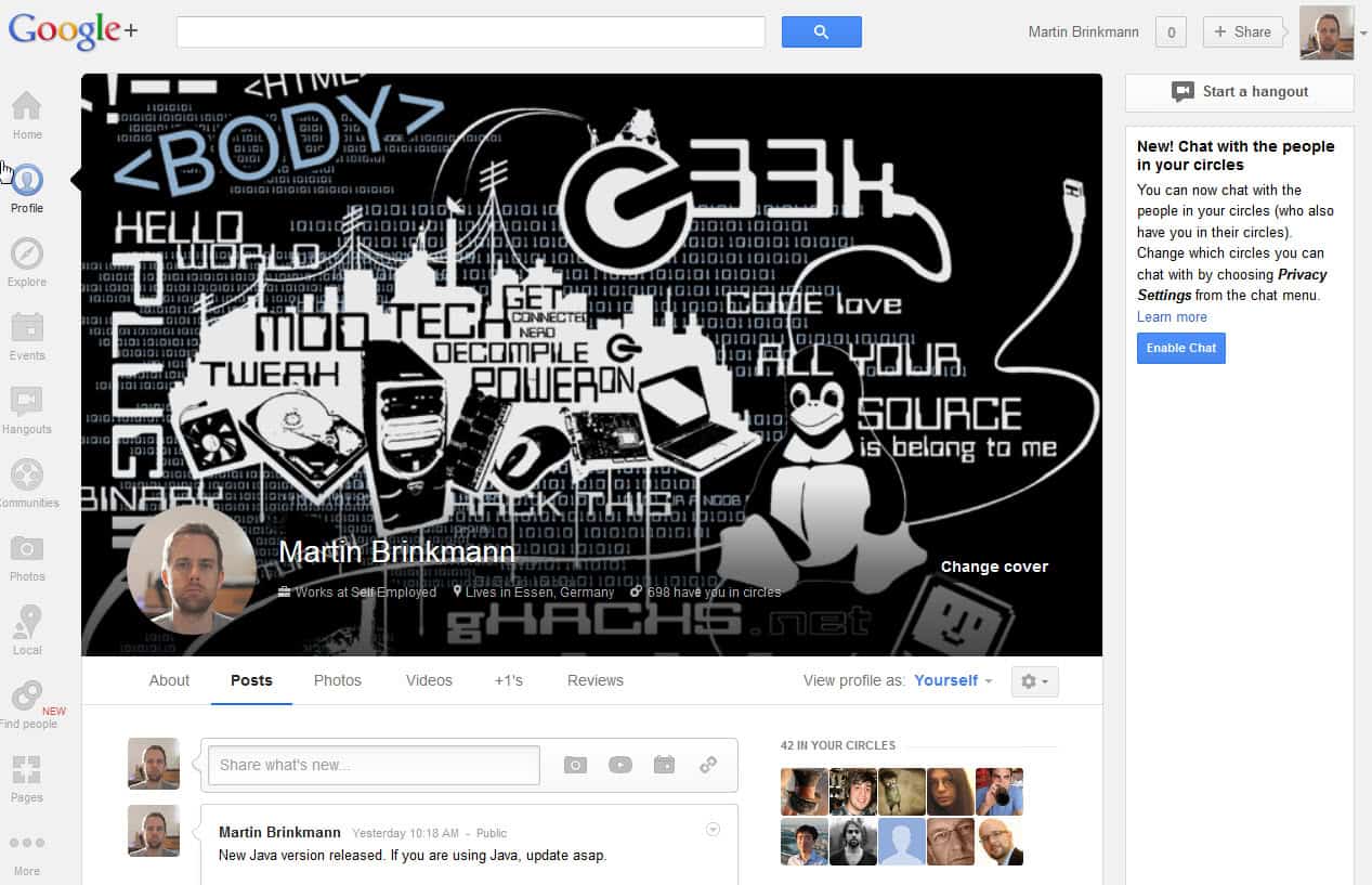
If you are now thinking boy that is a big cover photo then you are certainly not wrong about that. I do not really like how the profile photo is displayed on that page as it is looking really out of place. Can't say if this is because of the selected cover photo or because of its round shape or placement on the page.
Are you using Google+? If so, did you change your cover photo already and what is your take on it?
Oh, and by the way. The cover photos are increased for both your personal presence on Google+ and pages you administrate.
Advertisement


Broken broken broken broken broken.
Circular clipping breaks logos. Text & profile image are on top of the cover image(s). I still use scrapbook images, and it spoils them. Rescaling’s bad too since I have some images carefully set up for the old (good) layout…
NO, I’m NOT changing the images. NO, I’m not “upgradingâ€. If it looks broken now (and it does), it can stay that way. (I should still be able to change which scrapbook images are used, though, although indirectly.)
I change it yesterday. Can you see here https://plus.google.com/b/104662389056338295854/104662389056338295854/posts
It is simply too big. Especially for mobile surfers.
Bad mimicking of Facebook.
Agreed. We do not need another Facebook timeline setup.