Stumbleupon Redesign Makes The Site Simpler And More Attractive

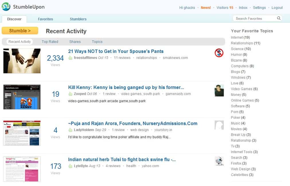
Back in the days when I began using Stumbleupon I always thought that the website itself was a bit messy. Plus there was not really a good search to find websites related to topics that you were looking for. This has changed with the recent redesign of the Stumbleupon website. An account is still required to use the service but that's the only requirement. The new design looks clear and bright but what it sets apart from the previous one is the usability.
Once you are logged in you have access to three main areas (discover, favorites, stumblers) and several account related options in the header. Discover displays new websites based on criteria like popularity, rating or topics selected by the Stumbleupon user.
The favorites section contains the listing of all websites that have been added to Stumbleupon by the user. It is also the place to add a new website to the service.Stumblers finally displays a list of friends, visitors and other information related to other Stumbleupon members.
It is still possible to stumble upon new websites by clicking on the stumble button in the main interface. Everything feels more natural and in place after the redesign. Head over to Stumbleupon if you want to check out the new features.
Update: The company behind the popular discovery and sharing service Stumbleupon has launched another redesign of the service's website. The new homepage shows logged in users liked contents from their friends, channels and interests. It is now also easier to search past likes. All you need to do for that is visit your profile page and use the search your likes form to do that.
New users and old users who did not use the service for some time see now a Site Tour when they log in again which takes them by the hand to highlight core site features.
Advertisement


You could have put a link to Stumbleupon in the article…