Say goodbye to the old Google Contacts interface
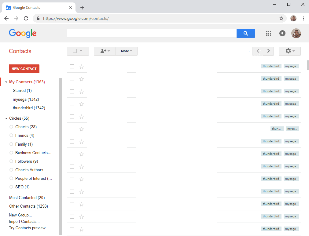
Google announced yesterday that it will shut down the old (classic) Google Contacts interface on February 12, 2019.
Google customers who are still using the old interface on that day will be moved to the new Contacts interface automatically according to the company.
Google launched an updated version of Contacts in 2015 to "provide a modern, smart, and quick contact management experience" and offered it as a preview for existing customers.
Google customers could activate the Contacts Preview option in the sidebar on the Contacts website to switch to the new layout and version of Contacts, and return to the classic version by activating "switch to old version" in the new interface.
The classic interface looked like this:

The new interface looks like this instead. It
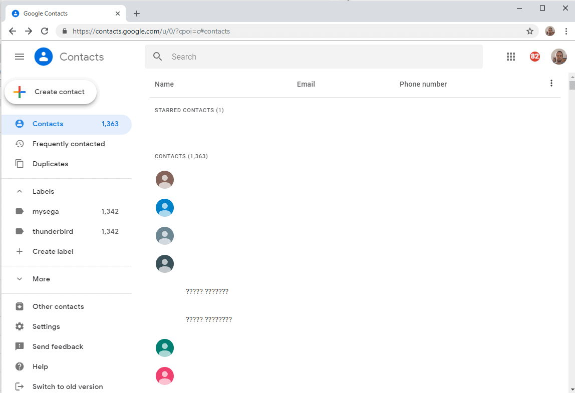
Google customers who use the Contacts Preview already won't notice any changes in the coming months. Those who are still on the classic Contacts site will be moved to the new design.

The company revealed the following timeline for the change:
- November 28, 2018: Google Suite admins could use a checkbox to enable the preview version of Contacts for users. The setting changes on November 28, 2018 to set a default version of Contacts. The current setting determines the new default. Admins can configure the option under Apps > G Suite > Directory > Sharing settings > Contacts Preview.
- January 15, 2019: All Google Contacts users are moved to the new Contacts version. It is still possible to opt-out and return to the classic version of Contacts at this point in time.
- February 12, 2019: All users who are still using the old Contacts interface are moved to the new version of Contacts automatically. An option to return to the classic version of Contacts won't be provided anymore at this point in time. The classic version of Contacts is shut down.
Closing Words
Google will shut down the classic Contacts design in the coming months; I never used it and have no intention to use the new "modern" version of Contacts either. I'd like to hear from you about the change, what is your take on it?
















PLEASE PLEASE PLEASE GO BACK TO THE OLD VERSION OF CONTACTS. THE NEW VERSION IS UNUSEABLE.
the worst thing for me is that in a group email each contact can have only one email address (the first one) the rest of the contact emails don’t get into the group :-(
how can they remove the ability to export all contacts at one time to one file? can this be right? how to i export by groups and then create a single file later? this is why google need to be broken down to a smaller company, why too much much power and control of the data that we all use to life and function in today’s world. if there a way to export all please let me know!!!
We lost the capability of exporting all contacts in one single step. We need to export now by labels only. I need the all contacts exporting back
actually this all contact option seem to be tied to the browser you are using. I didnt have a all contact option via firefox, but though chrome i did. this makes no sense to me. but seeing is believing.
I don’t see a way to export all contacts any more, from the export menu.it show categories, but none of them are for all contact, what i’m i missing? I also don’t see way to see the total number of contact i have.
HELP anyone. many of the other email contacts system don’t let you create a custom name for a phone number, Otherwise i would switch out.
There is no way to add names to a large list/label (talking in the hundreds) from an outside source anymore! Old version was, open up a group, select the add name(s) from the drop down menu and paste in the list of names you wanted added to the group. Now they expect you to go into your contacts and select each individual that you want added to that list. This literally increases the amount of time needed for this from 5 seconds to hours, not to mention the user error potential of clicking wrong names, skipping over names, etc.
GO BACK TO THE OLD WAY OR AT MINIMUM HAVE THE SAME BASIC FEATURES AS THE OLD VERSION. THIS IS ABSOLUTELY USELESS NOW!
Same issue. Need a way to add a list of email addresses to a group (label).
I hve the same problem.
Another very bitter user.
The new version does NOT let you make new Labels for contacts.
Nor can you type-in / look up contacts by the Labels………instead you have to scroll through the long list.
Also missing recent conversations! Don’t tell me they show up at the bottom of the contact field……..that is NOT recent conversations as many are missing.
This design engineer should be FIRED!
Absolutely shocking update from google. This has made the entire contacts system so slow and unusable we are looking for other options. Painful as a G Suite user for years.
It feels like it was designed to be used mainly on a tablet with tons of wasted space and big fat buttons. Who does contact management on a tablet?
Extremely bitter pro user.
I am losing my mind with this POS! It seriously seems like we are supposed to find it great because who needs anything other than a phone number and email address, right? WHY ARE THERE 4 DIFFERENT SCREENS/CLICKS to add contact info????
Does anyone know if there is some way to easily add contacts from the same place? When I onboard a new client I typically have 4 – 20 new contacts to add. They ALL have so much of the same information (address, base phone number, company name, NOTES where I enter details, etc. etc.) I am either a dipshit thinking I have to do every single one separately, field by field, screen by screen by screen (then you have to save and THEN you can add your Labels).
OK, before I just continue to rant uncontrollably, if anyone knows how to populate contact info for multiple clients in the same company, I would greatly appreciate it!
Habanero
I do the email for a non-profit fundraiser. I enter several hundred emails at a time. Using the old version when I started to type in an address it would show if that address was already existed. The new version doesn’t. This will add additional time to my work.
Please bring this usability back!
I never leave comments on anything, but I’m livid. I’m just about done with the total control companies begin to exercise once their good products are thoroughly enscounced in our culture. Just change anything you like without concern of users… I’m livid;
Okay, I got slammed w/ the new Contacts today on PC. It’s okay, I don’t spend that much time in PC contacts. My annoyance is NO COMPACT VIEW. Typical Google. Gmail has it, but “no, we’re not going to do that for Contacts.”
Google has gotten too big for it’s britches. I’ve been a G-fan for decades, but they’re really annoying me the last some years.
We are having issues with things not saving. We are a small business and have multiple users logging into a single account and are finding that notes appear to be saved but then when going back into that contact later, some of the prior notes are not there. We blamed user error for not “waiting” for the save to occur but that does not seem to be the issue. Is anyone else having issues with things not saving correctly?
I found a way to add multiple contacts and create a group with them, also known as BATCH ADD EMAILS.
full tutorial: https://www.cedarville.edu/help/Google-Mail-Create-Contact-Group-from-an-Excel-File
Quick version:
– create a .csv file with 3 columns: First Name, Last Name, Email Address
– Add the emails on the 3rd column (you could add the names for the contacts)
– Save the file
– Import the file into Google contacts (More>Import)
– Assign a label for the imported contacts.
Cheers.
Google, please, if something is not broken, DO NOT FIX IT.
the NEW VERSION IS HORRIBLE AND IS NOT WORKING FOR ME… I MAY QUIT USING
It was so much easier to create and manage groups with multiple people using the old Contacts. I could easily copy and paste a bunch of email addresses to create a group.
I DON’T want to tap on each person individually!
The appearance of the pop up window in the Contacts makes it much harder to find information. There is so much white – there’s no separation between categories of information. Will be FORCED to get used to it, but so far its very uncomfortable to use.
I usually look forward to Google app updates and innovations. One of the very few exceptions is this New version of Contacts for the Desktop (the Android version is very good). Others have covered the short-comings and I will only add that this has been, and is now officially a step backwards with the shutdown of the old version. A simple copy and paste operation leads to frustration. I make extensive use of the Notes field and with the Edit Window being so unnecessarily small, it’s frustrating to add a Note and also not being able to see the entire contact while editing. Making the Edit Window that small SERVES NO PURPOSE. This division of Google needs a real hard look. Because just about every other department at Mountain View is turning out some phenomenal work.
@FlyFisher wrote:
“I usually look forward to Google app updates and innovations. … [T]he Android version is very good. … [J]ust about every other department at Mountain View is turning out some phenomenal work.”
I really couldn’t disagree with this more — see my earlier comments in this thread — which I suppose is a good reminder that different users can have *very* different perspectives.
the old version contact is so much more useful and easier to navigate!
especially when sorting out different tags and groups.
the recent changes by Google is NOT HELPFUL!
together with the new look for gmail … more slow and complicated
I have over 2000 google contacts and now find the new interface almost unusable.
The reason I chose to move to google contacts a few years ago was the hope that it would be integrated with google maps – so I can display a group of contacts as map pins.
each contact has the postal address and a second one that is the GPS coordinates – in anticipation of the map integration.
Given that hasn’t happened, and the new user interface is hopeless, has anyone found another way of storing and accessing contacts, ideally with a simple way to export to google maps?
New Interface is not good:
Adding new contact – does not autosave
Adding new contact – adding address – used to be able to cut and paste from google maps – not any more – you have to key in everything because they are all in different field (address, city, etc). And then when you’re done copy everything into the fields – the address doesn’t match the google maps version. Now you pull up the address of the contact while driving and google maps can’t find. Unbelievable stupid.
Adding new contact – multiple windows to add all the fields – now takes longer for now benefit.
I’ve used the old interface for years. I probably have about 2000 names in it – this new interface sucks.
Hmm… Adding contact is miserably slow and you’re right – the address thing is wacky. It auto-fills, but puts it all into street address. This needs to evolve – feels like beta.
It’s shit , you used to be able to bulk update contacts now you can’t
For example if you did a search for @abccompany.com you could select all found results and add them to group. Now you have to do this individually for each contact
Actually you CAN do bulk label changes to a select group of contacts. Search for your contacts, select one, then choose SELECT ALL from the pop-up menu that subsequently appears at top of column. Then select the MANAGE LABELS icon that also subsequently appears. Works fine to apply LABEL (group) changes to all selected. Not all that different than before, but definitely slower and less intuitive.
Thanks, I didn’t see that, that’s at least a big lifesaver for me
After two days forced into the new contacts I’m livid at all the useful features they’ve gutted, and how less useful and more time consuming the new interface is. Now I’m looking to export or sync my contacts to something like the old contacts. I wish I’d made some screenshots of the old version, as it might be possible to replicate it with Google API calls. Any volunteers???
Rants:
Ajax search is gone. Now there’s no way to know how much to type to find what you’re looking for.
More user unfriendly hide and seek menus. Where’d import/export go?
More clicking. The fields I want to see aren’t in the first screen that comes up when selecting a contact, and copy and paste is much harder as the numbers are linked to dial with Hangouts, and the call, trash, and text icons that used to be in the 2nd older contacts are gone.
Settings are almost all gone! How about a compact or cozy option like Gmail?
This died long ago, but it’d be nice if we could have the option back to just sync “My Contacts” with numbers, and not all the thousands of other email contacts gmail automatically creates.
I use a 40″ 4K TV as my primary display as my vision is not what it used to be. I loved the ability to skim through a lot of contacts at once, and to be able to select a lot at a time into groups. The new responsive design feels like the advantages of larger displays are largely gutted.
We use Contacts extensively to keep notes on clients. Now we have a multi-step process to go thru in order to add a note to a client. We also have fewer clients visible on the screen list at any one time. The old version was simple, clean and worked well. Now we have multiple pop-up windows to open then close. Hate the new version.
Exactly. Ease of adding/editing notes was a KEY strength! That was the first GOTCHA that hit us in the face immediately with the new version. It’s exceedingly slow and cumbersome to popup multiple windows and scroll down just to edit notes, which is our most frequently used field. Very disappointing because we don’t think they’ll ever return that feature. Rather than 1 click, it’s now 3+ clicks with less real estate to edit. POTENTIAL FIX would be to provide a quick link near the top of the contact pop-up editing window that will open yet another window dedicated to editing that contact’s notes field. That would at least keep it to 2-clicks and restore the real estate for editing.
So far, we haven’t found anything compelling about the new design, but we’re OK with the rest of the UI. Another noticeable change – loss of predictive searching, nice to have, but not essential like editing notes quickly.
I love Google contacts but have been resisting the new preview version since the beginning and it’s really bugging me for the same reasons you’ve mentioned here.
RE: the predictive search, on https://gsuite.google.com/learning-center/products/contacts/get-started/#!/, it’s actually saying that “You’ll see matching results as you enter text.†so it supposedly
should still be happening… I thought it was a Safari compatibility thing so just tried in Chrome but still no.
Would love any insight on this!!
I have figured out how to get the predictive search back! On Chrome, go to Settings, and switch on both of the “Use a prediction service…” lines. Hope this helps alleviate some of the growing pains!!
@Anonymous:
This is par for the course for *all* of Google’s new interfaces:
The old Google Maps used to load fairly quickly and have many useful functions a click or two away. The new Google Maps takes ten times as long to load, and good luck even *finding* some of the old functions.
Google Translate used to load *fast*, and you could target its input field with a Firefox/Pale Moon “quick keyword search.” (For example, if you had stored “xef” as a search keyword for Google Translate English to French, you could just type “xef your phrase here” in the address bar, and the result would load.) Google made some change a few years back that ended *that* particular convenience. And in the past couple/few months they’ve made additional changes that now cause Google Translate to take 5 to 10 seconds to initially load (on my computer, at least) … and then *re*load a few characters after you start typing your source-language input. More terrible, brain-dead changes for the worse.
Gmail now takes *considerably* longer to load and reload. When you reply, it automatically hides signature blocks and appended earlier messages in the thread, which can be dangerous if you reply to a group and want to hide a previous “private” message in the thread that was sent to or from only one member of the group.
Even Google Search has removed a bunch of specialized searches from the interface. (I don’t remember all of the details, but I’m certain Martin wrote an article about it at the time it happened. I *do* remember that “search blogs only” was one of the things they dropped. There were *many* more.)
In *every* Google online service I use, the changes over the past six years or so have been for the worse. I used to be genuinely impressed with the quality of Google’s interfaces. They were snappy and straightforward without being dumbed down, and they made features readily accessible. Now they’re slow, cumbersome, dumbed-down things that I increasingly have to *fight* to do what I want. I have to wonder whether they’re being designed by people with an actual background in human interface design, or by art-school grads who only care about what they *look* like. Using Google services used to be a joy, and now it’s a PITA. It’s incredibly disappointing.
Absolutely hate the new, kept the old and now it is the new. Hassle to imput new contacts, can’t read the groups, can’t see all the info and more .
Same feeling here, it’s really terrible. The new interface to add contacts s*cks. Also if you open an old contact, the country is not filled in correctly. Instead it saves new contacts with the international landcode, so e.g. FR instead of France. So all old contacts that have France, just show France in the list but once opened show Belgium (default country of me as a user).
I takes ages to add a new contact compared to the old interface. Why always use popups? Is it to show off how skilled their programmers are?
You show up the one of Google Contacts worst problem: As you, I am a “global” person, Normaly I use a Spanish UI, but 20% of my contacts are German and 50% are from South America. I used and liked to complete the State/Province-Field for german contacts with the State=Bundesland, now if I edit a german contact Google “destroys” this info, the field disapears when I select Alemania as country. An argentinian contact enables the Province-Field, but now it is a dropdown-list, I used “Capital Federal” for the Federal Disctrict, now Google forces me to use what they want. And of course, as you said, Brasil is now BR !!
It feels like a dictatorship from Google !
I tested Outlook.com, Micro$oft is much more flexible, more open-mind, perhaps it’s time to go back.
Google NEVER notified this Google User they would be changing Google Contacts nor was this Google user given the OPTION to OPT out of the newer version of Google Contacts. POOF Gone, no option to turn on the OLDER version of Google Contacts as of (3) days ago. Google did the same thing when they ENDED Google Notebook. Bottom line Google THINKS they KNOW what Google users WANT and simply do NOT ask us, the Google users what we want!
Good article, although you should warn everybody that unlike the old version, the new Contacts Preview can only handle 10 email addresses per contact. There is no warning so if you enter more than 10, they don’t show up next time you open the contact.
I went off on a tangent about display ratios in my previous comment, but I do have something to say about the subject at hand. I don’t think I’ve thought a single thing Google has done with their apps over the past six or so years has been an improvement. From Gmail to Maps to Calendar and now to Contacts, the UI has gotten simpler (dumber) and less useful. The New Google Calendar doesn’t even work in Pale Moon, at least not in *my* configuration. (I can’t add or edit appointments — I have to fire up another browser.)
Hopefully, people who use only smartphones and tablets are happy with the changes. And to be fair, it’s understandable that a company as small and cash-strapped as Google just doesn’t have the resources to maintain a separate, *good* interface for the tiny number of remaining desktop/laptop users with full-size screens and physical keyboards. I mean, there can’t be more than a billion of us left, right? /s
I don’t trust Google with my contacts and run CardDAV on my NAS.
You still have to revert to the old interface if you want import contacts. I assume they will have this up and working on the new interface before the shutdown?
This kind of interface really infuriating. There are too many white spaces or too much padding.
Some developer created a contact list format that looks like a cartoonist game for their five-year-old child. Google is pandering to some perceived set of mobile device users without thought to PC users. This is a disaster to a user with a long set of contacts and manages the contact list on a PC with a high res monitor – it totally negates large-screen capability. I challenge anyone with a small screen mobile device to manage a large list of contacts that is categorized into multiple groups.
Where are Groups in the new UI?
One of my main tools
I have just switched to the new interface after reading your article
Same kind of interface as the agenda
More modern
Anyway there is no choice
what is the best free contact management than googel contact.
I would recommend https://www.fullcontact.com/
$499 per month? Nearly $6000 a year?
Fortunately I only use Google Contacts on one account specifically for syncing / controlling what appears in my Android phone.
Agree about the dev-child Material ‘Design’ stoopid template, but I wonder if the excessive white space is just Googles choice. I saw a similar trend in GTK+3 but some designers can be pursuaded to tone down the white space.
And despite the wasteful desktop, my phone still is not (my) human finger friendly. Tiny buttons, arrghh ………..
I’ve used Google Contacts for a long time and switched to the new version once it was available. It’s fine, nothing great. I haven’t really searched for or found alternatives.
The one feature I really wish it offered was the ability to share or co-manage contacts for regular (non G-Suite) users – similar to how you can share and/or grant editing permissions for a calendar. It would really be great in a family situation.
So I’m now getting 40% less useful screen space… due to this bloat, desktop/laptop users are treated like niche-tablet users, can we have our usability back? Especially poor people forced to use 16:9 laptops – scrolling endlessly.
Yes, unless the only thing you do on your laptop is watch 16:9 HD video in full screen, the extra vertical space provided by a 16:10 ratio is extremely useful. After all, menus, toolbars, tab bars, and the like take up a more or less fixed amount of vertical real estate if they are to remain legible and usable, leaving what space remains for content. The taller the screen, the more room for content. Score one for Macbooks. And Microsoft went 3:2 with their tiny Surfaces — a smart choice. Even though I watch a fair amount of video, I actually miss the old 4:3 ratio for text-document work. The solution with modern-day 16:9 laptops is to hook them up to a big external monitor. Your barista might look at you funny when you pull it out of your enormous backpack and put it on the table at your local coffee shop, though…
Years after its first debut, I still hate how Material design makes everything huge and fat for sausage fingers, even on non-touch desktop.
You made me laugh so hard!
Everything is “huge and fat for sausage fingers” on phones. I had to go to developer settings to make everything at a sane size, the lowest level allowed normally is still far too large. These developers are assuming everyone is two metres wide I guess.
Yep. I’m afraid we’re going to have to put up with the Material Design nonsense for a while. Eventually, though, I think the industry will move on to the next fad.
LOL
Friends (4)
Family (1)
me:
Friends (1)
Family (0)