Google Search, New Layout, Style
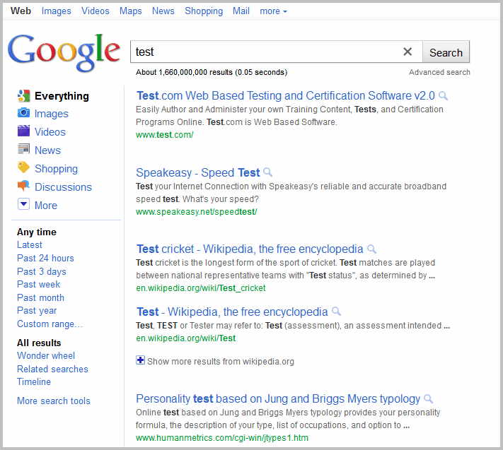
We know that Google is constantly running experiments on google.com. Those experiments are only visible to a subset of visitors to test them before they may go live for all users eventually. The majority of tests make small changes to the search page or result's listing. Some users may not even notice that they are there.
I'm seldom in a test group, but today was different. Imagine my surprise when I found out that Google is testing a new result's page design.
Take a look at the following page:
Notice anything significantly on that page? Right, both the layout and style have changed dramatically. The titles use a light blue color instead of the standard link color. They are also not underlined anymore.
The description and url use lighter colors as well, and the row height has been changed. The space between results has been increased, and the Cached and Similar Links have been removed.
Here is a screenshot of Google's old search results layout.
What are the implications? For one, you need to scroll down to see all ten results. I'm running a 1920x1200 resolution which allowed me until now to see all ten search results without scrolling. On the new search results page, I only see eight or nine results on page load.
The lighter title colors make the titles harder to read, and the overall page feels brighter which is more taxing for the eye.
Overall I'd say that the test layout and design is a step backwards. The space between results is to big, the "whiter" colors are taxing my eyes and the missing cached and similar links are missed dearly.
It is unlikely that Google will roll out this new results page to all users of its search engine.
Do you see the new search layout as well? What's your impression of it if you are?
Update: some users have reported that clearing the cookies reverted the search results page to its old glory. Check out our guide: How To Delete Cookies On A Computer if you do not know how to do that.
Advertisement












It’s still there. just see top of the preview page (pop out view to the right) the you will see both “cahe” and the “similar” link.
Why you change beautiful things to be ugly…
Are you doing plastic surgery…?
The letters are thick…spaced…divorced
No love to each other…hate…curse…leaving children alone
This ugly letters …I don’t know their name…
Who arranged them is wearing thick glasses need to be changed
It squint your eyes—
As if you have more than two eyes using all
instead uniting them
To have one look
One sight
One glance
Please return me my old lover, my old google, I didn’t ask for new …
You are forcing us to use something without love…
You are never allowed
There are many sites we will leave and go…
Sylva Portoian, M.D
Peadiatrician and Poet
The cache option is there provided you hover over the search result and see the review of the search result. This change does not make sense though I thank God that Google did not remove the cache and similar option altogether.
Google is getting annoying which reference to design changes. First and foremost Google does not ensure that users know about the changes made. Removing the cache link from the actual results is dumb (I thought KISS was the mantra at Google” Does not seem to be the case now.
It seems Google is panicking because of competition and in the hurry they are launching changes to existing products without testing them and a classic case of that is Google+ business page launch – No one has been able to explain why Google+ business pages were not launched at the start.
Google needs to get it’s act together otherwise Microsoft II is in the making.
Is someone from Google listening?
Oh, and on the thumb preview you have Cache link again :) as CacheAndSimilar also points above.
and you can click the >> button in order not to wait for its popup.
There is some trace of the former “Cached” functionality: in the page thumbs shown on the right the words searched by you are pinned to the places in page where found. at least the first occurrence of each or something.
You could almost tell whether the page really contains what you are looking for or not, but no more access to the page content from their cache. I once really benefited from that cache trick since the page I was looking for was forever gone, and the only place where the info could still be found for a little while was in the cache.
Oh well…
Well, I hope this has NOT been implemented….I just now noticed the changes to my search results today (4 Oct 2011). I am using Opera browser. I find these changes horrid. I too use cached results a lot….or did…….wottafukup Google! You FIX!
Cannot say I am impressed if the only solution is Bitmaps’ post above…..
Pissed!
Solution found for missing cache link. The same way you disable the preview, you can add back the cache link.
I have used this script in Greasemonkey for several months:
http://userscripts.org/scripts/review/90222
I modified their script to replace one line, and works well for me, “cache” and “similar” are back.
var css = “.vspib {display: none;} .vshid {display: inline; margin-left:7px;}”;
Accessing Cache and Similar links is now an additional mouse move, pause, and mouse move away.. Adding like 2 seconds to my navigation workflow for each link I follow.
Yahoo although cluttered still provides a quick (unhidden) link to the cached version of a page so you can automatically highlight your search terms..
Deleting all cookies and cache worked for me.
I hate it. How can I get back the other layout? I use my IPad and now the icon that were on the left side going down are gone. I was so much easier n my eyes to see the colorful maps right beside the shopping stores when I did my searches! Now it’s all messed up!! Plz someone tell me how to fix this? If not I am using a different search engine…period!
Heh, this is funny -> starting to like this new layout with black bar on the top. It seems my mind gradually adopting changes and now seems quite OK…
Gosh, this new design sucks so hard, my eyes can’t stand it – come on, white on black, this is terrible!!
Wow, what a nuisance. If Google implements this I will be switching to a new search engine because there is no more *clean* advantage.
I don’t understand why these companies keep thinking they need to change things around. People don’t like change. You will ruin your company that way!
Again some new changes -> black top navigation link background … aah all this changes are useless. Here I found the link to the Google official blog explaining about it:
http://googleblog.blogspot.com
for me it`s likely that they finding better user interface… welcome googler…
IT BLOWS! LIke over at MS Office, Google staff obviously have nothing better to do than to fix what’s NOT broken! I depend on the cache feature on most of my searches – going through an entire site just to find a specific amt of information is ridiculous, time consuming & extremely inconvenient. With Google’s new format my searches will be easier if I just pull my encyclopedia’s out of the attic… Guess going forward I’ll have to use Bing or another search link that will actually help in finding search results…
Just want to agree that the new layout is harder to scan. Basically colors need more contrast. Also, loosing the “cached” links is a significant step back.
Actually I’m happy to test out new things but in that case it would be nice if Google places a corresponding feedback button on the experimental sites.
Horrible, it looks like a re-direct to google from another page. Couldn’t they at least have put an option “revert to standard view” or something? And what is the point of losing the cache? If I switch to IE, I get the old layout, and everyone else in the office still has the “normal”. This is one of those times that I really don’t want to be part of a test group…and I am on deadline, to boot!
June 7th 2011
Its been looking this way all day, not sure if its been here a couple days or not.
Hurts my eyes! …Finding this page was not easy…
No one is happy about this change, are they?
Something I’ve recently realized: 90%+ of people must be dumb, spineless, carefree, obedient, good-hearted sympathetic people, with a love for backstabbing that feeds their giddy self-serving greedy appetites that can never be quenched.
It is for these people the world is crafted, not for me.
I don’t get this change at all, but I guess those of us on this site are outnumbered.
I just saw the new layout for the first time today when searching on Google. I have to say that I agree with you. The new layout is horrible! It’s harder to read and the colors are way to light. I hope they don’t switch over to this new layout.
i like the new google logo, with a slight shadow behind it, nice
I love the new layout. It is much easier on the eyes. Its cleaner, and it is easier to differentiate between each result. I will be very disappointed if they dont roll this out to everyone soon.
I thought it was horrible and I couldn’t stand using it. Like you said, it’s hard on the eyes. I used Bing for the first time that day and set it as my main search engine so I could avoid using the new layout…
I always search 100 results. I would spend 10 minutes scrolling each page with that much space between each entry.
I only want a more distinct color change of results that I have already clicked on instead of just changing from blue to purple. It should turn red or orange–something immediately easy to see where I left off.
Now recently colors are not changing at all, they all stay blue. This is the worst yet. What the heck is going on?
http://imageshack.us/photo/my-images/857/catturagq.jpg/
just playn’ with firebug…
i think my version is better
I am looking into other search engines since the new layout is completely counter productive. Allowing to set a layout in a profile so people can choose how the results are presented is the way they should go.
I hate the new look………..
Yet another change whose only purpose is to get more ad clicks. Top page ads are now twice as big, for popular queries pretty much all i see above the fold is ads.
It will also increase competitioÂn (and cheating) for top place since unless a site is top three they are now nowhere to be seen.
For those stuck with this, I did find a temporary solution.. go to Google Labs under your google account, and you can find the Google Experiments section.
Direct link:
http://www.google.com/experimental
You can join the Accessibility experiment to get search results back to very similar to the old style. Only thing it changed for me was added a giant ugly ‘Web’ square to google.com, which I don’t use frequently anyway.
Thank you, thank you, thank you! Too bad there’s not a way to get your answer as the first result in a query about this problem!
THANK YOU!!!
Interesting, thanks for letting us know.
IMPORTANT:
Like the user “SIro” done: delete all cookies [completely all] from your web browser and the Google will revert to previous look. We are seems part of some google test program and after deleting cookies no-more… :-)
i got it too, and i hated it.
at first i was certain it’s an issue of an addon / malware taking over my google results page. then i realized this is a test group. after a short while I cleared my cookies to remove it. it’s really annoying.
Horrible. How could anyone at Google think this new design is an improvement? I’ll be looking for a new search engine if they don’t change the design back soon.
This new layout sucks! It has too much white space, scrolling down is lame, it seems like it was made for a kindergartner to read. A BIG step back, I say. The underline was so much better, so much more concise and to the point. With this new layout, you have to look more for what you want. I’ve always liked google, but if this is permanent, I am going to switch to another browser.
HATE IT
I hate this new layout, got it randomly yesterday and thought i had messed something up…
All the negatives listed here are why i probably won’t get used to it… so much white space, and tiny light text…no cache… like wth? It’s depressing (embarrassingly) because i’ve been loyal to Google since the beginning…i hate other search engines…this is just frustrating… T_T
not seeing it either, but your screenshots immediately struck me as awfully similar to both alt-engines duckduckgo.com and blekko.com, especially the former. go chk them out!
mho is that it’s an improvement, but goog can’t ditch the cached version!!
not seen by me …yet!
But… (from your photos),
I really dislike the new layout .
Hope they allow you to choose the layout!
This new layout and style is horrid. It’s more of a strain on the eyes and really gives the whole setup a “cheapened” feel. The lack of similar and cached is a big minus too, those were useful when researching. Why “fix it” if it’s not broken?
thats nothing against my new layout… there are dotted lines between the search results -> http://www.mirror24.de/upload/bilder/8416478229d13048084774dc5cc1d7d51e.PNG
Hehe, nice ;)
I’m hate to say this, but I think that every update that Google has done sucks.Google used to be the only search engine I could use to get exactly what I was looking for. Now I can’t the search results are too stretched out font is too small,and the pictures take forever to load. Google needs to stop trying to compete with other search engines,because the only thing that their doing is making browsing the internet less enjoyable and making it difficult. I already have really bad eye sight this is making it so much worse. Now I have to find another search engine that fits my requirements.
Rubbish. Revert please ASAP.
They should try to adopt the Blackle layout anyways ;) That’d be the best thing to do!
-> http://www.blackle.com/
Like the SIro says: Search engines should simply follow this amazing search page to save some watt hours :) –> http://www.blackle.com
Why do I have this layout too?! How can I switch it back?!?!
I don’t like the new layout! If this carries on, I will switch to Bing too!
What is going on there in GOOGLE? Are you going nuts? This is the most useless style change it could possible be! This styleshit :) is painfull change -> pls get normal and revert back as it was and dont imitate bing and similar foolish internet creations or trends, BING …. hahaha what a funny name!
I’m using the GoogleMonkeyR userscript and a custom css…I’m not seeing any of the changes that google implemented. Oh wait, no more cached links…damn!
Everything else looks as I’m used to, seriously what’s with people changing things that already work well to crappier forms.
Time to ping Bing.
It sucks. I just wasted 30 minutes trying to find out if I had inadvertently changed the page layout or format. Now I know I did not. Google did it without asking me, or giving me a choice or a way to put it back to the former layout and colors. Its too bright for someone on a computer screen 12 hrs a day like Iam doing research.
If Google is listening, its now too hard on the eyes, the text is too light and harder to read, and it’s spread out too much. It wastes my time and my eyesight. Either go back, or send me the option to go back with my computer only.
Your format and layout just before this lighter brighter text version (5-6-11?) was pretty good.
Humbug! …… this version should go to the Recycle Bin.
Hate it…..looks like advert catch all page…..no cached…really?
The brightness tipped me off to the changes, (don’t care for it as well) then came the slow realization that extra tools weren’t available. Fail.
I find it much more difficult. Really wish they would not force me to be in a test group. Will need to start using a new search engine if this keeps up.
I have this new layout. It only happens when I use Google Chrome. If I use Firefox etc. It’s fine. Does anyone know if you can change it back?
I hope this isn’t a permanent change, I found by going on google.com instead of .co.uk I could avoid this annoying new format.
Horrible, horrible, horrible. Are they serious? The spaces are annoying and totally pointless and I miss the godsend cache-function and the purple color for visited links. How am I supposed to find anything now when websites are down? Or find out easily which websites I visited? Go screw you, Google. If you want to test something, then offer a test mode. I am so angry right now.
By the way, on Safari, there is even more space. http://tinypic.com/r/1xxsur/7
The new design is horrible. The text needs to be darker and the spacing needs to smaller. I hope they will soon change this test layout so i can get back to the old one.
Btw I’m only seeing the new design in Chrome and only if i do search in my native language.
I got exactly the same feeling as someone above – the search results looks like adverts to me. Second to that, it is a lot harder to read, a lot more scrolling and .. well a lot more ugly. If this is the next google looks I’m gonna make the switch to Bing sad enough. It shouldn’t be this hard to read search results.
Looks terrible. Can’t tell what’s a link, what’s a description and what the url is that I may be going to. The old version is way better. This one sucks!
its horrible, can’t see anything, makes it so hard to read and find things
Annoying.
Hate it.
I only see the new layout when I search directly from Chrome but not when I go through the site. I now see five results instead if eight. It feels like such a waste of screen space. Image results now appear at the very bottom of the page instead of five links down.
Terrible
Reminds me of bing
I’m really not liking this new layout. I hope one google employee visits this site, because most people liked it as it was. Every font colour is lighter than it used to be which might make it somewhat difficult to find what you’re looking for. I’m carrying out a few less searches on google as it is a bit of a eye strainer.
The new layout is terrible lost all of my visited site that were purple and now I can’t work
i hate it ..no upside
Cant stand it. Need the cached option and dont like the expanded description of each hit. I need to have an option to switch back to the classic view. very angry as I have work to do
I also have the new layout and it’s terrible. The spacing between result items is way too big and overall the layout feels more unclear than the old one. Please, please do not make this the default.
I also got this new layout. It suddenly appeared as I was searching on google. It is so LAME that I initially thought my settings had been inadvertently changed. I find it much more difficult to read the search results due to the pale colours and I am also really missing the cached facility; in other words, I see no advantage what so ever and will be looking at alternative search engines unless Google reverse those changes. RATING: STEP BACKWARDS
VIsually, for me it’s more appealing and has a more up to date feel to it. Obviously need to resolve the issues with the too-big gaps between results and the missing cache/similar links.
Apparently, some are seeing something similar but with dotted lines between results, which I think spoils the visual benefits of the layout you’re showing.
I should say though that this opinion is on the basis of having seen screnshots of the test layour – I’m not actually getting it myself at the moment, but there is every chance my view would change on actually using it!!
no, i dont have that new layout…
If this is future layout, I will switch to Bing.
Please go back to the prev layout, this one is terrible. Why change something which works perfectly just for the sake of change?
Google spends squillions on usability studies and I’m hoping this is one of them. I find it MUCH harder to scan, slightly harder to read and irritating that you get fewer results per screen. It’s not so much a ‘someone moved my cheese’ kind of problem for me, but I genuinely don’t think that this is a move forward.
I can’t read the text its to lite, it hurts a tonne.
I suppose it’s a matter of taste. Judging by your screenshots I like it better.
the layout seems more like adsense adverts..lol
Removed Cached ? Big step to nowhere.
I have the new layout too and it’s really distracting. It feels harder to read the page because of the paler text color and the extra spacing is awkward and unnecessary. It breaks the flow of the page.
Its really dreadful. Its strains my eyes and i hate scrolling. I will be switching to ixquick.