YouTube Music's new grid view emphasizes cover art
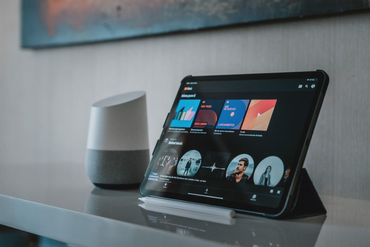
YouTube Music is undergoing a major redesign of its Library tab for Android and iOS devices. The overhaul has been in progress for quite some time, but the web version is now receiving some Library changes ahead of its wider release.
Last August, YouTube Music began testing a new design for its Library tab, which was widely rolled out earlier this year. The new design presents items in a list view. However, at least one Reddit user has noticed a redesign that shows items in a grid view, with two tiles per row.
The new grid interface places emphasis on the cover art for albums, tracks, and playlists. The album, track, and playlist title and artist details are displayed beneath the cover art instead of beside it, as in a list view. In addition, a one-touch toggle beside the sorting options allows users to switch to a list view if they prefer larger text.
Like the forthcoming mobile redesign, the Library's "Last played" carousel has been removed. Instead, users can access tabs for "Library" or "Uploads" (if available), followed by filters for "Playlists," "Songs," "Albums," and "Artists," with one filter selectable at a time.
Playlists and albums retain the grid view, while everything else adopts a list approach. Selecting "Artists" provides an additional "Subscriptions" filter. Finally, the "Sort by" filter on the right includes options like Recent activity, Recently added, or Recently played.
How does it look?
The redesign allows for faster browsing than before, although the fullscreen grid of artists, albums, and playlists can be overwhelming at first. The UI has remained largely the same since YouTube Music's relaunch, as you can see in the tweet posted by Matt Navara:
YouTube Music has a new grid layout to browse your Library https://t.co/tvu8qWwnmA pic.twitter.com/G7RuaNVBVU
— Matt Navarra (@MattNavarra) April 5, 2023
The new Library for Android and iOS devices is gradually being rolled out, but it is not yet widely available. The feature rollout for YouTube Music has been rather unusual, with large-scale availability appearing for a few weeks last year before being unceremoniously removed. Google could have communicated better about the changes.
The pace and extent of the rollout of the new view remain unclear. While it is live on some of the Android Police team's devices, it is not yet widely available.
Meanwhile, YouTube Music has recently rolled out playlist cards to the main Home feed. These cards display the first few songs of a playlist and enhance the app's user experience. The playlist cards make the app feel less segmented and more unified.
Advertisement







Looks horrible. Is there a compact list option? Never understood the need to see album covers.