How to restore Wikipedia's old design
Last week, Wikipedia rolled out a change an updated version of its desktop interface. It has a modern look, and is actually one of the biggest changes made to the website in over a decade.
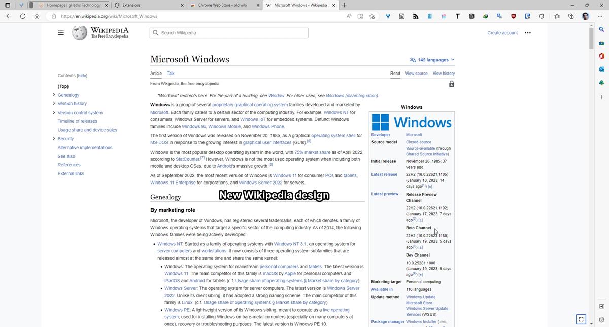
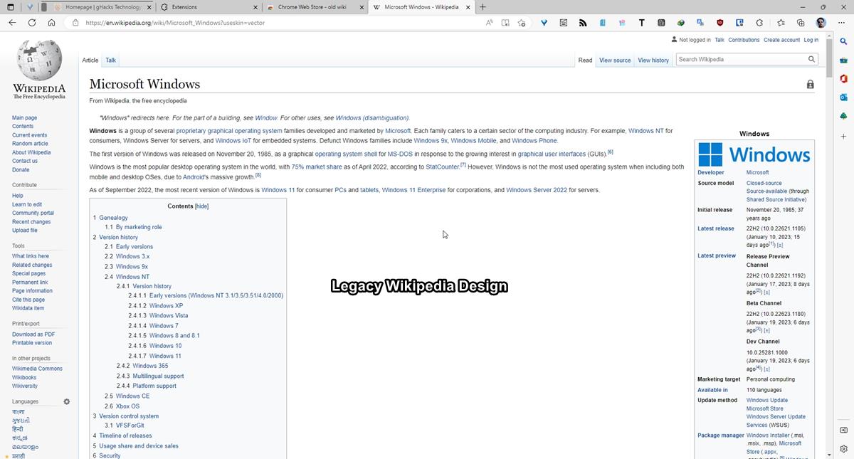
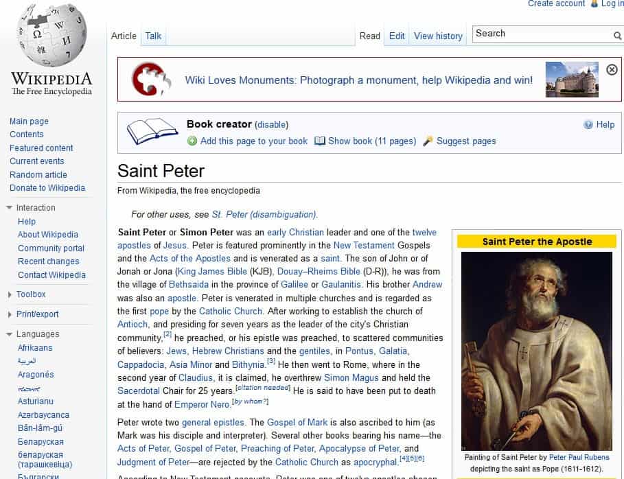
The new design is called Vector 2022, the old one was Vector 2010 and is now called Legacy Vector. I use Wikipedia from time to time as a reference source for work, to learn about various things like history, sports, etc., just like many people do. If you like the new design, that's cool. But I'm sure there are users who dislike it. I'm not a fan of the redesign, I think it looks ridiculous on a large monitor with a lot of wasted space on the sides.
You can click the maximize button that appears in the bottom right corner of the pages to expand the view, but it still doesn't offer the same experience as before. The official explanation given by MediaWiki (which Wikipedia uses) for the change is that shorter lines make for easy reading, as users don't have to move their eyes a lot.
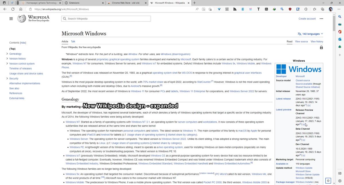
If you don't mind the new Wikipedia design, but want a persistent sidebar (h/t reddit) to appear when you scroll up or down a page, you can add the following rule to uBlock Origin's filters. wikipedia.org###vector-toc-pinned-container:style(position: static !important;)
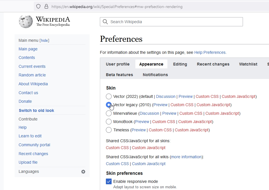
Thankfully, there are a few ways to restore the old Wikipedia design. One option is to sign up for a free account on Wikipedia, and enable the Legacy Vector theme from the Settings.
How to restore Wikipedia's old design
- Go to Wikipedia and log in to your account.
- Click on Preferences > Appearance, or just go to this URL. https://en.wikipedia.org/wiki/Special:Preferences#mw-prefsection-rendering
- The Skin section has the Vector 2022 option set as the default experience, click on Vector 2010 to set it as the preferred design.
- Scroll down the web page, and click the save button to apply the changes.

Not everyone may want to sign up for an account just to change a single setting, right? In that case, you can add the following parameter at the end of Wikipedia URLs. ?useskin=vector
For example, https://en.wikipedia.org/wiki/Microsoft_Windows is the default link of the page. Add the suffix, and it becomes https://en.wikipedia.org/wiki/Microsoft_Windows?useskin=vector
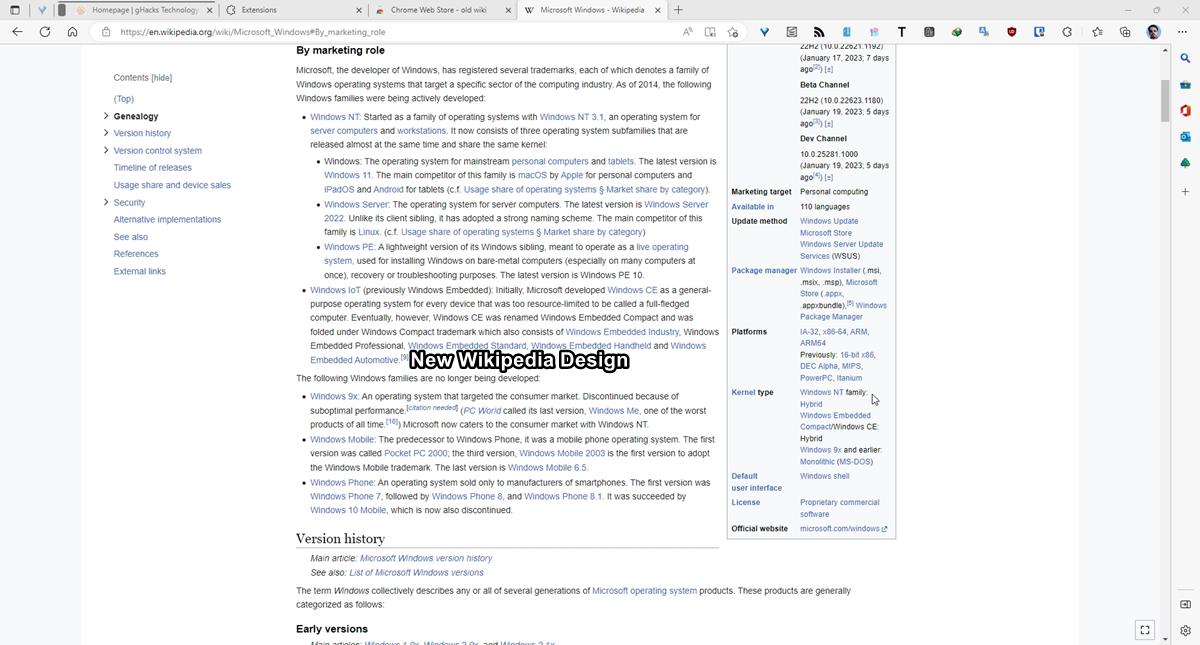
This allows you to use the site's old style, but the problem is you will have to add the parameter to every link that you open. And on pages that are divided by sections, and tables, you will need to add it after the URL, but before the # part. That's a tedious way to browse the site, but you cannot save your preferences, since the settings are not available for users without an account. So this is the only option that you have without relying on external sources.
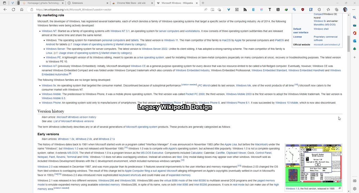
If you know your way around UserCSS, you can play with the styles here to tailor the appearance to your liking.
Tip: You can use email masking services like Firefox Relay, DuckDuckGo Email Protection, SimpleLogin or an email alias service of your choice to hide your real email ID, and use the one provided by the service to create a Wikipedia account for personal usage.
Browser extensions to restore the old Wikipedia interface
Wikipedia is suggesting users to use browser extensions to customize their user experience. A few add-ons have popped up which offer an easy way to restore Wikipedia's legacy look. These are of course made by third-parties, indie developers.
Old Wiki is the only one I found on the Chrome Web Store, it works fine on Wikipedia, and Wikimedia sites. All you have to do is install the plugin and let it do the job. Here is its GitHub page.
Firefox users have a few options to choose from. Wikipedia Vector Skin is one such add-on. An alternative is to use the Classic mode for Wikipedia add-on, the advantage here is that unlike Wikipedia Vector Skin, the former supports a few more Wiki-websites.
All these extensions basically just add the ?useskin=vector parameter that I mentioned above to the URL, but since they do it automatically, they are quite convenient to have.






Thank you, Ashwin
Worked a treat.
Clicking that ‘hide’ button every time was a pain and what was more a pain was opening links in other tabs and having to click ‘hide’ each and every time.
I use Wikipedia a lot and had already set up an account – mainly to correct typos, untruths, grammar, spelling, wrong links.
I am a self confessed pedant with OCD – lol!
Thank you!!!
-Our _interface experts_ said that this interface is more useful for _users_.
-But the _users_ aren’t pleased.
-But _users_ aren’t _experts_.
Wikipedia:Requests for comment/Rollback of Vector 2022
https://en.wikipedia.org/wiki/Wikipedia:Requests_for_comment/Rollback_of_Vector_2022#Oppose_rolling_back_to_Vector_2010
Thanks for this link, I had no idea about this discussion. I compiled a list using notepad:
257 Support for Vector 2010
194 Oppose rollback to Vector 2010
15 indifferent/neutral
75 support alternate proposal (make Vector 2022 unlimited width for desktop default) (or 74? last user didn’t apparently write anything)
48 oppose alternate proposal
It very much looks like Wikipedia/Wikimedia had already made their decision because under parliamentarism this would not have gone through. Even Wikipedians themselves oppose this skin. Personally I find it amazing they didn’t make the normal width default under desktop (“fullscreen” mode doesn’t look that bad, imo), the button they implemented isn’t even persistent, you have to click on it for every article which is so annoying. How difficult is it to make a cookie or something to make it normal width?
Where did Wikipedia get their consensus from? This is a very authoritarian way of thinking, just like the majority of Internet corporations. I’m glad I haven’t donated anything to them. I suggest others not to donate to them either (despite them constantly begging for donations, thankfully ublock Origin blocks shitty wikipeida pop-ups.)
thankfully with browser addons, you can check the code to see what it does exactly, so there’s that. (But of course you have to know to do that… if you don’t, ultimately you have to rely on other users expertise, which is not necessarily a good idea indeed)
The fact there is no simple button to switch to old layout, make me feel this is another “wet-dream” from data-grabbers to win here too. Like many others, they want you to log in, even you are not an editor, or to give admin rights to an extension, to keep an record of what you read. It is another junk on wikipedia yard, alongside propaganda and and fake news. I hope i am wrong, but for me, making a layout horible, forcing you to log in or install something unknown on your browser, it is a trick. That make me think many times before go there and throw an eye to something.
There’s actually another Chrome extension too. It was the first one that came out as well. The developer posted it on Reddit the same day Wikipedia change the layout.
https://chrome.google.com/webstore/detail/revert-wikipedia-layout/jpnfgjjnmghhkgffigedilglfkpcjlda
@Anonymous from January 28: I assume you’re the add-on developer. That’s neat to have a variety of independent addons, as if one of them stops working, or if one developer goes rogue and starts forcing advertisement on his add-on, there are alternatives out there. So thank you for your work!
I thought there weren’t extensions for Firefox, only Chrome, so thanks for this information. When the redesign landed I thought Wikipedia broke, it was so sudden. Personally having used it for a little while it’s not too bad for reading a few quick articles, I don’t visit it often. For regular readers these extensions will help for sure.
First a reddit redesign and now Wikipedia.There was NO reason to change Wikipedia on big screens. They could have, you know, added round (more like oval) buttons and round window design, but no, just ruin it for everyone else!
Can’t imagine what it looks like in higher resolutions like 4K screens.
Hi, I’m the “Classic mode for Wikipedia” add-on developer (https://addons.mozilla.org/en-US/firefox/addon/classic-wikipedia/). Nice to see the add-on has been useful!
I find the new Wikipedia layout quite disappointing, thankfully the software behind Wikipedia and other wikis allows developing add-ons that can fix this kind of problem. As for the future of the add-on, I plan to make some more extensive testing and code optimization, and extend the scope of the add-on to other wikis (given that the Wikimedia foundation plans to deploy progressively the new layout on all their projects).
By the way, shout-out to the “Wikipedia Vector Skin” add-on developer. We developed coincidentally add-ons with similar features, and I was not aware of his efforts before publishing mine. (That is just to say that I didn’t publish my add-on because there was something wrong with his, his add-on is great!).
Thank you. Using a userscript: https://greasyfork.org/en/scripts/458789-vector-layout-for-wikipedia-fast
to restore the old layout so I can keep using the Rotane 1911 userstyle :p
Thanks for the info.
Tried the Firefox extension Wikipedia Vector Skin
I have Wikipedia in my list of search engines, and the above extension didn’t work quite right; I had to reload the page and then it would display in the old format.
The Classic mode for Wikipedia extension didn’t seem to have this problem.
https://addons.mozilla.org/en-US/firefox/addon/classic-wikipedia
A new update today, v1.3 is out.
https://addons.mozilla.org/en-US/firefox/addon/wikipedia-vector-skin/
Thank you Ashwin
Thank you, Ashwin.
MeeToo fine with the new layout.
Trying the desktop layout, shortly.
Wiki is still a blessing for us all, I think.
@Ashwin
Thanks for the article; I’m fine with the new layout (?????).
The old appearance was so compacted, dense.
Thanks @Ashwin for the article! :]
A few scripts also appeared on GreasyFork. For ?useskin=vector there is maybe the Redirector extension.
Indeed. I found a REDIRECTOR redirect I used before switching to Wikipedia Mobile display:
For whom may be interested (change ‘the ‘timeless skin to whatever Wiki skin).
Not sure it’ll work correctly with new Wikipedia interface.
Made for all Wikimedia pages which support the skin feature, not only Wikipedia.
REDIRECT FOR REDIRECTOR FIREFOX EXTENSION
“description”: “### WIKIMEDIA/WIKI/ timeless STYLE ###”,
“exampleUrl”: “https://en.wikipedia.org/wiki/WebGL”,
“exampleResult”: “https://en.wikipedia.org/wiki/WebGL?useskin=timeless”,
“includePattern”: “(.*//.*)(mediawiki.org|wikibooks.org|wikidata.org|wikimedia.org|wikinews.org|wikipedia.org|wikiquote.org|wikisource.org|wikispecies.org|wikitravel.org|wikiversity.org|wikivoyage.org|wiktionary.org)/(.*)”,
“excludePattern”: “(.*\\?.*|.*\\#)”,
“patternDesc”: “”,
“redirectUrl”: “$1$2/$3?useskin=timeless”,
“patternType”: “R”,
“processMatches”: “noProcessing”,
“appliesTo”: [“main_frame”]
I like the new design because we no longer use 4:3 ratio monitors and 16:9 monitors are terrible for reading and editing texts. This new design makes reading better in 16:9 monitors. Fortunately 16:10 monitors coming back and going to be mainstream.
My typical app window is 1900×2100 or less and a lot less on my 32″ 4K monitor where reading and editing text is quite easy. Using the full screen 3840×2160 for any one app, especially a browser, would be ridiculous. Exceptions would be a massively large spreadsheet or an interesting UHD video from a news network. Otherwise, YouTube’s Theater Mode is just fine in a browser’s 1900×2100 window. (Fortunately, I’m not tied to a PC or mobile device for TV/movie viewing, streaming or disk.)
But your scenario makes sense if one is stuck with, say, a 15″ laptop screen.
I’m sticking with the old Wikipedia. Cheers.
Huh. I was puzzled about that maximize button you mentioned. Looks like your browser window has to be at least 1600 px wide for it to appear, any less and it won’t despite excessive whitespace still being an issue.
If you don’t mind creating an account and logging in, you can also toggle the width with a setting in the Appearance preferences – Enable limited width mode, which is On by default. Toggle that off and it’ll use the full width.
Regarding the official explanation, it’s not without merit. To each his own of course, trying to read prose on extremely wide lines *is* less efficient and harder to follow for me, but on wikipedia I’m scanning and reading snippets far more often than reading full articles from top to bottom, so the excessive/wasted whitespace is certainly irritating. I’d rather just make my browser window smaller on those rare occasions when needed than have so much space wasted all of the other time.
Thanks for sharing.
I am ok with new design. But what I like is speed. Browsing is much faster, even on outdated browsers.
I agree, it looks ridiculous.
I’m also offended by that “official explation” as it is bullshit. It’s painfully obvious they have optimized the site for the vertical screens of cell phones :(
^^ This, pretty crushing obviously. I don’t know why they didn’t just say this.
I’ve become inured to every website and app interface change making things worse for all users other than short-attention-span kiddies using mobiles while walking, so I’m just going to live with it. It’s not worth installing another extension to undo yet another “improvement”.
Or just use WikiLESS
https://wikiless.org/
https://github.com/Metastem/wikiless
Alas, wikiless broke (look at the weird layout problems on wikiless now… :()with the Vector 2022 theme. One should report it to the maintainer. I don’t use wikipedia/wikiless enough to do it myself.
Thanks, Ashwin.
Personally concerning Wikimedia sites (of which of course Wikipedia) I have no account, block cookies and open all in the mobile format (by setting my user-agent to iOS/Firefox), so I encounter none of the new layout disagreements. Many scripts/css made available to block what seems to be an annoyance for many of us.
Thank you, Ashwin.