Enable Compact View in Windows 11's File Explorer for improved usability
Microsoft's soon-to-be-released Windows 11 operating system comes with a redesigned File Explorer application to manage files and folders on the operating system. Gone are the times of the ribbon and tabs, Microsoft decided to simplify the File Explorer application.
The main toolbar lists just nine options by default, some of which open menus that list options that were accessible directly before. Core File Explorer functions such as cut, copy and paste are still available as buttons, everything else is available in nested menus.
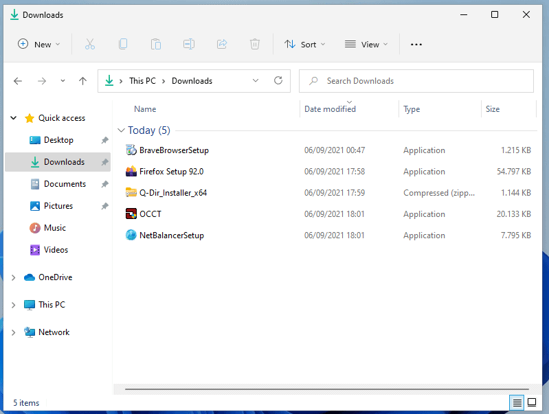
Microsoft changed the design of the drive, file and folder listing as well in Windows 11. While you do get the list of files and folders, sizes, types, modification dates and other information displayed to you when you open File Explorer, you may notice that there is lots of whitespace between items.
The following screenshot shows the default view mode of Windows 11's File Explorer:

Compare that with the Compact View mode that File Explorer supports as well:
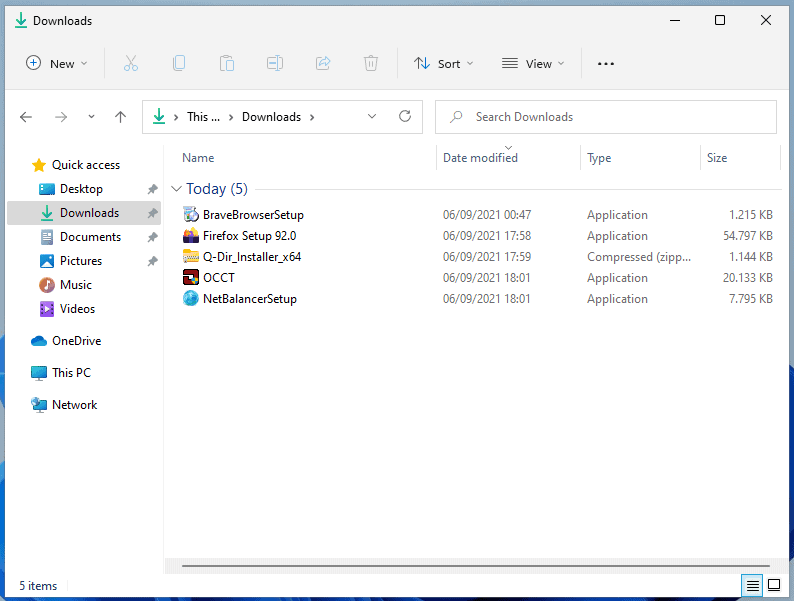
If you want more files and folders to be displayed at the same time, you need to enable Compact View in File Explorer on Windows 11 to achieve that.
It is unclear why Microsoft decided to make the "other" mode the default. Was it for aesthetic reasons or to make file handling more comfortable for users of touch devices? The second option seems unlikely, as Microsoft could have implemented a check that would enable the larger view mode for touch device users and leave the more compact option enabled for everyone else.
Compact View is available for all Windows 11 users; it needs to be enabled though, and many users may miss out on that mode and endure the less usable mode in the process.
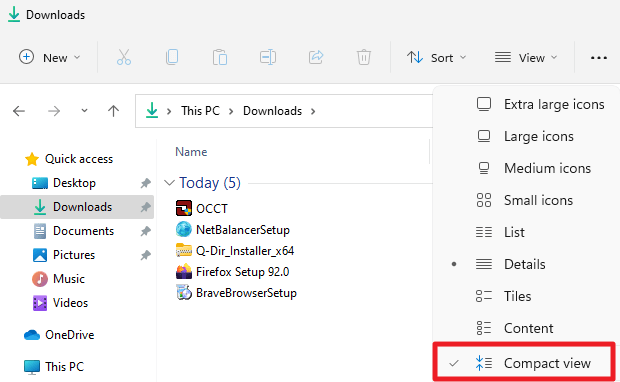
Do the following to enable Compact View:
- Open File Explorer.
- Select View > Compact View.
Not exactly rocket science, but if you never open the View menu, you will never stumble upon that option.
Tip: the view menu has options to display hidden files and file extensions for all files under the submenu "show" as well.
Closing Words
Some Windows 11 users may prefer the default view of File Explorer. It is certainly better for touch device users as it makes selecting files less error-prone. Non-touch device users on the other hand may prefer the compact file listing option as it makes it easier to work with files on the system as more as displayed without having to scroll.
It seems to me that designers and users are increasingly at odds when it comes to weighting design and usability.
Now You: Which mode do you prefer and why?







Hi Martin,
I’m curious why the corners of the windows are square instead of rounded in your screenshots. Is there an option to change the shape of the corners in Windows 11, or are you using some kind of mod?
The new explorer remove shortcuts to show hidden files and files extensions. A big regression…
Microsoft inconsistency continues. This is not true compact. The address bar padding is still too large compared to 1809 address bar. This is only the ugly touch mode view forced onto everyone.
Linux file managers have been like this for over a decade and nobody ever complained about that. But when Windows does it, it’s suddenly the end of the world.
LOL DumbDalf, Linux UI is stuck in the 1980s. The fact you are comparing it to a supposed OS with 2% marketshare is very laughable. You window fanboys are something else.
@ChromeFan
You are forgetting to take your medicine, because you’re running your mouth again.
I have complained about it. I’m still using midnight commander, because mainstream Linux file managers have been castrated of most useful features.
Just curious, from the screenshots, what does Q-dir look like on Win 11?
Except for all the missing things, Win 11 seems OK so far, its appearance is much less painful and it’s really not introducing anything bizarre such as Win 8’s charms, no start menu, etc.
Spread view is better for fingers on a touch screen. Compact view is good with a mouse.
Microsoft still hasn’t added tab support in the new explorer for 11???? No matter how many views they add, without tabs it’s a just a toy for children against other file managers. 11 comes with a new explorer, what’s their excuse for not adding tabs this time? Idiots, this is the most requested feature asked in their channels. Morons as always.
These over-the-top Microsoft hate comments crying about a feature that is used by pseudo power users never ceases to amuse.
Everyone is using tabs in web browsers.
It’s not complicated to use tabs in Explorer. It was most requested feature and it’s still not built in.
Look how clean the File Explorer in Windows 10.1 looks.
Also, sneaky advertisement of Chrome in those screenshots. I like the way you think, Martin.
I actually like the new non-compact view. It’s a nice change of appearance since Vista, which was a long time ago. It’s nice to have the option for both if one doesn’t like the new look.
I’ve been using Windows 11 lately and it’s performing better than Windows 10 in many areas and most importantly – it looks better.