LibreOffice 6.2 with optional Tabbed Ribbon-like interface
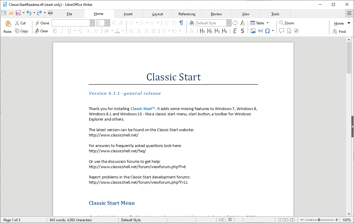
LibreOffice 6.2, a new version of the popular open source Office suite, has been released in February 2019. The new version of the cross-platform program introduces lots of new features, among them the final version of the tabbed user interface that is comparable to the Ribbon user interface that Microsoft Office uses.
The developers of LibreOffice started the integration of the then-called Notebookbar with the release of LibreOffice 5.3 in 2017.
The user interface is not enabled by default; LibreOffice users who dislike the ribbon interface can ignore it and continue using the classic LibreOffice interface.
Tip: check out our review of the major version LibreOffice 6.0 here.
Another user interface has been moved from experimental to final in LibreOffice 6.2 The Goupedbar Compact user interface is available for selection as well in the new version.
Select View > User Interface to select one of the available interfaces in Writer, Calc, Impress, or Draw.
LibreOffice 6.2.0 is available as a direct download for all supported operating systems on the official project website. The download is offered as a web download and torrent download. It can be installed over an existing LibreOffice installation.
The new version introduces changes to Mac and Linux compatibility. The minimum required version of Mac OS X to run LibreOffice 6.2.0 is Mac Os X 10.9; the next release of LibreOffice will require Mac OS X 10.10.
The development team announced that 32-bit binaries for Linux will be demoted. LibreOffice 6.2.0 is the last version with x86 builds produced by The Document Foundation.
Check out the changelog on the official site for a full list of changes. Below is a selection of changes:
- Writer: spreadsheet data can be copied and pasted natively in Writer (Word) now. The new functionality allows you to paste directly into tables (opposed to creating a new table whenever you paste spreadsheet data as was the case in previous versions).
- Writer: documents with many tracked changes don't suffer from major performance issues anymore thanks to the ability to hide tracked changes.
- Calc: Support for signature lines.
- Calc: Support for custom formulas for data validation.
- Calc: Regression tool supports multivariate regression analysis.
- Calc: Regex support to match text against a regular expression and optionally replace.
- Core: Sign signature lines with an image of your handwritten signature.
- Core: Source Serif Pro font added and Liberation font updated.
- Filters: EMF+ vector image import support improved (used in Microsoft Office formats)
- Filters: OOXML, PPTX import/export, PPT import/export filter improvements.
- Personalization: Personalization dialog is "much faster, efficient and stable".
- Performance: improvements across the board, e.g. latency reduction, unnecessary animations have been removed.
Closing Words
LibreOffice 6.2 is a good upgrade to the popular Office application. The integration of new user interface layouts won't impact users who prefer to use the classic interface; those who like ribbon UIs can switch to the new interfaces easily using the View menu.
Now You: which Office application do you use, and why?










https://blog.documentfoundation.org/blog/2019/08/08/tdf-announces-libreoffice-63/
@Alan Hope:
DISCLAIMER:
This is a difficult and confusing subject to research. If there’s another reader more knowledgeable than I am about font handling in LibreOffice, *please chime in!*
PRELIMINARY NOTE (cutting to the chase):
The first font Alan first used in LibreOffice (Liberation Sans) apparently does *not* support advanced OpenType features. If it was indeed the out-of-the-box default in LibreOffice, it may have been a poor choice on their part, as ordinary TrueType fonts don’t render well in LibreOffice. If the Georgia font he used was the 2013 or later version, I believe it *should* have supported advanced OpenType features, like kerning extensions and ligatures. However, I don’t know whether you have to append a special code to the font name to activate them in LibreOffice. (If that’s confusing, read on.)
COMMENT:
Out-of-the-box font rendering in LibreOffice has always been *horrible* for me. So far as I’ve been able to make out, to get acceptable results you supposedly have to:
(1) use Graphite-enabled fonts or full-featured OpenType fonts;
(2) append special codes to the font name in LibreOffice’s font-selection boxes, to activate at least *some* advanced font features; and
(3) maybe have a computer that’s not too old.
Regarding step (1), there are a decent number of OpenType fonts, although they are probably still outnumbered by older, dumber TrueType variants. As for Graphite, so far I have been able to identify only *six* Latin-alphabet Graphite font families:
* Andika (sanserif)
* Charis SIL (serif)
* Doulos SIL (serif)
* Gentium Plus (serif)
* Linux Biolinum G (sanserif)
* Linux Libertine G (serif)
There may be more, but good luck finding a comprehensive list or collection of them. (FYI, I don’t think Adobe’s “Graphite” font is a “SIL Graphite-enabled” font. I think they just share the same name.) Finally, I don’t know how Graphite and OpenType advanced features convert to and from MS Office. I was going to say that since MS Office doesn’t support Graphite, it might be best to stick with OpenType fonts, but since Graphite seems to be based on OpenType, with extra tables, *maybe* it doesn’t make much difference. By the way, one author says that since LibreOffice now fully supports OpenType, Graphite is essentially obsolete.
As for step (2) — appending codes — it doesn’t seem *egregiously* burdensome (just very unfriendly) if you just have to do it once, when specifying default fonts or creating or editing styles for a template. But for ordinary users selecting random fonts on the fly, without using styles, and who want special features, it’s really too much to ask. There is no currently compatible GUI in LibreOffice for activating special font features.
As for step (3), I’m moderately convinced I once read that some aspect of LibreOffice’s advanced font handling required a minimal level of hardware graphics support, but I can’t find the article. I *do* vaguely remember determining that my aging laptop didn’t meet the minimum specs, so I didn’t bother doing further research at the time. (And that’s why I can’t provide first-hand confirmation of much of what I’ve written here!)
ADDITIONAL NOTES:
* If you want to use an ordinary TrueType font — and there are a number of them that I *really* like for some purposes — you’re probably going to get markedly uglier and more amateurish character spacing with them in LibreOffice than you would in Microsoft Office.
* A while back, LibreOffice apparently started using HarfBuzz as its common, cross-platform “font-shaping” engine for Linux, Mac, and Windows. I’ve read that HarfBuzz had problems on Windows at one point and I don’t know whether those problems have been fixed. If your LibreOffice output is uglier in Windows than it is in Linux or Mac, *that* might be why.
CONCLUSION:
Out of the box, font rendering in LibreOffice is *bad* for a lot of fonts (and maybe for *all* fonts on old computers or in Windows). With the right fonts and tweaking, LibreOffice can *reportedly* yield good results (at least on recent computers running Linux or OS X). But if you have an eye for typography and you just choose a font at random and start typing away — which is what most users want to be able to do — there’s a good chance you’re not going to be very happy. In my opinion, this is something that LibreOffice really needs to work on.
USEFUL LINKS:
LibreOffice: Professional Typography Fully Arrives | OCS-Mag
http://www.ocsmag.com/2017/06/23/libreoffice-professional-typography-fully-arrives/
Bruce Byfield / June 23, 2017
(A moderately recent overview, by an authority in the field.)
Smart font optional features for Graphite and OpenType fonts – The Document Foundation Wiki
https://wiki.documentfoundation.org/Smart_font_optional_features_for_Graphite_and_OpenType_fonts
(A general overview on using Graphite and OpenType advanced features, with an illustration showing “font name plus code” in a LibreOffice font-selection box, a tentative list of bundled fonts known to work and of fonts known not to work, and links to more detailed information.)
[A third-party review of LibreOffice 6.2.2.2]
http://www.softerviews.org/LibreOffice.html#New
(A few “font name plus code” samples showing syntax, under the “OpenType Support” subheading.)
Registered features – Typography | Microsoft Docs
https://docs.microsoft.com/en-us/typography/opentype/spec/featurelist
(A complete list of OpenType codes, with links to definitions and implementations.)
Font features of Linux Libertine G and Linux Biolinum G
http://www.numbertext.org/linux/fontfeatures.pdf
(Tables of codes specific to the fonts above, which come bundled with LibreOffice.)
Graphite – Graphite-enabled fonts
https://scripts.sil.org/cms/scripts/page.php?site_id=projects&item_id=graphite_fonts
(A list of all SIL Graphite-enabled fonts, including non-Western.)
Okay — while the following article is *not* the hardware-related article I was thinking of and tried in vain to find, it *did* refresh my recollection of what I *think* the problem is on my laptop:
How to Fix Ugly Fonts and Text in LibreOffice on Windows 10
https://www.makeuseof.com/tag/fix-ugly-fonts-text-libreoffice-windows-10/
Joel Lee, February 1, 2017
My CPU’s integrated Intel HD graphics support OpenGL 2.1, which I believe is (or at some point was) LibreOffice’s *minimum* OpenGL requirement. LibreOffice actually recommends OpenGL 3.3 or higher.
For whatever reason — maybe the minimum requirement was upped, maybe my HD graphics or its driver is buggy — LibreOffice appears to have blacklisted my GL (“GL is currently disabled”). And without OpenGL, I gather, text-rendering is going to be ugly.
Ignoring OpenGL blacklisting in LibreOffice’s Options causes the soffice.bin process to go into an endless start-terminate loop upon restart, so I had to kill the soffice.exe process, start LibreOffice in Safe Mode, and turn off hardware acceleration there.
In short, until I get a computer with better graphics, it’s ugly text in LibreOffice for me! (And maybe after that, too, but I’m keeping my fingers crossed.)
Well, that goes a long way explaining why open source software is not all that it’s cracked up to be, and why this religion is a false religion.
It’s the first time I hear about this problem, and God knows how many idiots I’ve read barking “Libre Office !” at any question extended to them.
This is a major, major flaw, nobody even talks about it, and I’m not surprised anymore by the horrendous, non high DPI-aware rendering of Libre Office toolbars I experienced myself. Reason why Libre Office lies unused on my computer.
But open source developers and users are still holier than thou, despite the fact they have the work ethic of bums. How very typical of the mentality.
I have MS Office, this article made me install LibreOffice 6.2.3 just to see …
Opened Writer, looked OK, and typed a few words in the default Liberation Sans. Just wow! Noticeably ugly font rendering and poor kerning. Opened MS Word and typed a sentence in Georgia, at 100% page magnification. Duplicated this in Writer. No comparison.
Clearly, Libreoffice Writer has major problems with font rendering and kerning. I guess maybe this part has never been updated, and it may be too much to expect good typography in FOSS software, but it is bad enough to be a deal-breaker to me.
Uninstalled, and will try some of the other alternatives.
https://blog.documentfoundation.org/blog/2019/04/18/libreoffice-6-2-3/
LibreOffice exports all settings
All the settings of LibreOffice, all in the LibreOffice folder.
C:\Users\aâ†When installing the operating system, the name entered.\AppDataâ†File Manager ~ “Hidden project” to open, the AppData folder will be displayed.\Roaming\LibreOffice
Back up the LibreOffice folder, when reinstalling, put the LibreOffice folder in its original place.
Note:
1. If the installation is preview edition, because the name of preview edition is LibreOfficeDev, so the LibreOfficeDev folder will be displayed.
2. Formal edition can be installed together with preview edition, if both formal edition and preview edition are installed, LibreOffice folder and LibreOfficeDev folder will be displayed.
3. To clear all settings, just delete the LibreOffice folder, then open the program, a new LibreOffice folder will be created.
LibreOffice exports a single toolbar I made
Common path
C:\Users\aâ†When installing the operating system, the name entered.\AppDataâ†File Manager ~ “Hidden project” to open, the AppData folder will be displayed.\Roaming\LibreOffice\4\user\config\soffice.cfg\modules\Please connect the branch path of the individual software below.
Branch path
\modules\StartModule\toolbar\The “Start” toolbar I made is placed here.
\modules\swriter\toolbar\The “writer” toolbar I made is placed here.
\modules\scalc\toolbar\The “calc” toolbar I made is placed here.
\modules\simpress\toolbar\The “impress” toolbar I made is placed here.
\modules\sdraw\toolbar\The “draw” toolbar I made is placed here.
\modules\smath\toolbar\The “math” toolbar I made is placed here.
\modules\dbapp\toolbar\The “base” toolbar I made is placed here.
Backup file, when reinstalling, put the file in the original place.
Note:
1. Because of the toolbar that I made myself, default file name, will automatically use Numbering, so to open the file, can know the name of the toolbar.
2. The front file name “custom_toolbar_” cannot be changed, change will cause error, behind’s file name can be changed.
For example: custom_toolbar_c01611ed.xml→custom_toolbar_AAA.xml.
3. Do well of toolbar, can be copied to other places to use.
For example: In the “writer” Do well of toolbar, can be copied to “calc” places to use.
LibreOffice self-made symbol toolbar
Step 1 Start “Recording Macros function”
Tools\Options\Advanced\Enable macro recording(Tick), in the “Tools\Macros”, the “Record Macro” option will appear.
Step 2 Recording Macros
Tools\Macros\Record Macro→Recording action (click “Ω” to enter symbol→select symbol→Insert)→Stop Recording→The name Macros stored in “Module1” is Main→Modify Main name→Save.
Step 3 Add item new toolbar
Tools\Customize\Toolbar→Add→Enter a name (example: symbol)→OK, the new toolbar will appear in the top left.
Step 4 Will Macros Add item new toolbar
Tools\Customize\Toolbar\Category\Macros\My Macros\Standard\Module1\Main→Click “Main”→Add item→Modify→Rename (can be named with symbol)→OK→OK.
The above article, has been replaced by the following article, please delete the above article, thank you.
LibreOffice exports all settings
All the settings of LibreOffice, all in the LibreOffice folder.
C:\Users\aâ†When installing the operating system, the name entered.\AppDataâ†File Manager ~ “Hidden project” to open, the AppData folder will be displayed.\Roaming\LibreOffice
Back up the LibreOffice folder, when reinstalling, put the LibreOffice folder in its original place.
Note:
1. If the installation is preview edition, because the name of preview edition is LibreOfficeDev, so the LibreOfficeDev folder will be displayed.
2. Formal edition can be installed together with preview edition, if both formal edition and preview edition are installed, LibreOffice folder and LibreOfficeDev folder will be displayed.
3. To clear all settings, just delete the LibreOffice folder, then open the program, a new LibreOffice folder will be created.
LibreOffice exports a single toolbar I made
Common path
C:\Users\aâ†When installing the operating system, the name entered.\AppDataâ†File Manager ~ “Hidden project” to open, the AppData folder will be displayed.\Roaming\LibreOffice\4\user\config\soffice.cfg\modules\Please connect the branch path of the individual software below.
Branch path
\modules\StartModule\toolbar\The “Start” toolbar I made is placed here.
\modules\swriter\toolbar\The “writer” toolbar I made is placed here.
\modules\scalc\toolbar\The “calc” toolbar I made is placed here.
\modules\simpress\toolbar\The “impress” toolbar I made is placed here.
\modules\sdraw\toolbar\The “draw” toolbar I made is placed here.
\modules\smath\toolbar\The “math” toolbar I made is placed here.
\modules\dbapp\toolbar\The “base” toolbar I made is placed here.
Backup file, when reinstalling, put the file in the original place.
Note:
1. Because of the toolbar that I made myself, default file name, will automatically use Numbering, so to open the file, can know the name of the toolbar.
2. The front file name “custom_toolbar_” cannot be changed, change will cause error, behind’s file name can be changed.
For example: custom_toolbar_c01611ed.xml→custom_toolbar_AAA.xml.
3. Do well of toolbar, can be copied to other places to use.
For example: In the “writer” Do well of toolbar, can be copied to “calc” places to use.
LibreOffice self-made symbol toolbar
Step 1 Start “Recording Macros function”
Tools\Options\Advanced\Enable macro recording(ï’), in the “Tools\Macros”, the “Record Macro” option will appear.
Step 2 Recording Macros
Tools\Macros\Record Macro→Recording action (click “Ω” to enter symbol→select symbol→Insert)→Stop Recording→The name Macros stored in “Module1” is Main→Modify Main name→Save.
Step 3 Add item new toolbar
Tools\Customize\Toolbar→Add→Enter a name (example: symbol)→OK, the new toolbar will appear in the top left.
Step 4 Will Macros Add item new toolbar
Tools\Customize\Toolbar\Category\Macros\My Macros\Standard\Module1\Main→Click “Main”→Add item→Modify→Rename (can be named with symbol)→OK→OK.
It looks awful compared to the classic Ribbon.
I would rather use Microsoft Office 2003 than LibreOffice.
weirdly, it needed me to kill some vmware/virtualbox usb thing (or reboot) during installation.. .so it’s not just a ms office thing.
Does anyone know whether this last version of Libre Office is (at last) fully high DPI aware ? Icons included ? I’m referring to this :
https://winaero.com/blog/hidpi-icon-theme-libreoffice/
This developer designed a special set of icons, which is less bad than the embedded alternatives, but it’s still not great. He explains the problem.
I don’t understand how such an old piece of software, which has so many users, developers and fans, it still stuck with those horrible, childish and ugly sets of icons. Especially when it’s installed on configurations which are sensitive to high DPI issues, where they don’t render well at all.
I want my software to be beautiful. At the very least, not ugly. Ugliness is a deal-breaker. It hinders usability.
This developer has also some criticism of the original icon system :
https://libreofficemaster.blogspot.com/
Here is an interesting comparison of OOXML (Microsoft) and ODF (Libre Office) formats, by Only Office :
https://www.onlyoffice.com/blog/2018/08/onlyoffice-vs-libreoffice-what-to-choose-when-you-decide-to-ditch-microsoft/
@Clairvaux: “I don’t understand how such an old piece of software, which has so many users, developers and fans, it still stuck with those horrible, childish and ugly sets of icons”
I’ve never noticed any problems with the icons at all, personally.
@ John Fenderson
I’ve prepared a little interface comparative for you.
https://imgur.com/a/VCXE41Z
Note that this is specific to how those programs display on my configuration. This might be different on other people’s.
I am on Windows 7 64-bit, with a 24″ 1920 x 1200 monitor, and (that’s the tricky part), in Control/Display/Set Custom Size DPI, Display is set at 150 % and XP-Style DPI Scaling is set at Yes.
I need this, because of my failing eyesight, and how different programs I use a lot react to those settings.
However, this combination makes my PC react as if it were high DPI (which it’s not), therefore programs which are not perfectly high DPI-aware (and there are many, big and small) don’t display perfectly.
Sometimes it’s a minor difference from normal, sometimes it makes the program completely unusable.
Libre Office is not fully high DPI-aware, it’s a known problem, and it shows in the interface and icons.
This is added to the fact that the different icon sets for Libre Office are bad, irrespective of that high DPI problem.
The proof they are bad is there are several sets from which you can choose, embedded in the program. This is almost always a sure sign that the graphic designer(s) is (are) bad, so they throw several options at you in order to hide that.
Of course, all of them are bad. If you’re bad at designing icons, then throwing one more set at the wall won’t make it stick.
Note how several of these sets look almost the same. That’s a classic defect of such software offering those false choices of “styles” or “templates”.
The Tango (default), Elementary and Galaxy sets are almost the same. The graphic designer couldn’t make his mind, so he “gave power to the people” and made users do his job in his place. Such moves are always the sign of a bad worker.
Those sets are childish, too colourful, tacky, not elegant, and they have a crushed and blurry aspect to them that probably comes from non high DPI awareness.
In a similar vein, Sifr and Breeze are almost the same : almost no colours, black, sinister, with nothing to catch the eye in order to separate the features and swiftly direct the mind to the one that’s needed.
The one I have installed right now it Breeze HiDPI Winaero. It’s that special hacked, third-party set of icons I linked to before. The developer tried to address the non-scalable quality that comes from not being high DPI aware.
https://winaero.com/blog/hidpi-icon-theme-libreoffice
That’s the best combination I could find for my PC, however you can see it’s far from perfect. The size is not right, the icons are too big and there’s not enough white space to separate them.
I’ve added the menu and toolbars of two other programs to show you what a good interface looks like.
The first one is Text Maker from the Soft Maker Office suite, with the Classic UI option. I regret the light blue background, I think it would be better with a light grey, but still, this is much more efficient and professional that the Libre Office interface.
From a graphic standpoint, I prefer the Ribbon interface option of Soft Maker Office, but I did not want to compare apples and oranges, so I displayed the Classic UI.
And finally we have PDF X-Change Editor with the Classic UI (there’s also a Ribbon UI you can change into, without even relaunching the software). That’s one of the best menu / toolbar / icon / interface jobs I’ve seen lately.
Note that neither Soft Maker Office nor PDF X-Change give you a “choice” of “styles” or “templates”. They took their responsibility and did their job. They tried to deliver the best, and the best has no options, of course. Because anything else would be worse.
The choices they can and do offer are justified : ribbon interface or classic interface is a fundamentally different way to work, different people have different preferences in that regard, so it’s good to be able to choose between them.
Soft Maker Office and PDF X-Change also give you the choice between “Mouse” and “Touch” interface. Also justified, because those are two different ways of interacting with the screen. I’ve also found that the Touch option can be useful to use with the mouse, when like me, you need slightly larger interface items to be really comfortable.
Soft Maker Office has a choice between a light theme and a dark theme, and there again, that’s a fundamental choice which is justified. Some people really, really want (and need) dark screens, for the sake of their eyes.
And finally, Soft Maker Office and PDF X-Change toolbars (just as in Libre Office) can be completely customised by the user, taking away some icons, adding some, grouping them differently, and that’s a major advantage for power users, because each one of them has different needs.
Note how Soft Maker Office and PDF X-Change Editor are paid-for programs, developed by big, bad capitalist companies, which are out to make a profit (despite the fact they offer free versions of their programs, which are very generous feature-wise).
Libre Office is open source and free and leftist and caring and politically correct as hell, and, as a result, it’s bad.
In that respect. I don’t mean obviously it’s a complete steaming pile of horseshit, useless to anybody. I’m just saying this leftist mindset often produces such results, as is exemplified by Firefox and do-gooder Mozilla.
@Clairvaux:
OK, side-by-side like that, I can see the difference. I guess that it’s just not something that would bother me, so I’m less likely to notice it in isolation.
@ Peterc
Thank you for the info on icons. That’s the primary reason why I don’t use Libre Office.
Regarding politics, I don’t insult anyone. On the other hand, I have been insulted quite a bit by leftists here.
The reason I write here, apart from learning and sharing about tech tools, is expressing what I think are relevant observations regarding this domain of interest. Politics and economics are very much relevant to tech. So establishing an artificial barrier over that, which would often be bypassed anyway because of the double standards of the left, is not conducive to the betterment of ideas and intelligence.
I will respectfully submit to you that it is not for you to state what is and what is not out of bounds here. That’s for the blog author to do. For the time being, there’s no ban on discussing politics. Therefore, it’s a permitted subject.
If Martin changes his mind, then I will reconsider. There are plenty of tech blog/forums where politics are explicitely forbidden. That’s the reason I left Ask Woody, the real reason being the double standards enforced over the ban. As is so often the case.
@ John Fenderson
I’d be very interested to know : is that how Libre Office looks on your computer ? Or is it specific to my configuration ?
It is not how it looks on either my Linux machines (under KDE) or on my Windows 10 machine at work. On both of those, the icons are high quality for me.
That’s what I thought. Thanks for the info.
Clairvaux, there’s work being done to improve svg support so that LO can better support High DPI resolutions and also Light/Dark themes. This may take 6 months to 1 year depending on the work load.
You really don’t know what the fuck you are saying though, since Tango and Galaxy were discontinued and are not present in LO since version 6.1.
The designers working on those icons do know what they want, and the reasoning to have multiple icon sets is to make LO look at home in the different OS/DEs that it is used on. This is because LO offers freedom of choice.
You have the following icon sets that are being actively developed each for its specific reason:
Breeze – this icon set was developed by designers that belonged to the Visual Design Group of Plasma/KDE. It’s the default icon theme for Plasma DE and MacOS (however this will change).
Elementary – this icon set was first developed by Elementary OS designers. It’s been further improved and superseded Tango. Currently it is the default icon set for Gnome DEs.
Colibre – This icon set was developed by the LO designers to make LO look native in Windows 8/10 following the Metro guidelines and drawing inspiration from Microsoft Office icons. Default in Windows.
Karasa Jaga – this was an icon set that one of the new designers worked on based on the old Oxygen icon set. It is a very polished and complete icon set even if it might look a bit outdated. Hence why it was included in LO, even if it’s not the default in any OS.
Sifr – The high contrast theme was discontinued. Sifr is the new high contrast theme. It is now receiving many improvements for 6.3.
For 6.3 there will be a new icon set named Sukapura to make LO look native in MacOS. It uses the Mac color palette and is an adaptation from Colibre.
LO has releases every 6 months. It’s no released “when it’s ready”. This means that it will always feel like a Beta in some aspects. It’s still a useful tool to have.
@ Pedro
That’s a nice illustration of my point : libre software has a tendency to attract uncouth individuals, whose lofty, alleged ideals serve mainly to hide their anti-social and sectarian nature. To wit :
“You really don’t know what the fuck you are saying though, since Tango and Galaxy were discontinued and are not present in LO since version 6.1.”
I really know what THE FUCK I’m saying, and I’v just proven it to you. You don’t even try to address the problems I exposed.
I don’t care that Tango or Galaxy were discontinued or not one second ago. I don’t spend my life feeding my computer and updating Libre Office. I’ve just shown you that Tango, Galaxy (and the others that you didn’t mention, because supposedly they are still there), are shit.
And I explained why they are shit. I seriously doubt this shitness has suddenly gone away from Libre Office. Even Libre Office fanatics, which I linked to, recognise and regret that shitness.
You don’t even begin to debate the argument. You say :
“The designers working on those icons do know what they want.”
Well, that’s the problem. What is important is not what they want. What is important is what I want. That’s a weird concept you’ve apparently never heard about : the customer.
That concept usually takes form when people are forced to rely on customers to pay their bills. That’s what separates free from for-profit. I’m not saying open source and free is never good — it often is. It just has a knack to attract unpleasant, self-centered individuals with an attitude.
You say :
“The reasoning to have multiple icon sets is to make LO look at home in the different OS/DEs that it is used on.”
Well, yes. That’s the reasoning. But there’s reasoning, and there are facts. I’ve just shown to you that to this Windows user, Libre Office does not look at home at all. Windows 7 is not a small operating system.
When facts disprove reasoning, sane people change their reasoning. Sectarians stick to their reasoning and pretend that theory has precedence over facts.
Then you go on name-dropping about development bureaucracy details only nerds care about. Nobody cares if icon set X was first developed by Elementary OS designers.
Several icon sets you mention are not even included in my version of Libre Office, and it’s quite a current one. It’s probably n – 1.
If icon sets are designed to be OS-specific, then why is a choice even offered ? That’s my whole point. It’s a false choice. Soft Maker Office and PDF X-Change Editor, which don’t offer that “choice”, have much better interfaces. As I have shown.
But you don’t even care to discuss competing software. Nothing exists apart from Libre Office. That’s the mindset that’s so deplorable in some sections of the open source movement.
@Clairvaux:
I appreciate well-designed icons, too, but the only things I really *require* of them is that they be readily identifiable, readily distinguishable, and not unduly distracting. And while I have never looked at LibreOffice’s toolbar-icon sets and thought to myself, “Damn! Them are some *good-lookin’* icons!”, I’ve never had a problem with them, either (even though I scale *my* display up because of *my* poor eyesight). I occasionally cycle through LibreOffice’s toolbar-icon sets to see which one I like best, but that’s the extent of my preoccupation with them. I look forward to future improvements, but I’m not losing sleep over the fact that they’re not here yet.
I care a lot more about functionality. I use LibreOffice Writer and Calc and I *like* them, but I find the Macro Recorder (still an “experimental” feature) woefully inadequate. I frequently can’t get even straightforward sequences of commands to run properly without first manually editing the recorded macro — which is a challenge for someone who knows absolutely nothing about UNO, LibreOffice Basic, or coding in general.
I used to bitch about how Writer’s character spacing was *horrendously* amateurish. I’ve since learned that recent versions of Writer have professional-typesetting-class character spacing … but that it requires modern hardware support that my computers don’t have. (Maybe it’s limited to certain classes of fonts, too. I don’t remember.) I guess I’ll find out when I get a fancy new computer someday.
Finally, it’s unfortunate that you inject personal ideological inferences into your opinion of open-source software and its advocates. All sorts of people use, develop, and contribute to open-source projects, including the US Army, the US Navy, the French Gendarmerie nationale, the French Parliament … and the hard-nosed, very-much-for-profit American tech company my brother works at. Plenty of “right-wing, free-market types” use open-source software simply because they don’t want to be at the mercy of one proprietary-software vendor’s future whims and dictates. At any rate, being left-wing, right-wing, pro-gay-marriage, anti-gay-marriage, politically correct, politically incorrect, or whatnot just doesn’t have a whole lot to do with how *good* a software package is and what the pros and cons of using it are. In conclusion, “Workers of the world, unite!” (Just yanking your chain! ;-)
@ Peterc
I have a similar question for you : do those Libre Office icons look that way on your computer ?
As for the political side of it :
“It’s unfortunate that you inject personal ideological inferences into your opinion of open-source software and its advocates.”
Why ? Injecting personal inferences into a discussion is called freedom of thought and expression. Economics and politics is a major part of our lives, and they have great influence over our well-being.
The tech products and services we’re discussing in this blog would never have seen the light of day if the economy and politics of their place of birth had not been arranged in a certain way. Indeed, you can notice that such products and services never see the light of day in some countries whose economics and politics are arranged differently.
What you’re pulling there is a typical left-wing stunt : one is not allowed to make political statements unless they are left-wing. It’s fine and dandy if you say open-source software is saintly and godly because of all its marvelous left-wing qualities (who wants to be “closed” ? who doesn’t like “free” ?). That’s not being political. It’s just being neutral and fair and truthful.
Just show that some of the open-source apologists say one thing and practice another, just show that their purported love of freedom and humanity is sometimes the very opposite, just bring some facts to the table that prove that some ingrained defects of open source software stem right from the vicious left-wing mindset of their apologists, and bingo ! You “inject personal ideological inferences into your opinion of open-source software and its advocates”.
Because of course, that’s something that open-source advocates never do.
The quasi-religious fervor with which they talk of “libre software” (and bark at you if you beg to differ) bears no hint of ideology. Richard Stallman is just a hard-nosed engineer.
@Clairvaux:
No, my LibreOffice toolbars don’t look the same as yours. I’m running LibreOffice 6.2. I applied the presupplied “sand” theme (which provides a beige/tan background color for the menubar, toolbars, searchbar, and statusbar) because it’s easy on the eyes and makes the difference between the GUI and the document a little clearer. I changed the icon “style” from the default “Automatic (Colibre)” to Sifr because Sifr is a little heavier-weight and easier for me to see. (And even though Sifr isn’t offered in an SVG version, unlike several other icon sets that *are*, I can’t say that it’s blurry. But 125% is as high as I can scale on my relatively lo-res laptop. Maybe the Sifr icons would get blurry at 150%. I don’t know.) The meaning of the great majority of icons in Sifr is obvious to me at a glance, and the tiny handful that are unclear to me have tooltips (like all of the other icons). If I started to use them regularly, I’m sure I’d remember what they do just by looking at them. To be honest, though, I think most of the icon sets would work for me except for the ones intended for “dark” themes, which largely disappear on light backgrounds like “sand.” Finally, I’ve customized my toolbars quite a bit, removing default icons I never use and adding custom entries for 18 special-purpose macros I *frequently* use. So in short, my LibreOffice looks different from yours.
As for the politics, if you were a radical Maoist-Leninist with a bug up your ass about the “vicious right-wing mindset” of proprietary-software apologists, I’d tell you the same thing: this isn’t the venue for venting about it. Of course politics affects tech to a considerable degree, and it necessarily comes into play to some degree here, but this is primarily a *tech* blog, where people come to learn about and discuss software, not to be harangued or insulted about their political ideology. If you want to vigorously debate tech politics, maybe a site like TechDirt or certain subreddits would be more up your alley.
That developer made an svg version of the Breeze icon theme. That’s why there’s that issue with High DPI systems.
In 6.2 there’s already experimental svg support and icon sets, but it still needs work.
You mean he developed that because there was that high DPI issue, not the other way round ?
People should hold off converting their data to Firebird format. I was one of the first to convert when version 6 of LibreOffice appeared. The conversion mangled my data so badly that I couldn’t upload it to the bug fixers when I reported the error. Being trusting, and stupid, I failed to make a backup of the data, so I had to manually recreate the data from printed records in the old format( the data wasn’t critical).
Today I received a email from a user reporting in Bugzilla reporting that Firebird was still corrupting numeric data, so I will hold off converting, and upgrading to LibreOffice 6.2, where I believe that Firebird conversion is mandatory. I do have data backups now.
This is Fresh Branch version aka beta.
There are two branches…
6.2 – Fresh
6.15 – Still
https://www.libreoffice.org/download/release-notes/#Fresh
I chose to upgrade from LO 6.1.4.2 to 6.1.5.2 to take advantage of its stability and feature set which is all I need as a limited user of the fine product.
Running under Windows Home x64 [Version 10.0.17763.292]
LibreOffice programs look and may work nice once using them, but they seem terribly inefficient in terms of resource use.
On a computer running Windows XP Professional with Service Pack 3:
–Microsoft Word 2000 with SP3 takes about a second to start and uses about 25 MB running.
–LibreOffice Writer 5.4.7.2 takes about 10 seconds to start and uses about 211 to 306 MB running.
LibreOffice does not support Windows XP. Windows XP is an unsupported OS even by Microsoft.
Why should they worry about performance on it?
Consider using modern software please.
I see the same performance difference between Libre and Office 2003 installed on a W7Pro I7-6700 machine, on the same machine only Office 2016 is slow like Libre (maybe because of blocked telemetry?).
Maybe the day that Libre will be able to run some complex macros I will accept its slowness and dump the M$ spyware, overall Libre is a good SW for those without special needs.
One of the remarkable qualities of old Microsoft Office (2003 here) is indeed its launch speed. You’d think it never closes. I guess they knew how to write tight code in those days, and Microsoft took advantage of its ability to deeply integrate Office into Windows.
Why are you still using Windows XP and Microsoft Office 2000 in 2019? You are just opening yourself up to a whole host of security issues.
I guess for similar reasons to people still using Opera 12…?
That brings back the day. Win 95 running Office 2000. 64 mb hard drive. Floppy disk. Pin connectors. Hard to believe ain’t it.
Hey Q:
Hmmmmm ….. Me thinks I’ll stick with Softmaker Office.
Hello Jody,
I had not seen you post above, prior to myself posting.
If I remember correctly OpenOffice.org had an increasing dependency on Java. LibreOffice also has functionality that relies on Java, but it can be used fine without Java.
I have LibreOffice installed myself as a backup office suite to handle something should Microsoft Office 2000 be unable to. I rarely have to use it. I do not have Java installed.
I have not used more recent versions of the SoftMaker Office suites, but the older ones did run well and were usable. It, however, did not focus on imitation of UI and functionality of Microsoft Office; it was not a Microsoft Office clone. It had its own way of implementing things. The SoftMaker Office start time for a program is quick and the resource management is rather decent (at least this was the case for SoftMaker Office 2008).
So I take it LiberOffice stems from OpenOffice. The latter used to be Gawd-Awful slow (especially since it required Java). Is that still the case? Is there another reason to use either OpenOffice vs LibreOffice?
@Judy Thornton:
When I used OpenOffice in PCLinuxOS 11 or 12 years ago, I wasn’t very happy with how unrefined it was compared to MS Office. (Maybe not “Gawd Awful,” but definitely not “Gawd DAYum, this is good!”) I seem to recall that LibreOffice forked off after Oracle acquired OpenOffice from Sun and at some point later on looked set to reduce or pull support for it. (I think maybe Oracle fired a bunch of OpenOffice developers and maintainers or something, but I just don’t remember the details.) Regardless, LibreOffice has been *very* actively developed since then and (in my opinion) has improved dramatically.
I don’t use Base or pay much attention to news about it, but to my knowledge LibreOffice Base still requires Java for certain features. However, there is an active project underway to migrate completely away from Java:
=============================
When will the next version no longer use Java? – Ask LibreOffice
https://ask.libreoffice.org/en/question/154407/when-will-the-next-version-no-longer-use-java/
“Current version does not require Java to use most of [its] functions. Only some masters, non-linear solvers, and embedded database in Base requires Java (so, Base is actually usable without Java, too; just not its masters and embedded mode).
“Currently, a tender by [The Document Foundation] is ~finished to create a conversion module from HSQLDB to Firebird (which is the new, Java-free, component used to embed DB in Base) – currently conversion is being polished, to allow removal of HSQL completely.”
=============================
[HSQLDB runs in Java and Firebird runs in C++.] But again, I don’t pay close attention to news about Base, and it’s possible that Pedro is correct and that the very most recent versions of Base don’t require Java for *anything*. (I just didn’t find anything that explicitly said so in a quick Google search.)
Développement on OpenOffice.org stopped a couple of years ago. LibreOffice essentially replaced it. Java is only required if you use the database. I don’t have Java installed and have been using LibreOffice just fine for years.
“Apparition” is mistaken. OpenOffice.org is still under active development. As a matter of fact, they just recently issued a new release.
Even for the database is not required since they migrated to Firebird.
LiberOffice was forked from OpenOffice long time ago. Is there any reason why you hate Java? It’s much better than those Electron apps
@Anonymous: “It’s much better than those Electron apps”
Talk about damning with faint praise!
What “Electron Apps” are you alking about?
@Anonymous
Insecure, and I find Java applets runs slow. I’ve never needed it in the last decade.
Besides, why support another dead technology. It would be like singing up for Yahoo! Groups.
if you think Java is a dead Technology, I suggest you go back to programing school
In the case of LibreOffice, I think the “Enterprise” version (currently 6.1.5) is usually preferable to use for stability reasons: https://www.libreoffice.org/download/download/
Now You: which Office application do you use, and why?
I chose onlyoffice, (snap version for linux), which I find better for .docx files and generally simpler for the little I ask for. Tabbed interface.
https://www.onlyoffice.com/
https://snapcraft.io/onlyoffice-desktopeditors
ONLYOFFICE doesn’t support keyboard layouts with dead keys (e.g., US International, Brazilian Portuguese), so if you use a dead-key layout, don’t bother. But it’s open-source, so if you use a *non*-dead-key layout and don’t need the fancier bells and whistles found in other office suites, go for it.
Peterc,
Are you positive about that ? Only Office is published by a Latvian company, a small country by any measure. It would be a major failing if they hadn’t designed their program to be adaptable to any language in the world.
I installed OnlyOffice around a week ago, in Windows, and gave it a spin. I couldn’t type apostrophes or quotation marks, because in the US International layout those are dead keys for the acute accent and the dieresis (umlaut), respectively. In any other program, I type apostrophe+spacebar and quotation-mark+spacebar and get an apostrophe and a quotation mark, but in OnlyOffice I got nothing.
I also read a post from someone who uses the Brazilian Portuguese keyboard layout (which apparently has dead keys), and *he* complained that it didn’t work. Someone from OnlyOffice responded saying that this was a known, upstream problem with a Chromium component that OnlyOffice uses.
Anyway, regardless of where the problem lies, it makes OnlyOffice unusable for me, so I uninstalled it.
OnlyOffice is a really nice open-source office suite, however it’s much more barebones than LibreOffice.
I would say it is more of a GDocs competitor.
I use the onlyoffice snap too. I also use the WPS snap. Both snaps work very good and the good thing with snaps is that they don’t leave leftovers on my ubuntu system. I like them a lot.
I’d never heard of ONLYOFFICE until I saw your comment last night.
I’ve since downloaded and installed the Desktop Editors on my Windows 7 Home Premium SP1 x64 computer, and have begun testing it. Apart from a little slowness in opening some documents (probably due to the age of the computer), I’m having no issues with compatibility with opening/reading/saving LibreOffice or Microsoft Office documents so far.
I’ll be further testing it on a Windows 8.1 PRO x64 desktop, a Windows 10 Home x64 laptop, and a Linux Mint 19 x64 laptop in the next few days, but so far I’m very impressed with what I see, and am seriously thinking of making it my go to office suite.
Thanks so much for the tip!
“Mac OS X to run LibreOffice 6.2.0 is Mac Os X 10.9; the next release of LibreOffice will require LibreOffice 10.10”
should read
“macOS to run LibreOffice 6.2 is macOS 10.9; the next release of LibreOffice will require macOS 10.10”
Thank You!
Even better would be that “LibreOffice 6.2 is the last version to support macOS 10.9 (Mavericks). Future releases require macOS 10.10 (Yosemite) or greater.”
Nobody care about MacOS because nobody use it.
not really, i like my mac
Waiting for the portable version.