Mozilla launches redesigned Firefox Add-ons website

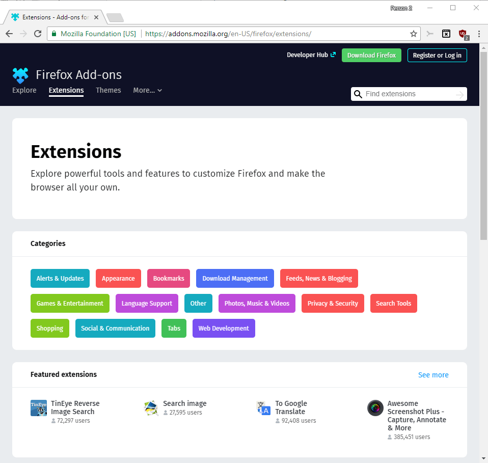
Mozilla launched a redesign of the official Firefox Add-ons website recently which changed the look and feel, and some functionality of the site.
Firefox Add-ons, or Mozilla AMO, is the central repository for Firefox add-ons. While it is still possible to offer add-ons elsewhere, the vast majority of add-ons is offered on Mozilla's official site.
The first thing you will notice is that the layout and visuals of the site have changed. The "explorer" page, the first that is opened when you open the Add-ons website, lists individual add-ons, topics, and themes.
You find uBlock and YouTube High Definition listed there, and topics such as password managers, bookmarks, or watching videos.
The extensions page has been updated as well. It lists a tag cloud at the top, and below that featured, top rated and trending extensions.
There is no direct option anymore on the page to list the newest or most recently updated extensions. These sorting options have not been removed entirely however, so that Firefox's Add-ons website is still more useful in this regard than Google's abysmal Chrome store which feeds users only the extensions that Google wants them to be exposed to.

You need to click on a "see more" link next to an extension listing, or use the search to display a search results page with additional options.
The "sort by" menu that is on those pages lets you sort by recently updated. While that mixes new and recently updated extensions, it is good enough to go through the list of new add-ons quickly.
You may sort by add-on type or operating system as well on the page.
Here is a list of all available URL parameters:
- sort=updated, relevance, users, rating, hotness
- type=extension, persona
- platform=windows, mac, linux
- featured=true
Some examples:
- Display recently updated add-ons (extensions and themes) for all platforms: https://addons.mozilla.org/en-US/firefox/search/?sort=updated
- Display top rated themes for all operating systems: https://addons.mozilla.org/en-US/firefox/search/?sort=rating&type=persona
- List trending extensions that are compatible with the Firefox for Windows version: https://addons.mozilla.org/en-US/firefox/search/?platform=windows&sort=hotness&type=extension
The add-on profile pages shine in a new design as well. Most information is still on the page, but you may notice that user reviews have been moved to a secondary page. While you get the overall rating and number of reviews on the main page, you have to click on the reviews link to read any of them.
It is still possible to display all versions and release notes. This page has not been updated yet however.
The redesign of the add-ons website does not filter out legacy add-ons for the Firefox web browser yet. This means that users are still exposed to these add-ons when they open the website, and may still download and install them in Firefox.
The main issue with this approach is that Stable and Beta channel users will have those add-ons disabled for them automatically when the browser is updated to version 57.
Closing Words
The redesigned pages have a lot of whitespace; some users may like that, others may dislike that. I don't mind it that much provided that the functionality is retained, and it appears that this is the case.
Now You: What's your take on the redesign?


I don’t like (at least now), that redesign, a lot of “info” is missing and “responsive design” is not good, but, it is a “beta” or “alpha”, so maybe it will be improved…
For “return to old theme” on desktop go at the footer on bottom and “click on see desktop version” or something” or “force user-agent to desktop”
I am shocked and horrified that someone hasn’t come up with a user script for “View classic desktop site” yet. Someone hook me up please!!!!!! ;)
Much can be achieved regarding the Firefox UI with simple CSS once the ‘Classic Theme Restorer’ vanished from Firefox 57+ Webextensions-only versions. I found the following interesting page at the time I was desperate about loosing CTR with upcoming FF57 (no longer my worry since I run now Waterfox).
Github – CustomCSSforFx [https://github.com/Aris-t2/CustomCSSforFx]
Thanks for the link and it’s all good. I’ve actually been keeping an eye on that link for awhile. As far as FF v57+ goes I have found or figured out all the userchrome I need, for now, I think, but don’t worry, I’ll find a need for more… somehow… someway. :-D
Oops … I think I goofed : I had in mind you were referring to Firefox’s UI when in fact you’re mentioning the new AMO website pages … Oh well, above link won’t hurt even if off-topic as it seems.
Looks lighter and it’s quicker, and while that is crucial it’s the only positive thing I can say on that change. I don’t like it.
Just terrible. There was nothing wrong with the old design. This is another Australis like change that adds nothing new. Now all must waste time adjusting to the layout.
Thats alota eye candy 0.0
FF still has addons left?
Moment or never to point out that now (Firefox) : add-on = legacy add-on & extension = Webextension
I dunno, personally I find it really ugly. Whitespace and large buttons are nice in theory, but only to a certain point. Beyond that point they start affecting you psychologically in a negative way. This is particularly true on the addon pages themselves. For example, when I’m on the uBlock Orign page,I do not get the impression that this is one of the most widely used addons for Firefox. Instead I get a feeling of emptiness – even loneliness. It’s bleak.
On the other hand, the content of the website is fine, and actually I would argue that the addon pages are better organized than they were in the old version. I particularly like the info included in the “More Information” box. However, I would have preferred the “About this Extension” box to be higher up the screen (above the “sign in to review” notice, for example!!!).
QUESTION: How do you download an addon when your user agent confuses Firefox? I tried clicking on the release history and then on the version number of the latest release, but all that did was refresh the page. I expected it to open up a “save” dialog.
I am not impressed either. Nor can I always follow Moz’s logic of making decisions. BUT by far I do prefer FF with all its hickups over Google Chrome. Vivaldi may be an alternative, but it needs work plus I am just wondering why after installing it a Google chrome entry always shows up in my registry.
For me FF usually is working fine and seems to be the best compromise between usability and privacy. In the end I am willing to live with Mz’s decision making since I am not even mildly interested to change to data octopus Google.
It’s useless if I don’t enable dom.storage. Buttons are not responding to clicks if I don’t open in new tab. Search also doesn’t work properly. Overall bad experience. I’m on esr52.
Interesting, I had a similar experience. I am using the add on Privacy Settings and the site did not work properly with “full privacy”. Had to change it to “Privacy compatible”. Then it worked. Again, interesting because on the old site I did not have to do it. Wondering, why.
https://github.com/mozilla/addons/issues/514#issuecomment-340245481
This must be the work of a committee. Or done by some disciples of alcohol. Imagine that. A drunk Mossihlah teem izz immbroovink a veppsaid. Considering these aggravated circumstances, well ………..not so bad, Zillmozza. Cheers !!!
I hate trawling through all the New Tab themes, it’s driving me crazy!
Everyone is talking about the cosmetic change… ugly/not ugly…whatever. What really needs updating is the search engine which is garbage! You can never find what you’re looking for easily. I’m better of googling the extensions!
It looks like a fresh out of college student looked at the app store and designed the website for them.
If you go down to the bottom of the page you can renable the old version: “View classic desktop site”
This is what I had to change my bookmark to, to see the newest addon’s created
https://addons.mozilla.org/en-US/firefox/search/?page=1&platform=windows&sort=created&type=extension
sort=created resumes to sort=relevance : sort=created is considered nul and replaced by default sort=relevance
RSS remains available : https://addons.mozilla.org/en-US/firefox/extensions/format:rss?sort=created
Horrible. Btw, want to see something funny? Here: imgur.com/lsK2RQ4
The site is not renderted properly in FireFox, but it is rendered properly in Chromium!
Apparently the rendering issue is present on ESR52, but not on stable. Still annoying.
I love it, and actually it’s rendering just fine for me: https://i.imgur.com/nnLFTyn.png so it appears to be something wrong your end, not theirs, though the new design is still in development so I would expect bugs.
Lines up fine here on 56.0.2
I don’t have that issue here. It looks great. Loving the new design.
Collections seem to have been completely removed from the new UI. This is worth mentioning.
Martin, there is still a very useful URL parameter available: “created”. It’s not documented or available via the UI, but it works perfectly.
Hopefully Mozilla will add it to the UI, as it is one of the most useful options.
before you could see if an extension was a webextension or not by clicking on the permissions button, how is this done now?
Website shows that my Firefox is out of date even if I have newest version
https://i.imgur.com/hAwvSFH.png
if you have the privacy.resistFingerprinting;true about:config entry then you will get that behavior because it changes the useragent.
Thanks.
Before I was able to get to the addon site by clicking in the bookmarks on “customize FF”. Now I am being directed to a site with an endless blablabla and no way to get to the addon site. I am not saying this site is useless but please, guys, put on it a big link to the addons. Maybe I am blind like a rock but I could not find it.
The new addon website ? Well, have to get used to it and really did not see a need to change the old one. It’s almost like selling old junk in a new package. FF for me is getting more and more annoying with restrictions and, at least I feel that way, is trying to treat its users like a child. I can’t help it but it seems they look at Google as their big holy Guru and want to become like them. I simply cannot follow the logic of Mozilla anymore.
There is an add-ons link near the bottom of the Mozilla main website.
Thank you, Martin. They should pay you for doing their work !!
Mozilla’s new AMO site isn’t well thought IMO, not intuitive, spread as if the aim was to fill the page but at the same time topics are in too wide half-empty compartments. You have to search from left to right then from up to down to find what should be displayed in a logical tree. It looks definitely cheap, modern it is, quasi flashy but fundamentally closer to a chaotic closet then to a well structured page.Not to mention there is no longer sorting by newest : why? No idea.
One thing seems sure to me which is the total lack of artistic inspiration when it comes to design. But what more to expect from a company which has a logo and favicons such as those of Firefox and Mozilla? Artistic doesn’t mean only inspirational it means as well harmony, of shapes, colors, width/height ratios … everything which makes a pages pleasant to the eye. It’s not the most important but it does count IMO. I believe Mozilla lacks maturity in a certain way, lack of wisdom, be it for their page fantasies, be it for their browser.
@Tom Hawack wrote:
Mozilla’s new AMO site isn’t well thought IMO, not intuitive, spread as if the aim was to fill the page but at the same time topics are in too wide half-empty compartments. …: why? No idea.
Problem is Tom, this is not the case when viewed on a mobile platform – which is ALL that matters. That’s the idea and focus. I am a desktop user, but I know the writing is on the wall. Mozilla hopes that the desktop browser will be fine as is for most people. If that’s the case, they won’t need to use the AMO page on a desktop much, but on a phone they will – in fact, they may just change in time to an AMO app.
Well, if what appears to me as a junkyard when viewed with a desktop computer displays a garden of roses when viewed on a mobile then the designers are half forgiven in my perspective, lol!
You write, Jody, that the mobile platform is “ALL” that matters and obviously you are expressing many companies trend to follow the market and given the leading market is now that of mobile devices… “ceci explique cela” (“this explains that” in French).
Desktop users may be happy with a less significant computer cost but unhappy when viewing on a 1600, 1920, 3840px (!) pages designed for mobiles.
I’m not at all into coding but I always thought that a site could develop different formats and have them called according to what they analyze of the visitor’s platform. If so, why not Mozilla? If not, then I cry, silently :)
One step forward, two (maybe three) steps back.It seems like Firefox is being put together by teams that don’t talk to each other, like the Ford Edsel.
on individual pages, the icon takes up its own row for some reason???, and the text description for addons is too small. I guess mozilla is too cheap to hire a proper web designer and instead we’re stuck with this failed abortion of a design.
Actually the only ones that are going to hate it are legacy desktop users (which is fine because that’s longer Mozilla’s focus). You can still access complete themes and other legacy stuff by Googling it (hard to believe that’s a verb). The pages are still there.
This looks great and is of priority to you, if you use a phone, which is the focus of ALL tech companies. All tech companies think of the desktop as “necessary afterthought”. Future plans don’t get made with desktop computing in mind. I am an avid desktop user, however I don’t delude myself into believing I’m part of the mainstream. I’m in the tech nursing home, so to speak, and so is any desktop user.
On Android, this new AMO site will resize to a perfectly screen dimension. On a desktop, it will provide the necessary functionality for you to get your add-on and install it. But as for looking great, no one in any decision making capacity is the least bit concerned. But that’s not a Mozilla-only behaviour. That’s everyone!
I really love the new design personally, looks great.
Designed for mobile devices. Translation: BUTT-UGLY!
I noticed recently that the “fire” has gone out of the fox and the new logo looks like a fox who took the wrong door on the way out and ended up in the ‘fridge instead.
Other than that though, I’m not very impressed with the new layouts. Take “Themes” for example. In the old design, hovering the mouse over a pattern or solid color used to temporarily change the UI so that you could see what it was going to look like. But now nothing happens at all and users will have to actually install the theme to find out what it’s going to look like afterwards.
Just in case it’s a problem with my profile, here’s the list of themes for which previews don’t work for me. https://addons.mozilla.org/en-US/firefox/search/?category=solid&sort=hotness&type=persona
They work just fine. Click on the theme, then click ‘Tap to preview’. It will then preview the theme without installing it. I never liked hovering the mouse over. I also really like the new logo.
I found quite often the theme got ‘stuck’ and stayed on unless I rolled over a couple of others, really annoyed me.
Duh….should have thought of that. Still, it means having to do everything twice now. Why didn’t you like using the mouse to preview a theme? There used to be 12 themes per page spread over three columns and hovering the mouse over them would give you a preview of all of them in one go. Now you have to open each and every one to find out what they’re going to look like. Hardly an efficient way of doing things IMHO.
Still possible to change back to old Design, just go to Botttom of the Page, check Classic Design, done.
‘Classic Design’ requires a cookie, the url remains the same, which is relevant of a cheap attitude.
THIS SHOULD BE NOTED IN THE ARTICLE ! ðŸ‘ðŸ‘ðŸ‘
Agree very ugly
A much welcome redesign. The refresh to the old design a while back was already a good change so this is a positively progressive move. The new site looks better organized and more responsive, whether in device-based layout or in speed.
Agree, I like the new design. Useful, attractive and simple.
When I opened yesterday, I was scared, because I did not expect this change! I found it a good change, I’m not used to it yet, but it’s a matter of time! I am a type of person that I adapt to certain types of changes, I adapted to the new Firefox (Nightly).
An issue that has nothing to do with the publication, the complement(S3.Translator) is now a WebExtension … :D
Readability has definitely suffered: fonts are smaller now, and previously visible text is now hidden behind a “Read More” bar. Instead, there’s lots of empty space and colored boxes.
Functionality has been lost,too:
gone is the instant preview of themes when you mouse over their thumbnails in the list.
For that, you now have to go to their respective pages and click a button.
This “new look” is certainly not an improvement.
Readability has definitely suffered: fonts are smaller now an previously available text is now hidden behind “Read More” bars. Instead, there’s lots of empty space and colored boxes.
Functionality has been lost,too:
there is no more instant preview of themes when you mouse over their thumbnails in the list.
Now you have to go to their respective pages and click a button.
This “new look” is certainly not an improvement.
+1 to everything you said Timoleon
“Read the privacy policy for this add-on” at the very bottom of the page and not hightlited as if it was insignificant. Looks like the infected Chrome Store to me.
U G L Y
Nah, looks great! I really like it.
Ugly. Yes.
mega UGLY
Just noticed that this morning. Well…, I don’t like the new design.
At first i was like “Uh oh”, then i realized that all the functionality is there and i think it loads a tad faster, it doesn’t look bad either, i kind of like it.
i did had to “noop” addons-amo.cdn.mozilla.net in uBlock Origin on Advanced Medium Mode so the “Tap to preview” button would work so i can preview the themes. i already had to have addons.cdn.mozilla.net “noop”d to be able to see comments, but i tested it by undoing it and we don’t have to have it “noop”d anymore as it is already green when i undone it, so i undid that. Blocking them both in Privacy Badger doesn’t affect anything though, the site works just fine.
Also, i like the fact that the Release Notes for the current version is listed on the main page, before you had to scroll down and click on Version History, wasn’t a big deal before though.
Also addons.cdn.mozilla.net has to be “noop”d in uBlock Origin Advanced Medium Mode for the comments to show on the old layout, but not the new layout, which as others have stated you can get back to the old layout by scrolling to the bottom and clicking View Classic Desktop Site.
I don’t care about Mozilla and Firefox anymore. Anyway, it looks like crap.
But you care about to comment about it? lol.
So far so good, for a long time finally firefox is heading toward right direction. Anyway, I wonder why you decided to stop using marfeel and back to wptouch?