This is Google Chrome's redesigned chrome://flags page
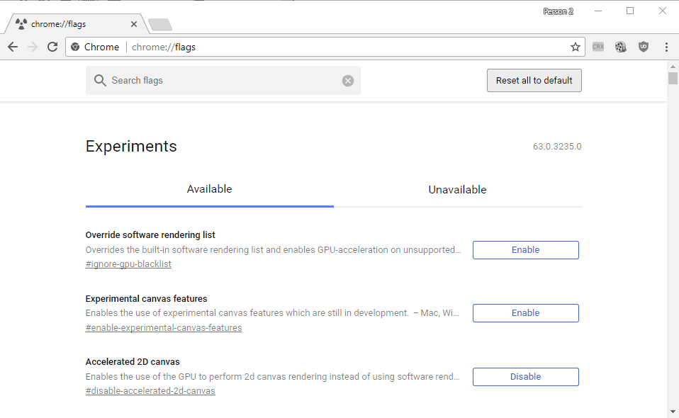
Google is working on a redesign of the Chrome's browser's chrome://flags page as part of the company's effort to modernize the web browser.
The chrome://flags page of Google Chrome list experimental features for the most part. These features may not be ready yet for direct enabling for all Chrome browsers, or they may modify features of Chrome that are either on their way in, or on their way out.
The current redesign version improves some things on the page, but it the changes may not be to everyone's liking.
Chrome's new chrome://flags page

First thing you will notice is that Google added a search box to the page. You had to use the browser's on-page find (F3) previously to find specific flags quickly if direct links were not available.
The new page centers the listing of experiments, and it divides all into available and unavailable ones. Chrome is available for various operating systems, and some experiments are only available on select systems but not all.
Tip: Here are instructions on finding out which chrome://flags are enabled.
This means for instance that Windows users won't see Chrome OS or Android exclusive features under available.
The current chrome://flags page lists all unavailable experiments at the bottom of the page. In other words, it does not separate them into two tabs, but displays all experiments on a single page.
You may also notice that the listing of flags is centered, that the font size is larger, and that there is more whitespace on the page. Lastly, the buttons to enable, disable or default an experiment have been moved to the right side. This improves the handling on touch devices significantly.
The following screenshot shows the old chrome://flags page.
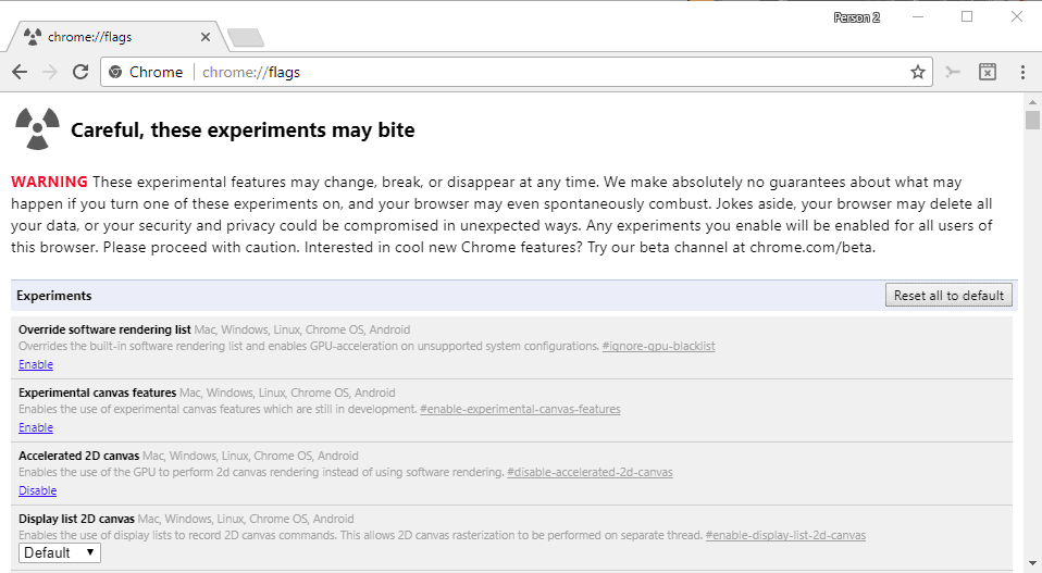
I mentioned earlier that some users may dislike the redesign, or part of it. The extra whitespace and use of a larger font for instance lists fewer experiments in the visible area of the browsing window.
Another thing that is not optimal is that descriptions are cut off by default when they reach the end of the line. This means that you cannot read a description in its entirety without clicking on the entry.
Also, this has the consequence that you don't see the supported operating systems anymore either.
The new design is live already in Chrome Canary. It takes months usually before features that land in Canary will reach the Stable channel. Considering that this is a beta browser, it is possible that things may change before they land in stable (or may be pulled but that seems very unlikely).
Now You: What's your impression of the new chrome://flags design?







On the old Flags page, it never tells you what the ‘Default’ setting is.
The drop down has the possible settings, along with a selection for ‘Default’, but there’s no indication what Default is.
The new Flags page doesn’t improve on this. Why keep it a mystery?
PLEASE TELL ME HOW TO REMOVE IT
I’m going to miss the warning about the possibility of my browser spontaneously combusting. I hope they add another pun back.
The “Careful, these experiments may bite” warning in the redesign is missing. This makes it easier for careless users who know little about the chrome://flags page to unintentionally mess with flags that may break Chrome’s functionality. This is one thing that needs to be fixed before it reaches the stable build.
On another note, Google needs to find a balance between the current compact design (that’s lightweight on resources and contains much more information) and the “mobile first” and low density design they’re trying to push. I doubt most desktops/laptops with Chrome installed even have touchscreens.
This doesn’t just apply to Chrome but other Google products which received redesigns like the desktop websites for YouTube and Google Voice.
It is there, in read, not shown on the screenshot: https://imgur.com/a/iGfk3
I’m happy to see it’s still there. Thanks Martin!
That is what I call a good redisigned! Congrats Google!