Google switches Done and Remove bookmark dialog actions in Chrome

If you are using Google Chrome, you may have noticed that Google switched the Done and Remove actions of the bookmark dialog recently in the browser.
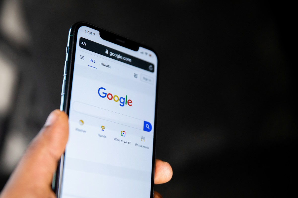
Chrome users may click on the bookmark star icon displayed in the browser's address bar to bookmark the page.
Doing so bookmarks the page right away, but it opens a dialog as well which gives users options to change the save location of the bookmark, its name, to edit it in detail, or to remove it again.
The order of actions of the add bookmark prompt was Edit, Remove, Done up until recently.
If you open Google Chrome right now, and start to bookmark, you will notice that the order has changed. Basically, what Google did was swap the Done and Remove buttons of the dialog.
This is a problem for users who clicked on done whenever they added a bookmark using the bookmark star icon of Chrome, as they may now hit the remove button instead if they don't pay attention.
This means that the process adds and then removes the bookmark again in a single process.
If you bookmark a lot, and don't pay attention to that process, you may end up without bookmarks until you realize that something changed.
It is unclear why Google made the decision to flip the done and remove buttons of the add bookmark dialog. Since Google did not mention it when it released new Chrome versions, all that we can do is guess the motivation.
It seems unlikely that Google did so to annoy its own userbase; the most likely explanation is that Google believes that the new order makes for a better workflow, or improves the process in general for the bulk of users.
There does not appear to be an option to reverse the change at this point in time.
This is not a "the world will come to en end" type of change, but it is certainly annoying to a subset of Chrome users (who use the bookmark star regularly to add bookmarks to the browser).
Now You: Why do you think Google flipped the buttons?


When di get the bookmark
Googleheads hope you are listening to this and make a quick simple code change to fix this. I hope there are enough H1-B’s you have at hand to get this done!
someone please make a chrome extension to reverse this
Biggest bonehead move of late.
Is this the only article about it, on the internet. I thought many more people are gonna have trouble with it.
I usually have to bookmark everything twice now because I automatically hit the “remove” button. Plus I often use Chromium, where the “Done” button on the “correct” side which makes things worse.
True its not the end of the world, just makes you wonder “why?”.
Done was on a side (right side of the window) and now, for some reason it’s in between 2 other option (edit… and Remove)
Why oh why would they do this ?
“It seems unlikely that Google did so to annoy its own userbase”
Hitler didn’t do what he did “so to annoy its own userbase”
Satan surly won’t do what he do “so to annoy its own userbase”
But Google… why the f….
More seriously, someone at Google Office probably had to justify is salary and went with:
“hey, lets switch that button location, no actual reason, no actual benefit… just so it look more cool ?…. now pay me”
Annoying as hell. If the objective was to simulate or resemble other OS or browsers; bear in mind Chrome is the dominant standard. We don’t want Chrome to conform, we want others to conform to Chrome’s design. Secondly, consider ergonomics. As the mouse travels to the right of the window to bookmark a page, it speeds the process by having the confirmatory navigation “Done” on the right also. Hence the expression
“IF IT AIN’T BROKE, DON’T FIX IT”
Yeah this little change is a thorn in my side. I remove all my bookmarks now instead of saving them. GRrr. I guess I will have to learn the new way but I seriously think it’s stupid they did this.
Annoying change for sure!
“This is not a “the world will come to en end” type of change…”
…well, first of all, thank you for confirming this change so I can know for certain I wasn’t going bonkers, but as for that previous statement, I’d beg to differ actually! I save trillions of bookmarks daily (ok fine, maybe not *trillions*, but let’s just say “lots” doesn’t quite cover it!).
While researching products, merchandise, supplies, etc. for my home business I bookmark each item of interest for future reference, comparisons, easy retrieval when it’s time to purchase, etc. And though I file them into folders and sub-folders (and even sub-sub-folders), I often add notes to the beginning of each title, capitalized and in parenthesis, so that later on when speed-scrolling through a folder of many, many bookmarks I can keep my eye on just the first section of the title for my personal notes and easily stop when I come across something suitable for whatever I’m doing or searching at that moment. Sometimes what I’m looking for may not be pre-determined or specific enough to run an actual keyword search (which I utilize often as well, and is another reason for my personalized notes)… it could be that I’m browsing through a certain category to see what else piques my interest to add to a purchase order before finalizing it, for example.
Regardless of the reasons, bookmarking is something I do repeatedly ALL day long, and hitting the “done button” is an automatic part of the process… errr, it WAS an automatic part of the process… that is, until hitting “remove” became automatic instead!! Agghhh!!! How utterly frustrating and annoying after diligently and painstakingly adding in my personal notes to the bookmark title (which was already often done with much sighing and head-shaking involved because, though my bookmarking method is a ROYAL pain in the arse, it’s the only method I’ve found so far that works and suits my needs). And there aren’t enough cusswords in the universe to alleviate the frustration! I mean, WHO does that???!! Who switches exact opposite command buttons with no blinking lights and warning signals? ‘Yes’ means ‘No’ and ‘No’ means ‘Yes’?? ‘On’ is the same as ‘Off’ so no biggie?? Good thing these techies aren’t, like, engineers in a nuclear science lab or something!!… geez! (Yes, I’m almost done griping!! …well, actually… no, I’m NOT!).
Just yesterday alone it must’ve happened at least 40 or 50 times! When one automatically hits the “done” button as many times a day as I do, only to have it suddenly, stupidly, and mercilessly switched overnight and without warning, it’s maddening enough to hunt down ALL those responsible for such idiotic absurdity and quietly SMOTHER them in their sleep with a pillow!!!
Ok, RANT OVER!!… got THAT outta my system at least!! (well, sorta)… now bring on the NEXT ridiculous change!! ;)
I love you. Are you me? Because I bookmark dozens of things a day. And I thought I was just going crazy, misclicking. But muscle memory is a hard habit to break. I feel your pains.
I knew something was throwing me off today and this confirms that I wasn’t just going crazy (well I might be, but at least this isn’t the proof of it). Yeah thanks Google for AGAIN slowing down my power bookmarking. I’m starting to think I might just have to move to a post-bookmark era and basically loop back to the past and just try to remember all the sites I visit.
Thank you, I also thought I was losing my mind tonight from clicking remove after bookmarking. The definitely find the change annoying.
Cool, another reason I just ignore the Star itself. Don’t bookmark much but formed habit to do it the old way of pull down since IE days that allowed for create or place a mark.
Can see how this Chrome switch can prove annoying once habit established so long. Right now I run Chrome in a full screen since the line of add-ons (lot of ad blockers) longish.
i prefer Firefox’s bookmarking system. i just drag the Tab to the folder i want and release it in the folder where i want it. So quick and easy
I left Chrome for Bookmark OS and am never looking back. This is super annoying
I have no objection to this change because it has the ring of familiarity to this old guy. :-)
I’m surprised there are no “Chrome is now a Firefox clone!!!!1!” comments yet, considering this new order is the same as Firefox uses. ;)
Actually, Netscape and the old Opera from before Netscape (and after, of course) already used this order. So it’s much, much older and was common in the 90s, so it’s actually quite a surprise that Google is only *now* doing this.
This is caused by Chrome’s new material design. I hate new UI changes, especially ones that flip options like this.
I though it was just me being petty for disliking this change and wondering why they would change it. Thanks for letting me know that I’m not the only one.
Same here!! I thought I was going insane because I kept clicking on the “Remove” button instead of the “Done” without realizing it. A bit crappy of them to switch the positions without even noting it in the release notes.
Old habits die hard Google.
This is why we need a standard for button position.
On Windows, yes is on the left and no is on the right.
On Linux, it’s the opposite side.
This is also true for Android, the interfaces are so inconsistent between the os versions. The OS back button is also different on each phone, there’s back button on the left, sometimes the back button is on the right.
Now back on the topic, the reason Google did this is because they want users to replicate the experience I mentioned above. Maybe 10 versions later they will decide to swap back the button again.
Why can’t we just implement a better standard? How about a standard where upon first startup the web browser asks the user which they prefer and websites could implement it to where it displays based on browser preference?
No, on Linux it’s not the opposite per se. Every DE has its own button layout. On GNOME, it’s the opposite side of Windows but on Enlightenment it’s different. Just to name an example.
I think that’s the point he wanted to make, even every Linux has different layout. Btw MAC is on the opposite side too like GNOME. So I guess it’s 2 to 1?
With android apps is even worse. Some apps have yes-no and others have no-yes postion.
It’s same with a close button. Top left position or top right position.