Opera Browser's new design revealed

Opera Software released the first build of the Opera 44 Developer web browser featuring a refresh of the browser's user interface.
The interface refresh is part of the bigger project Reborn which Opera promises to reveal more about in the future.
Today's release of Opera 44 Developer is all about the new interface that ships with the browser. The design has been updated with "a new, high quality graphical design that is less platform-specific" according to Opera.
Tabs are lighter and also more elegant according to the announcement, and the new sidebar is "subtle and refined".
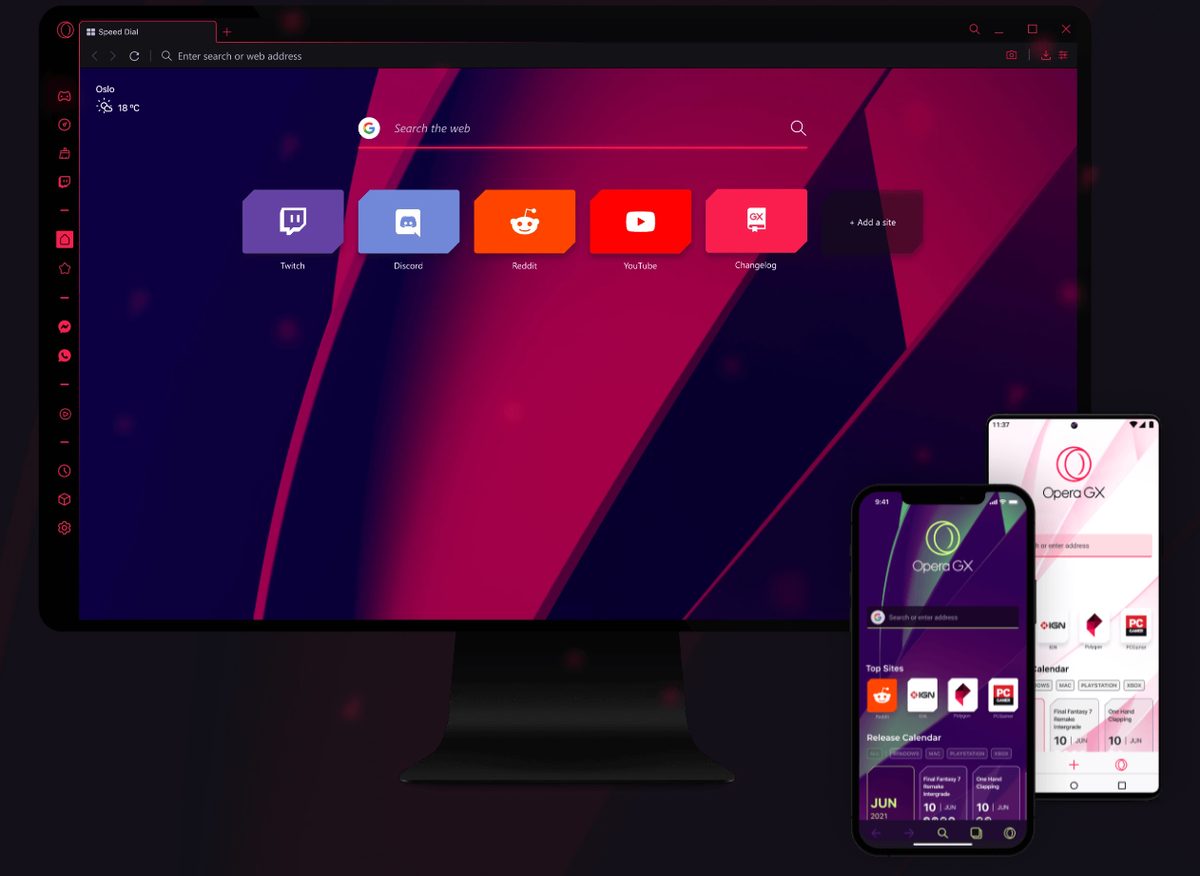
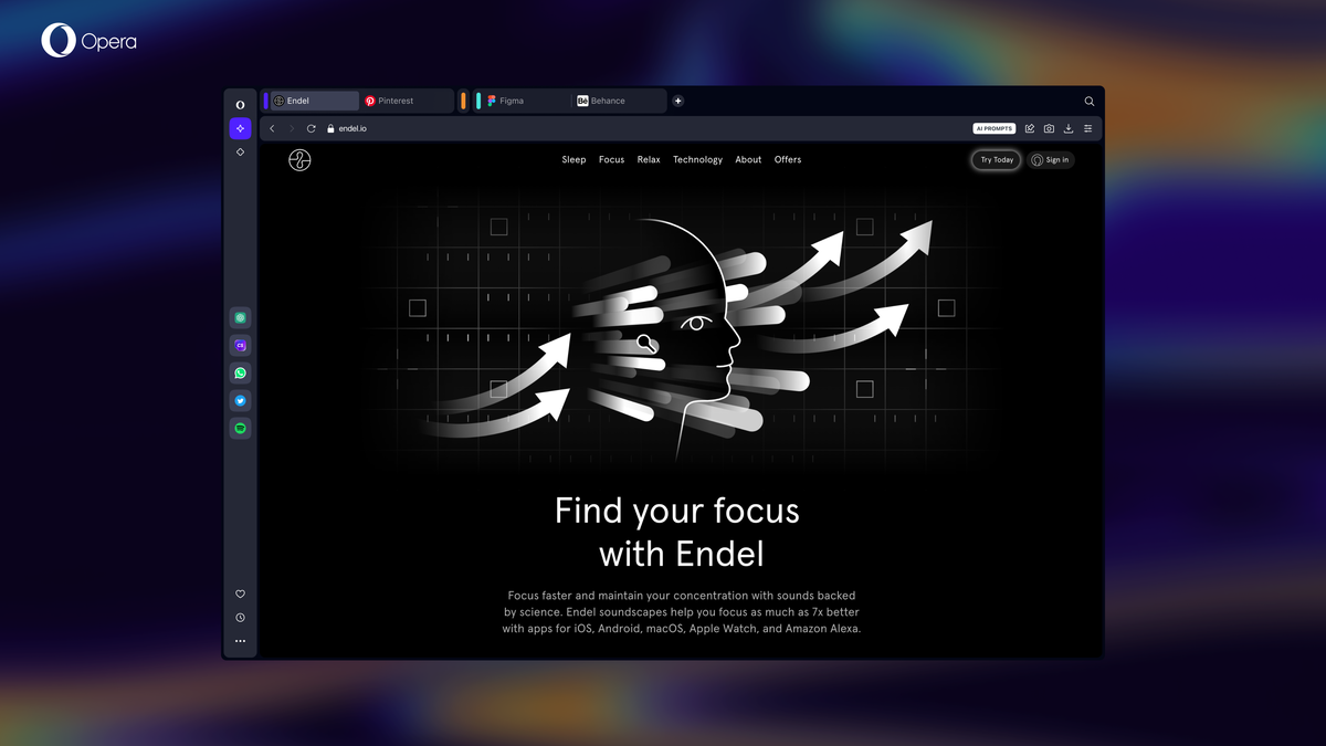
Opera Browser's new design
Here is a screenshot of the current version of the new Opera design.
Please note that work continues on refining the design and changes, and that some things may look different when Opera Software pushes it to the Stable channel of the browser later this year.
The sidebar has been moved from the Speed Dial page to the main browser window. You can show it there on the left, and enable the features that it offers -- Facebook Messenger, Speed Dial, Bookmarks, Personal News, Browsing History and Extensions -- with a click.

You may hide the sidebar again as well with a click on the hide button at the bottom.
Facebook Messenger is integrated in Opera's sidebar now in the latest version. This basically adds Messenger.com, the standalone website of Facebook Messenger, as a side tab. You may right-click on Facebook Messenger to hide the entry from the sidebar.
Opera Software plans to add more social services to the browser's sidebar in the future.
You may pin the sidebar so that it stays on top, or display it in an overlay. Pinning places it side by side with the active tab, the overlay overshadows part of the active tab.
The latest version of Opera ships with a light and dark theme. The light theme is enabled by default. To enable the dark theme, load opera://settings/, switch to browser, and select "switch to dark theme" under user interface there.

The dark theme appears to look not so great on various Linux systems. It is a developer release however, so bugs like these should be expected.
Side note: Opera plans to make changes to the installer it offers. The main installer, offered on the main Opera website, is a zero-click network installer. This means that the installation will run right after you run the program on your system.
So, no selection of the target directory, or selecting to "install" a portable copy of Opera anymore using this installer.

Opera Software notes that users who want the offline installer, or install Opera as a portable version, may download the USB installer from the company's download page.
You can try out the new design of Opera by downloading the latest Opera Developer version from the official site.
Now You: What's your take on the new design of Opera?


I am late to this but can the Facebook spy module, i.e. Messenger, be entirely disabled / removed / deleted?
If not, then that is a complete deal breaker for me and Opera will be removed from my computer.
the first theme looks like maxthon 5
The latest Opera looks great – shame the functionality hasn’t been improved. Where’s the H264 support? Every new release breaks the chromium codecs and, no, the bodge of copying libffmpeg.so to the lib_extra directory isn’t working any more (even with opera-developer-ffmpeg-codecs-57.0.2979.0-1 which is less than a month old.)
Additionally the window geometry is wrong when it first launches – I had to change the start page to a search engine rather than Speed Dial as it crops it. It’s fine once it has been resized, but considering it’s the first thing a user sees when they launch Opera Developer…. It just irritates.
In terms of the new GUI, it’s nice and clean – the icons look great, everything is quick and snappy and it’s laid out in a way that makes sense. I like it a lot. Let’s not forget the free “VPN” feature and also inbuilt ad-blocking, although every once in a while some advertising websites get added to the speed dial – no biggy, easily deleted if they aren’t relevant to you.
I also noticed something to do with Facebook – think it was Messenger (I didn’t pay much attention and dismissed it), but the idea of having Facebook embedded in my browser sends me running to the software manager to install Chromium.
Overall, once the niggles are fixed, yes I like it and I’ll probably keep using Opera Developer.
A quick update: this codec works for H264:
opera-developer-ffmpeg-codecs-57.0.2987.21-1-x86_64.pkg.tar.xz
You can get it from here:
https://repo.herecura.eu/herecura/x86_64
Unpack it and copy it to:
/usr/lib/x86_64-linux-gnu/opera-developer/lib_extra/libffmpeg.so
(you will have to be root and also create the “lib_extra” directory inside the opera-developer directory.)
Also regarding the screen speed dial being cropped – open the file
~/.config/opera-developer/Preferences
Find “window_placement” (near the top) and change it to:
“window_placement”:{“height”:1080,”left”:0,”maximized”:true,”top”:0,”width”:1920}}
or whatever your screen resolution is (in my case 1080 x 1920)
There – niggles begone!
I’m a bit lost with that new design…what about the Opera Neon project, which they introduce as the future of desktop web browser ?
I think they have always said that Opera Neon is just a “test” browser that they may or may not integrate specific features from it into the primary Opera stable release. Considering Opera Neon is still pretty new, I’m guessing that it will still be awhile before we actually see features from it added into the main browser.
atm it doesn’t integrate the extension bar, so if you activate both it looks a little bit weird. And except for the FB Messenger (that I don’t use) all the entries still open in a new tab and don’t have a sidebar, so IMHO it’s a little bit pointless to show them all the time.
Nevertheless I still like Opera more than Vivaldi. Besides syncing between different devices and phones, it still feels more polished and smooth (at least on Linux) and they are still adding a few nice little features, like built in ad-blocker, vpn or video pop out
As long as Opera auto-updates, like Chrome and Windows 10 itself, with no option to disable auto-updating, I’m not intererested in any of them. Ever.
I hate this new theme. It is VERY HARD ON MY EYES. Especially figuring out the active tab when I have LOTS of tabs open. I do not want EXTREME LIGHT or EXTREME DARK colors. They FORCE it without any option to revert to earlier theme? Goodbye Opera and hello Google Chrome. They should give us an option to revert to old theme. It looks like their designers don’t know anything about usability or how to introduce user interface changes. Light grey on grey? What kind of bullshit is this? No color in title bar? Are they insane? It’s so typical and brainless trend in the industry. Sacrificing usability for style and fashion. Who defined “lighter” as elegant? Lighter=harder to see. They have over-used grey everywhere and removed all the dark lines that provided contrast and cleanly defined various sections and borders of the UI!
If you want to stay on a Chromium browser, why not Vivaldi instead of Chrome ? Does it really need to be the default option ? Doesn’t it have enough users ?
Note: I have no vested interest in Vivaldi or Opera, I don’t use either. Just caring about market health.
I’m not convinced that this is the cause for Vivaldi’s slowness, but speed is an argument as I hear this browser is currently being sluggish.
Because Opera and Google Chrome are use C++ for the user interface which makes them super fast. Vivaldi’s UI uses the Node.js runtime environment, React JavaScript library, HTML5 and NPM modules instead of of some native code base which would have given faster and far superior performance.
Having UI theme options like vivaldi would be good. A full and proper UI dark theme or three.
I don’t like it much, but the dark theme makes it more acceptable. I’m not particularly a dark theme fan in general though, it’s just that whatever it is that displeases me with the default theme seems less unpleasant with dark.
…after another look, the greyness of the dark theme isn’t very pleasant either ;_;
How much can Opera’s UI be customised ?
Design and some “features” won’t change the fact that’s one of Chromium clones. /s
Chrome copied them. Opera was way back when with the Presto engine, some of their features later made it in other browsers, firefox also.
I have to give it to the Opera guys and gals – at least they’re trying to do interesting things with their browser. New features, clever little tweaks, a fresh new design… I don’t like everything that they do, but at least they *add* features to their product instead of whittling away every last bit of originality, like in Chrome.
just guys. There’s no women in this site
It looks decent enough, but it feels a little bit like they are trying to “copy” (for lack of a better word), Vivaldi’s base design. The Facebook Messenger thing on the sidebar is annoying, but it appears to be easy enough to get ride of/hide.