Firefox's new security icons and the reasoning behind the change

If you have upgraded your version of Firefox to 42, you may have noticed a change affecting the security icons displayed by the browser to indicate secure connections to websites.
As you may know, Firefox displays different types of icons depending on the status of the connection to a site.
While Mozilla has not changed the number of indicators like Google did about a month ago, it has changed four of the five indicators in the Firefox browser.
The change can be confusing to users at first considering that they may see new indicators for the first time and may have troubles understanding what they actually refer to.
The following before and after graphic highlights the current and the previous state of security indicators in the Firefox web browser.
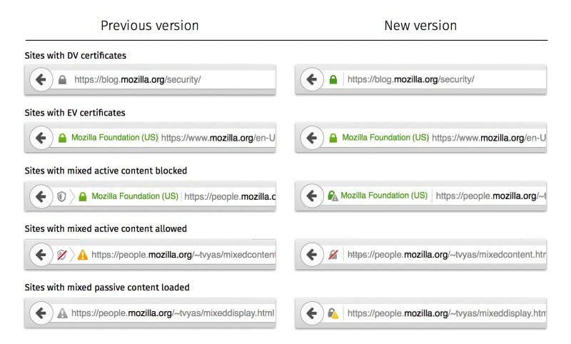
As you can see, the only indicator that has not changed at all is the one for "sites with EV certificates". The indicator for "sites with DV certificates" changed slightly only, as Firefox paints the lock icon green as well now.
The difference between sites with DV and EV certificates is whether the organization's name is highlighted in green after the lock icon or not.
The icons for mixed content sites have changed significantly. One common theme is the removal of secondary icons from two of the three mixed content indicators.
Sites with mixed active content blocked indicate this with a gray exclamation icon underneath the green lock icon now.
Sites with mixed active content allowed are highlighted with a crossed-out gray lock icon and a crossed-out https protocol in the address bar, and sites with mixed passive content that is loaded are highlighted with a gray lock icon and a yellow exclamation icon.
You may still click on the icon in front of the address to reveal additional information about the connection. Please note that you may need to click on the smaller icon to display the information and not the Page Info window.

Why did Mozilla make those changes to the security icons in Firefox?
The reason for changing the indicator of DV certificates is that "average user is likely not going to understand this color distinction between EV and DV certificate", and that Mozilla wants to better highlight that both connections are secure.
The removal of the second icon has several reasons. First, Mozilla wanted to communicate the fact in a single place instead of two, second, the number of users who actually override mixed content protection is slim, and third, a similar iconography is used in Firefox's private browsing mode.
Rule of Thumb
Basically, and this is probably the easiest way to understand the change, you can associate green with secure connections and gray with connections that are not secure.
Additional information are available on the Mozilla blog.


What a scam. Nothing but false positives from a data mining browser faking relevance.
Mozilla’s changes are good. The use of colours and signs are appropriate and clearer than before. The new designs are inline with the rules of good semiotic design. Note the strikeout through “https” when mixed active content is allowed. Nice touch.
I may have favoured blue over green to allow for colourblind users. However, the shapes alone are sufficient to convey meaning, and mimicing the globally understood traffic light colourscheme is no-doubt a smart move which outweights this concern.
Tom is wrong. Telling me “обеÑпечивать” isn’t very useful to me, but any of the signs above would be.
We certainly understand signs before a language. We conceptualize before we know. But I believe words help to not mistake on concepts, and images remain concepts (icon!) as they are less formal than words.
Хорошего днÑ!
I’ve pasted the style at http://pastebin.com/uT4weXZt
May need modifications though I don’t think it embraces default settings other than the identity-box.
Searched userstyles.org again, unable to find the source. Userstyles indexes (mainly) the styles’ names and if the name isn’t related strictly to the content searching is tough. Searched there as well if per a chance I would have left a comment but again unsuccessfully. Gosh… I remember it had a strange name, unrelated to whatever identity-box …
Anyway. Using this style requires disabling Firefox’s native management of the Identity-box. I’ve performed this with Classic Theme Restorer / Location Bar
/ Favicon; current websites icon [checked]
/ Green/blues button colors … [UNchecked]
/ Padlock icon for secure connections : hidden
Without CTR the same must be done with another style perhaps.
It was a nice little style, pity I can’t get a hand on the source. Most of the time when I copy a small style to join it to another for instance I add as a comment the source, but that time looks like I forgot to.
Thanks Tom. Pretty much the same as the one I linked to
– .verifiedIdentity
– .verifiedDomain
– .mixedContent
( I also have a .mixedDisplayContent )
I fiddled with the code and changed the background image to 20px width so it just colors behind the icon :) For now. I’ll probably whip up something better if I get time. And I’ll have to look up what the info is on mixed active blocked, mixed active allowed, and mixed passive
NOTE: I’ll never see mixed active allowed
// 2609: disable insecure active content on https pages – mixed content
user_pref(“security.mixed_content.block_active_content”, true);
But I will see mixed passive
// 2610: disable insecure passive content (such as images) on https pages – mixed context
// current default is false, am inclined to leave it this way as too many sites break visually
// user_pref(“security.mixed_content.block_display_content”, true);
Pertinent to link the topic to the “comprehensive list of Firefox privacy and security settings” (for those who discover : https://www.ghacks.net/2015/08/18/a-comprehensive-list-of-firefox-privacy-and-security-settings/ )
//2609 : checked!
//2610 : checked! — even if I prefer, in order to know that what is in my about:config corresponds to my user.js file :
user_pref(“security.mixed_content.block_display_content”, false);
rather than :
// user_pref(“security.mixed_content.block_display_content”, true);
Generally speaking fine tuning is more and more a necessity, in all domains and not only in computing : an increasingly complex world. Complex, not complicated.
I’m sorry to say I continue to consider Firefox’s security icon/id box/display confusing.
Why not a more simple approach with the security level clearly stated, such as what I use and is none of my achievement since it relies on a simple css userstyle found years ago and of which I have no longer the source : http://hpics.li/fc098fe
Mozilla’s design, all in pastel, is pretty but not functional, IMO. On a screen a user needs graphics which can stand out even in bad environmental/screen light/colors, not little icons with too soft color nuances, horrible and possibly misleading.
If it’s a userstyle then you have the source .. whats the name of it? Is it here > https://userstyles.org/ ?
Your 7.07pm post above hadn’t shown up when I posted mine
pastebin … go for it (the original author won’t mind – it’s all “open source”) .. I’ve already seen around 3 styles at userstyles (it’s pretty hard to search in) that modify the location bar’s style based on security connection – usually to color the background green or yellow or some mix – this is about the only one that seems re-usable in some way ( https://userstyles.org/styles/93454/url-bar-background-based-on-site-security ) but the code is 2 yrs old and only allows for three states (as does yours) – we have five states above.
I have Classic Theme Restorer, and under Location Bar I have unticked “favicon” (each tab shows a favicon, why do I need colorful icons in the urlbar?) – but this seesm to disable the security icon from showing. Hence I was thinking of some other visual tweak – I don;t want to color the whole location bar, and I need to work out the extra two states, but some starting code would be helpful.
As I mentioned above, Pants, I don’t have the source anymore, only the copied/modified style of course. I’ve been trying to find the original style at Userstyles but unsuccessfully. Must be somewhere, unless it was removed as it happens sometimes. I had installed it several years ago. If you wish the modified style I can paste mine over at pastebin … I don’t publicize this style because I am not the author, only a tweaker.
Yes. Your design is better than Mozilla mobile design :)
Except that the original css was in Italian and that I had translated the source to “Secured” rather than “Secure” … just noticed it. I modified the script as Firefox advanced as well as for my cosmetic tastes, hence I copied the modified original userstyle to install it as a personal style and avoid having it updated via Stylish… but the core remained, with perhaps a few css inconsistencies due to css rules modified since. Otherwise I”m not AT ALL into coding (and I’d never dare touch a javascript!), and I truly admire what programmers can perform, astonishing.