New Ghacks Theme Live Beta Test
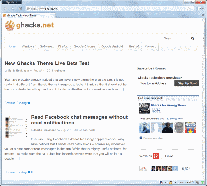
You have probably already noticed that we have a new theme here on the site. It is not really that different from the old theme in regards to looks, I think, so that it should not be too uncomfortable getting used to it.
I plan to run the theme for a week to see how it performance and what you all think about it before I make any decisions to keep it, or switch back to the old theme.
For now, I'm trying to sort out all the little bugs and issues that are still there, and optimize the theme to improve page loading times for all of you.
I'd like to know what you think of the new theme, especially if you ran into any issue with it. If something is broken, I'd like to fix it asap so please leave a comment below or use the contact form up top to send me an email so that I can start to analyze and repair the issue right away.
I'd also like to hear your opinion in regards to what you think is missing, features that you would like to see here on Ghacks Technology News, or those that you do not like at all.
I had a couple of reasons to switch to a new theme:
- I wanted a responsive theme design so that the site looks fine on smaller and larger screen resolutions.
- Ghacks has been plagued by Google algorithm updates (Panda), and I have the hope that a new theme may change that.
- I wanted to modernize the theme technology, as the old theme that I have used here on the site was rather plain in this regard.
You find a couple of modifications and new items on the site. I did remove several categories from the top menu and moved them to the sidebar instead. They are all still there so no need to worry about that.
Each category displays an RSS icon on top now that you can use to subscribe to its feed. This has been possible before but only if you knew that you had to add /feed/ to the url.
The sidebar lists a top and latest posts, and latest comments module now. The top posts are set to include only articles made in the past 180 days so that you can expect fresh contents to be displayed here regularly.
I'm really looking forward to your comments, so keep em coming please.
Advertisement








The new theme looks quite nice :) The text is easy to read and the pages load as fast as before.
Thanks for keeping it as simple as before. Many other sites, when they switch to new themes and desings, end up with difficult to read colors, pages cluttered with unneded/unwanted icons/things, features or styles incompatible with some browsers that make the pages render strangely or in an unreadable way, and painfully slow loading sites. You didn’t hit any of those problems with your new theme: well done! :)
The only problem I still see in the new theme are the “comment icons”. They show up as little squares with “F0 75” inside them (it’s just the same thing that happens on pages with foreing characters set, that characters appear as little squares like these). I have already cleared the browser cache. Anyway, it’s not important at all.
favicon.ico dont load it become http://localhost
http://localhost/theme-test/wp-content/uploads/2005/10/favicon.ico
The AutoPager rule for this site is broken in this site’s beta theme.
You can zoom in and not see the background color, or
use this userstyle.
@namespace url(http://www.w3.org/1999/xhtml);
@-moz-document domain(“ghacks.net”) {
/*change it */
BODY {
background-color: rgb(255, 238, 204) !important;
}
}
I added this comment to be facetious.
Frankly, the fact that you have done this in the open Martin, a design by committee type thing makes me like and respect you all that much more.
I personally wouldn’t have the same amount of patience. :)
I’m trying my best, but it is impossible to please all users. Still evaluating and tweaking the theme, especially how search engines react to it, if at all.
I meant
@namespace url(http://www.w3.org/1999/xhtml);
@-moz-document domain(“www.ghacks.net”) {
/*change it */
BODY {
background-color: rgb(0, 0, 0) !important;
}
}
I’m not convinced by the peachy background. Maybe something to break the monotonicity (like a texture or some graded out texture) could fix this. This website http://sport.be.msn.com/nl/ has a blue background but it is not monotone.
I simply love the new theme, loads fast. Nice and clean. love the thumbnail images next to the articles.
Sweet, much better.
Both things.
I was thinking that perhaps your buttons (Submit Comment, Reply, etc) could use a darker second color stop if you’re using gradients for them. They look disabled.
Also, the line height in the textarea box is tight
#comment {
line-height:
}
Fixed, and fixed ;)
Sorry, I do not like the peach/light orange side/background colours
Like the new theme…white space is good…not junked up…MAJORLY important!
The only suggestion that might be a possibility to try is the text leading…a little less.
You do an absolutely excellent job with the site and all the informative articles. I think we as followers will be pleased w/ whatever you decide. It’s the content we are interested in…
doe
Using Firefox 22 Portable, Chromium Portable and Firefox 18 loaded w/ extensions on Windows XP SP3.
My 2 cents is this, I don’t like the empty white (beige) space on the sides, I’d much rather have the content of the site fill my screen left to right, it would also reduce the amount of vertical scrolling needed.
It would be nice to have a different color layouts as well, something that’s easier on the eyes in the early mornings or at night, even something like this goes a long ways https://news.ycombinator.com/
Lastly on every page there is that little box with Popular, Latest, Comments. Latest seems pretty redundant no? I mean looking on the home page and I can well enough see the latest articles so I don’t see the point. Maybe you can replace it with something else like Popular (48h), Popular (month), Latest Comments.
Otherwise a redesign I don’t instantly hate, which is rare good job.
tested in opera and clean mozila profile now fine
thanks
very nice theme.
I not sure this from my Mozilla or Ghack can you check screen shot?
http://photoload.ru/data/b3/3c/7b/b33c7b63d60ad9c71fb7f3fb2c36da22.png
You should see a comment icon there, not sure why it is not displayed to you. Can you force a cache refresh? Press Ctrl-F5.
Your site scrolls fine on my Note 2. And the Firefox page looks clean. I don’t see anything to dislike.
Congrats Martin, it is a really nice theme, both on desktop and tablet. As a fellow blogger and admirer, I hope you can regain the ranking your site and articles deserves.
All the best!
There isn’t anything that I don’t like about it. Seriously.
Well done Martin.
I do like the thumbnails and the ability to jump right to comments (not sure if that was available before).
The sites looks fine at any size using Ctrl+ Shift+ M in Firefox so I don’t know what others are talking about.
In my primary Firefox profile with like 8,000 add-ons enabled, this page, the homepage, and others loads faster than in Chrome and IE9.
I tried updating to 10, but later.
Not sure if this is just on my end, but the page doesn’t finish loading or something is wrong in the code.
http://www.accessfirefox.org//tmp-images/IE9.png
Screw prefixes. They’re a pain especially since you have to go back and change them later. Just use standards and basics for fallbacks (background-color or background: color, image etc if you use gradients for images and so on). I can’t imagine your readers/visitors using anything but the latest version of whatever browser that they’re using. This is after all a tech site.
Thumbs up man.
8000 add-ons, that is funny ;)
yeah nice effort, but too much white for me martin strain on eyes
I like the theme and it loads relatively fast.
Martin,
I like the layout on the front page/section “Home”. Easy to scan down for articles of interest . However on the other sections “Windows”, “Software” etc I find the ads between article excerpts irritating and breaking the flow. I understand that you need ads to generate revenue but perhaps keep them to the right hand side of the page ?
As I normally read Ghacks from RSS ( android/greader) I did not know about the new layout until I saw your article about it.
Keep up the good work – I have picked up many many tips from your articles
Rocky, the ads should not have been there in first place. I just spotted them and have removed them from the pages, should not be there anymore.
It’s plain, the colors are ugly, the comment follow-up groups are hard to distingush and jeez, those big white empty spaces everywhere eating up the precious vertical space… why to scroll three times much as before when going through an article and the comments? If this stays might consider unsubscribe after 6 years…
So the top menu bar and the background color changed while I wrote my comment, so forget the ugly colors… the rest stays anyway.
Tom, please look at this as if it is some kind of beta test. Things will change and while I cannot promise to please 100% of all users, I try my best to come as close as possible. I have already changed the top colors and removed the read more links as they do not really serve any purpose. This has moved the article excerpts closer to each other so that you do not have to scroll that much anymore.
Good move towards responsive theme, loading time. Just make slight modification with the fonts style(Google fonts) would make it more impressive too…
Is too white..Please add an option to make the background darker..
Theme looks Awesome with Images. Sidebar is pretty impressive.
Thanks for this nice update. Don’t switch back to the old theme.
The graphics are IMO an improvement, delivering that touch of space, wideness.
Personally white backgrounds are not my cup of tea (I’d prefer a light tea, camel, sand ground), but it does have the advantage of participating to that broad effect (darker a site is smaller it seems). I dislike even more black backgrounds than white. Just a clear color but not too bright …
Overall impression : fast as previous theme was. I’d dare say elegant, which includes comfort.
Truly nice one, and finally, some images; small and not annoying.
I think it’s a little too washed out.
I was playing around with a few styles and I think I’ve got something to start you off.
If you’re interested:
body {background-color: #FFEECC; padding-top: 1ex; padding-bottom: 1ex;}
#wrapper {background-color: #FFFFFF;}
#navigation {background-image: -moz-linear-gradient(center top , #999999 0%, #666666 100%)}
#navigation ul.nav > li a {color: #FFFFFF;}
#navigation ul.nav > li a:hover {background-color: #808080;}
.searchform, #searchform {background-color: #FFFFFF;}
I uploaded a screenshot with the above styles applied.
I like it. What is everyone else thinking? There is a slight problem though with selected items in the menu as they appear with white text on white background.
Please excuse the multiple comments, but I just remembered why I posted the fix
#navigation ul.nav > li:hover {background-image: none; background-color: #808080;}When you hover over the little white line between the menu items, the menu item background colour is white. This code should fix that.
Thanks, this fixed it.
@Martin:
Aha! Nice fix.
Glad I could help.
@jasray:
The only reason I suggested the gradient was because the original theme had a gradient.
Insert here I think–yes, the faded yellow, not for me.
A gradient . . .
The thumbnails? Hmmm . . . variety without chaos. Don’t know. It’s hard to say, but I am sure it will all work out after a few weeks.
Everything on the page is to elucidate content, make it real and alive. Anything that detracts from the content – gotta go.
I did like the previous style because it was unique–no other site like it. First site I clicked every day for tech news. Maybe just the icon is attractive . . .
Hopefully I can whip up something for you tomorrow, assuming I’ll have a chance to work on my Windows desktop.
Thanks for all your help, I think I figured it out:
#navigation {
background-color: #666666;
background-image: -webkit-linear-gradient(top, #999999, #666666);
background-image: -moz-linear-gradient(top, #999999, #666666);
background-image: -ms-linear-gradient(top, #999999, #666666);
background-image: -o-linear-gradient(top, #999999, #666666);
}
Whoops, I forgot to test on WebKit. It seems that the menu background gradient doesn’t show up on Safari (the only WebKit browser I have access to right now), probably because of the
-moz-prefix.Uhh, I’m not too familiar with CSS3 linear gradients, but I think you could replace the #navigation line with
#navigation {

background-color: #666666;

background-image: linear-gradient(center top , #999999 0%, #666666 100%);

background-image: -moz-linear-gradient(center top , #999999 0%, #666666 100%);

background-image: -webkit-linear-gradient(center top , #999999 0%, #666666 100%);

background-image: -ms-linear-gradient(center top , #999999 0%, #666666 100%);

}
That should cover the major browsers (I didn’t include the old WebKit gradient code). If a browser doesn’t support a declaration, it will fall back to the one it last understood, leaving a plain colour for those pre-CSS3 browsers.
To fix the selected/hover problem, add
#navigation ul.nav > li:hover {background-image: none; background-color: #808080;}
I hope that fixes it.
I have fixed the issue with the selected menu item right away. The new code does not seem to work though.
I don’t like the gray text. Too hard on the eyes. I do like the comment level being more indented. Otherwise I like the change.
After a few days I agree, the gray font is hard on the eyes. Please change it to black.
I have changed it from #555555 to #333333. Would you say that this is better, or do you want it to be even darker than that? What does anyone else think?
Not bad, but I would love if I could select a darker background, like some sites that allow you to select themes.
The image on each post shoves text off to the right for a few lines, then the text sneaks back to the left. I find it breaks my reading flow. I don’t even see the relevance of those images … sorry :-)
The rest of the site is just fine, good improvement imho!
I LIKE IT. IT IS EASIER TO READ. (I USE CHROME, ON A LAPTOP, IN A WINDOW ON A SCREEN WITH 1366 X 768 RESOLUTION.)
FF23 / Win7 / 1080p
Everything looks fine here. Nothing broken.
Whitespace: lighter and cleaner, nice airy feeling, feels less claustrophobic.
Font: larger and roomier, easier to read, also feels less claustrophobic too.
Nav: simple, clean, unobtrusive.
Comment section: The reply buttons are disconcertingly contrast-y to the rest of the page. I don’t know if you have granular control over that one element but if you could make the buttons a shade of grey like #333333, I think it would be better. They are also on the left which feels unnatural. Bottom right would be better unless it’s a touchscreen UI scrolling issue.
Looks nice. Keep this theme. :)
Hi!
From my point of view comment system needs some changes in colors / styles.
Especially gray posts (post plus few replies to it) look difficult to read (user vs. comment distinction). See top comments on http://www.ghacks.net/2013/08/08/a-look-at-firefoxs-new-social-share-button/ article (“meh, Shared, ReTweeded” one). They don’t look nice.
While in general old vs. new.. surely NEW! :) (even if I’m >30)
And now they look far better – black line that separates them makes a huge difference! :)
I do NOT like it!
Please stick with the old one… if you are as old as me (>30 years) than
any change is tough on you!
It is pretty fast and couldn’t find any issue at here, however it isn’t awesome!
Have to congratulate you on this. I’ve grown to hate site updates in recent years because most sites I frequent have just made their sites worse. Big, medium, small sites all of them basically. I love this update though!
Martin , the new theme of my favorite technology website is simply fabulous and it loads pretty fast .
Why not use Thesis ?
http://diythemes.com/
The main reason for using this theme is a recommendation by a friend.
What do you think about OpenSans font?
Look great! You left light theme (right direction) but think about slightly larger font :)
working fine for Opera mini 4.5 java.
Viewing the theme on my Windows Phone 8 – in desktop mode and while the new theme is good, do something about ads taking so much space. Otherwise I hope you won’t be deleting the (current) mobile version and I will continue to use that. The reason I want the desktop version is because mobile version lacks some information and functionality.
Which ads do you mean in particular?
I am using Windows Phone 8 (screen resolution: 480 x 800) The first ad I see, is yes between the article and comments. When the comments end, the sidebar content is shown in the same way comments are shown – vertically bigger and horizontally smaller. The big ad is just before the Partners, About Ghacks, Topics part. Try using IE 11 Dev tools to try this.
You are right, when I scroll down more I see the sidebar as well attached there. I’m not sure I can change that, will have to look into it.
“Do you get that add when you are running desktop mode on your mobile?”
Yes.
That’s strange, I do not get that when I view the page on my mobile. In fact, I do not get a sidebar at all, and the only add that I see is the one between the article and the comments. Which mobile phone are you using?
Posted the link to screenshot in a comment – the message was “awaiting moderation”.
Thanks I got it. Do you get that add when you are running desktop mode on your mobile?
https://skydrive.live.com/redir?resid=A314EC4F37FA70E3!648&authkey=!AEOl9_kJLKWk0oQ&v=3
OK, forget that comment. I definitely saw ads in between posts on front page – but refreshing gives no ads in between. Could you do something about that Facebook ad at the (almost) end of the page? Takes up too much vertical space. The ad is slightly larger than my 3.8″ display. And if it could be done, please have smaller ads when someone wants to use desktop mode on phone (use document height or User Agent string) – like the small ones in the current mobile version.
Can you make a screenshot of that so that I can take a look at it?
As of right now (~16:40CET) I see large spaces between each excerpt on the front page. Some filled with an ad but others blank spaces.
This should not happen. There are no ads inbetween posts. Can you do a Ctrl-F5 on the page to see if it goes away?
It’s fixed now.
Too much empty space on left and right. It actually feels like G+ where you have to scroll down like crazy.
Hallo Martin,
Glancing one you new outlook I think “Not bad at all!”.
Its a good idea to give us a week to get more familiar with the handling, but
right now I am exited, not only because I think the reading for me is much better with this site.
Display is fine on my old netbook win 7, except for the reply box css… unlike before the background is hard coded white but the text not hard coded black,… If you have text as white/offwhite as your default… this makes reading what you write very difficult.
On my iphone / safari in mobile mode site renders well.
Would be nicer if the ads were at very top or under body of text and replies rather than between title and body text.
Pages doesn’t smooth scroll for me. Scrolling is jumpy.
Chrome 29.0.1547.49 beta-m with Chromium Wheel Smooth Scroller extention.
Your home page has more white space than anything else. This page is a little better that way but my fingers are tired from scrolling. My browser is Opera (12.16). Might look better on FF. . . . Yes. It is better on FF, but BIG. :)
It’s a nice “light” Skin, Martin. I like it.
The best part about this theme is that coming from RSS, I didn’t even notice it was different, and that’s how it should be – out of the way, unnoticeable, but modern and clean. Excellent work!
Working fine for me on desktop firefox 22. The site also displayed very well on my cellphone (android 2.3).
Your CSS still needs some work when it comes to medium size screens, i.e. the menus are broken and the right sidebar kinda disappears off the right.
For testing of various screen sizes, check this out:
http://dfcb.github.io/Responsivator/?site=www.ghacks.net%2F2013%2F08%2F13%2Fnew-ghacks-theme-live-beta-test%2F
I’m personally also a fan of position: fixed for the top nav bar on small devices.
Just a theory, but your Google issues may be related to your code layout and the performance bottlenecks it creates. Run your URL on Google’s Page Speed Insights service to identify the many! issues you might want to tackle (77 is awfully close to a failing grade!).
It will take some getting used to, but no problems so far. Keep up the good work.
I’m still working on the performance side of things and agree that I need to tackle it. The responsive theme has been designed to remove the sidebar when you reduce the width of the browser window too much.
My main problem that I have is that many of the optimization suggestions are for third party scripts that I have no control over, and the other part is about script features that I do not know how to get around as well.
The front is now at 81.
hi Martin
nice theme i have a education website and i have used thesis for that can you say that new ghacks is better then thesis for education website. thanks for sharing.
You might consider disabling your portable theme on iPads.
I object to “portable” themes displaying by default on iPads. The screen is large enough not to need them. Performance for portable themes is almost always worse than the regular desktop theme. Your website is not an exception.
iPads don’t have a “desktop” setting for their browsers?? My Android and Android Firefox has desktop view default settings.