Why the new Google Play layout is faster on Chrome than Firefox or Internet Explorer
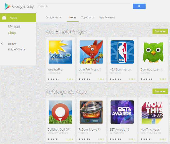
Google has redesigned the Google Play store and launched the new version yesterday to the public. Unlike in the past, where the shift happened gradually and not all at once, this time all users from all over the world got the new interface at the same time.
Some users may notice that the store is loading faster for them, while others may not notice a difference at all.
The core reason for this is that Google switched from using the png image format to the company's own WebP. The format provides lossless and lossy compression for web images, and in this particular case, the lossy variant is used.
The big issue here is that WebP is not supported by all browsers. While it is supported by Chrome and Opera, and Android 4.0 and up, it is not supported by Mozilla Firefox, Internet Explorer and other web browsers.
Good news is that Google decided to use the previous format, png, as fallback for browsers that do not support WebP. So, Firefox and Internet Explorer users load png images when the store is visited, while Chrome and Opera WebP images.
The problem here is that the png images are much larger in size because they have been saved with better quality settings (and because the format produces larger-sized images after all).
Here is a quick comparison of a couple of store images:
| PNG | WebP |
| 176K | 24K |
| 143K | 8K |
| 186K | 17K |
| 65K | 11K |
What's interesting is that Google is apparently using jpg images for at least some of the phone screenshots, while it is using png exclusively for larger screenshots. If you compare those two formats, you will notice that the size difference is not that large anymore. While WebP is still using a couple of Kilobytes less on average than images saved as jpg , it is usually just that and not that big of a deal, at least not for end-users.
Google on the other hand may save quite some bandwidth this way.
As far as png images are concerned, it is not clear why Google is not reducing the quality of those images as well to reduce them in size. A quick conversion of the png images of the table above reduced their size to about 40K each without sacrificing too much quality. While that is still nowhere near WebP sizes, it would mean faster page loading times for fallback users.
Improved page loading times are a good thing, even though only some users will benefit from them in the short run. Mozilla decided against implementing WebP in Firefox some time ago, but a second bug listing was opened several months ago that attempts to get the format supported in the browser after all. It is not really clear yet if it will be supported or rejected again.
On a personal note: I do not like the Play Store at all. I dislike its design and find it nearly unusable on desktop systems. It may work great on mobile devices, but the lack of a proper "new" releases listing means that it is impossible to browse the store for new releases. All it seems you get are spoon-fed "top" releases. Also, why is there no distinction between applications and games in the store?
What's your take on the new Google Play design? (via Android Police)
Advertisement






Due to limited internal memory on my phone, I always uninstall the Play app until I need it again. So, it was convenient to log into my Play account, as it would show me which apps has updates ready to install. As far as I can tell, the new layout doesn’t offer that feature anymore. And, there is still no to delete apps from the long list of free apps I installed and later deleted from my phone. The more I deal with Google, the more I hate Google.
I hate the new Play store layout. What the hell were they thinking??? It is practically useless. Goodbye Play. Hello Amazon!
As per mozilla WebP take 2 bug, comparison is meaningless between loseless PNG and lossy WebP.
Not all PNG files are lossless; PNG supports lossy compression formats as well as lossless.
For the love of God, we already have JPEG .
Well, this was my post amongst many similar ones on the Google Play Google+ page:
“BRING BACK THE OLD SITE UNTIL THE NEW ONE FUNCTIONS LIKE IT!
I need to be able to see what I have currently installed not what I put on a device for 5 minutes 2 years ago.
Pathetic – form over function yet again from Google or should that be “New Apple””
https://plus.google.com/u/0/106886664866983861036/posts/Gkk8tEEkbpt
We’re not alone hating it.
i like the design, it feel more dynamic and faster, even on firefox 25. i don’t have that much of a problem with the store itself because most of the time i only use it to look up or install apps i read about somewhere else. the top-listings are quite useless for me, since i have the feeling the entries almost never change. all in all i have the feeling that the market is one huge pile of… stuff, and you really have to either know what you’re looking for, or click through dozens/hundreds of apps, to find one good piece.