New Windows Explorer Will Ship With Windows 8
Microsoft is currently pushing out new announcements like crazy on the Building Windows 8 blog. We know for instance that the company will improve file management features like copying in the new operating system. Today another major change was revealed in a very detailed post on the blog.
Windows Explorer will receive a complete redesign and will ship with many changes when the Windows 8 operating system comes out. Many users of Windows feel that the current file manager of the operating system is in desperate need of a redesign, or at least some form of optimization.
The biggest change is a new Ribbon based user interface that many Windows users know from Microsoft Office. Ribbons have been criticized in the past, especially by experienced computer users. The main points of criticism are that a ribbon interface takes up to much space, and that its tabbed interface does not speed up all operations.
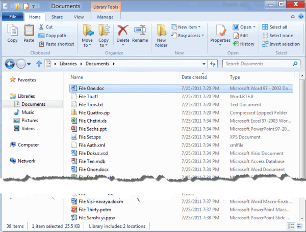
The new Windows Explorer on Windows 8 looks like this:

You see the ribbon interface at the top. To make up for the space requirements the status bar was reduced to a single row in Windows Explorer. Other changes that are visible immediately are a new font used for displaying files and folders and the dynamic Tools listing on the title bar.
The Home tab of the new interface offers buttons for the most popular Windows Explorer features. Microsoft analyzed the command usage and found out that only two of the top 10 Windows Explorer commands are currently visible in the command bar in Windows 7. Windows Explorer on Windows 8 will provide access to all those commands directly from the Home tab.
If you are wondering, here is the top 10 Windows Explorer command list:
- Paste: 19%
- Copy: 11%
- Properties: 11%
- Delete: 10%
- Rename: 8%
- Cut: 7%
- Search: 7%
- New Item: 6%
- Open: 2%
- Edit: 2%
The Share and View tabs are always displayed in Windows Explorer.
- Share: The Share tab provides access to features like emailing or zipping files or printing and faxing documents.
- View: Options to enable or disable panes, change the view mode of a folder or grouping and sorting options.
Dynamic tabs are displayed in addition to that. They depend largely on the current location that is displayed in Windows Explorer. Disk Tools are for instance added as a tab to the computer location. Here it is possible to format, cleanup or optimize a drive, use the Bitlocker encryption or work with removable media and rewritable discs.
Here is a video that showcases the new Explorer of Windows 8.
It is interesting to note that the Windows 8 Explorer will display more files and folders than Explorer of Windows 7. What I'm personally curious about is if Microsoft manages to get the view modes working properly in the new operating system. Another requested feature, the ability to display two Explorer panes with files in one Windows Explorer menu does not seem to have made it into the new version of Windows Explorer.
The most interesting part of the whole blog post is the end, if you ask me. Microsoft confirms that power users will be able to create their own personalized version by minimizing the ribbon ui and configuring a quick access bar instead. Plus, they get access to nearly every command available via keyboard shortcuts.
Here are a few screenshots that showcase the new design:


What's your take on this new Explorer, and especially the Ribbon UI?











Windows 8 security enhancements are the only factors about the OS that interest me personally.
http://www.techrepublic.com/blog/security/what-you-should-know-about-windows-8-security-features/7900
That video demo of Win 8 Explorer looks interesting. Win 7 Explorer is kind of blah but usable and that’s all I care about.
Some of you guys remind me of Linux religious zealots preaching about their favored desktop environment.
I just posted my analysis of the new Windows Explorer design on my blog at http://wp.me/pT8uW-LH. I think you will find it interesting. Please check it out!
Wonders me, why any power user wastes even the slightest thought about which file management tool Microsoft ships with Windows. Since Windows 95 the offers were crude and disappointing at very best. Between the eclectic but ultra-pricey “Directory Opus” and numerous freeware offers there is a broad range of programs that all leave Windows Explorer for dead.
Of-course, some users will upgrade to Windows just for experiencing the excitement of the thing with ribbon (ugh) – they probably also use IE, and will not even upgrade this one during the lifetime of the operating system.
Aside from taking up way too much space (and its asymmetrical layout), the main problem with the ribbon is it hides all the really useful commands. When the ribbon was introduced in Office 2007 most of the headaches it caused me were trying to figure out where Microsoft moved all the “advanced” features I like to use.
Good thing is that power users can create their own quick access bar and minimize the ribbon ui.
The Ribbon. It’s like a virus and it’s spreading. Kill it! Kill it! Please!
Too me Ribbon is the only bad thing I have ever heard about Windows 8. But apparently you can “turn it off”.
This is the first negative news about Windows 8 for me.
I have really been enthused about the whole Metro
inspired look and the ribbon aesthetically
runs completely counter to that.
Functionally, I have little time for it either.
I have stayed with Office 2003 to avoid
the implementation of the ribbon.
How awesome. One of Windows’ worst features ever is now part of Explorer. The mark of the Ribbon is upon you.
Somebody call an exorcist.
as long as you can minimize the ribbon, i’m interested.
I miss xtree! Sigh.
Why can’t microsoft build something even half as good? Until they get it right, I’m sticking with FreeCommander.
Mike. Ever heard of ZTree (ztree.com). However the guy wants a stiff US$ 30.00 for it. Else, I am happy to have encountered another old school XTree disciple. The clash of belief systems of the olden days: XTree vs. Norton Commander ;).
For windows explorer, the UI is my second concern while functionality comes at first place. I don’t care if they keep the current UI or introduces a space-consuming ribbon, I need tabs in explorer and the ability to manually arrange files and folders without using any registry tweak or 3rd party software. They maybe trying their heart & soul to improve the UI, but they should focus on providing some features first that have been long demanded by the users.
Microsoft had an almost perfect minimalist UI in Windows 2000. Every release since then, their UI has gotten progressively worse. Granted, I think the Start menu layout in XP was an improvement, but other than that it’s been a downhill slide. What’s the point in owning a hot roadster, if driving the thing is a royal pain in the arse? Maybe it’s time I switch to Linux or Apple.
Yeah, do that.
Jim, totally d’accord, Albeit I think he somewhat less square visuals of XP (the atrocious Luna design left aside – thanks to the uxtheme.dll trick quickly replaced anyway) were a step into the right direction. Anything beyond this – well therefore I am still very happy with XP.
Personally I found the apple finder quite a bit more annoying to use than the windows explorer, especially accessing network computers, but that’s just me
Just seen Pirates of Silicon Valley today and the stuff about Microsoft’s DOS. The improvements look good to me anyway! I like the ribbon stuff in windows
Almost anything will be better than the current (and previous ) explorers.