Opera Featherweight Introduces Interface Changes
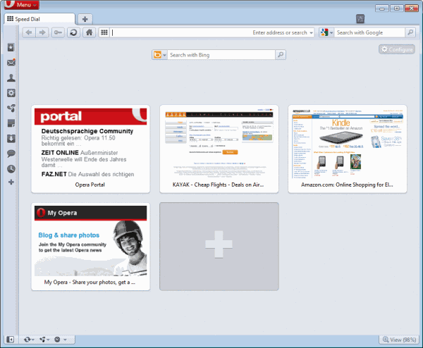
Every browser developer seems to be inclined these days to streamline and at the same time minimize the user interface. We have seen it with Chrome, Firefox and Internet Explorer, and now it is Opera's turn do propose the same. Currently available as an Opera Next snapshot only but soon making its way to stable Opera builds.
Project Featherweight consists of several phases of which the first has been first has been made available in the new development build.
The general idea behind Featherweight is to make "Opera as light, bright and user-friendly as possible" without losing the browser's flexibility interface wise.
Users who install the new build will instantly see some of the differences compared to previous Opera versions. I have created two screenshots, the first showing the old Opera interface, the second the new interface of the latest Opera Next build.
The Opera Next button, and other elements of the interface resemble that of the Firefox browser now. The toolbar icon set has been completely revamped, and users will notice the softer background and border colors immediately.
Users may also notice the new status bar design, which now integrates the Opera Link, Opera Unite and Opera Turbo buttons in a less obtrusive manner.
Button borders have been removed from the Opera address bar, and the home and fast forward buttons have been made optional, meaning that users who want them back need to add them through customizations.
A right-click and the selection of customize > Appearance opens the configuration menu where toolbars and buttons can be added to the Opera interface. New buttons are simply added via drag and drop. They become visible and accessible immediately afterwards in the interface.
The new interface has been made available for all Windows, OS X and Unix versions of the browser. Interested users can download the latest snapshot build from the Opera Desktop Team blog. Opera Next can be installed next to an existing version of Opera.
Advertisement





lol!
Firefox and Chrome resemble elements from Opera, for ex: Speed-dial, bars on top and Menu button. Firefox since 4 has the same look than Opera. There are more elements from Opera that I’d like to see in Firefox and Chrome.
been using opera ever since firefox was introduced as beta and i would say that opera started the revolution of web browser. i dont get why firefox is getting all the hype and people making it as reference when compared with other browsers.
I seriously fail too see much streamlining done here besides the skin overhaul which looks less aggressive.
Anyways, i’m an opera fan/user, and these changes are not like ground breaking changes….
“The Opera Next button, and other elements of the interface resemble that of the Firefox browser now.”
Huh? It does no such thing. First of all, Opera introduced that button before Firefox, and Opera’s new button looks nothing like the one in Firefox.
Crashes like there’s no tomorrow…
remember that this is opera next(unstable)
we might see a changes to the red menu button when it hits final
that button will be there when “IT IS” opera next again
i think is justs because “opera next” is longer than “menu”.
The Opera Next button and interface resembles Firefox?
You mean the Menu button and interface on the top screen shot that Opera already had before Firefox 4 cloned it?
lol ok.
Yep, this is wrong that the interface resembles Firefox.
Does Firefox have borders on the buttons?
Does Firefox have a permanent status bar with links to it’s services like Firefox Sync?
Jack, the button now resembles that of Firefox, regardless of who copied from who.
No, the button looks nothing like the Firefox button, which is orange and with a plain background. The Opera Next button is Windows Areo/Glass-glossy.
Also, Opera had the button before Firefox anyway.
i like it