The worldwide rise of Broadband - Interactive Map
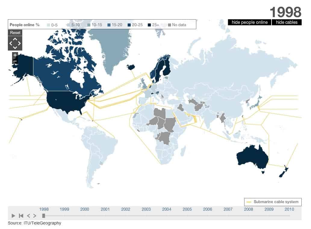
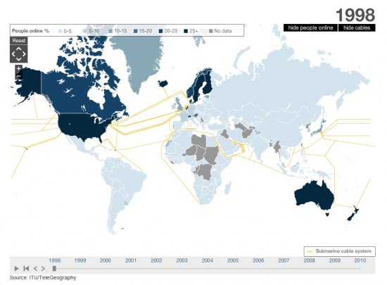
We all take for granted now that we have fast, reliable broadband and most of us can't even remember the days of dial-up of even acoustic couplers. Now the BBC have put a fascinating interactive map online showing the percentages of people online worldwide from 1998 and how many of us are using the Internet.
The map, which you can find online HERE, provides extraordinary details and shows clearly that the first countries to fully embrace the Internet were the US, Australia and those in Scandinavia. It shows that world powers such as China have come relatively late to the party, sometimes even after countries in South America and Africa that have overtaken them in net usage.
There are also a couple of links to articles about the problems Africa faces getting broadband infrastructure installed and allowing their population to get online.
Note that the information presented on the map requires Adobe Flash Player on the system as it won't otherwise load at all. The data ends in 2010 and while that means that two years of data are missing from the map - we have 2012 - it may still provide you with detailed information on how Internet use evolved from 1998 to 2010.
You can check out the growth of Internet use in a country that you are interested in, a continent, or check out how and when major Internet submarine cables were set up to connect continents or countries, and how that may or may not have improved Internet usage in connected countries.
Advertisement






Thanks, great map.