Firefox Photon: new design mockups show interface, and more
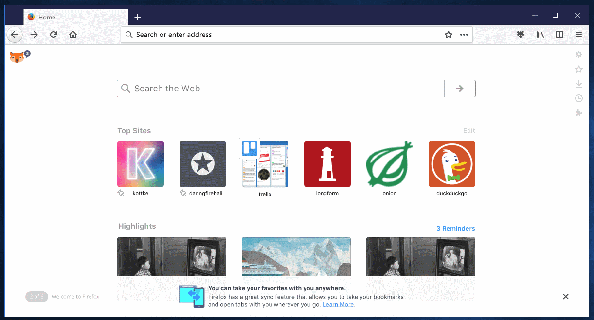
We talked about the upcoming Firefox interface design change, codename Photon, before here on Ghacks, and even revealed a mockup showing some of its interface elements last week.
Turned out later that the mockup was not by the Photon team, but by another Firefox team that used tidbits of Photon in the screenshot.
Anyway, if things go well, Photon will be part of Firefox 57. The browser is one of the most important releases for Mozilla in a long, long time.
It will put the focus on WebExtensions as classic add-ons won't run anymore in that version. Additionally, plans are underway to make it the first stable version with bits from project Quantum included.
Firefox 57 will be released in November 2017 if things go as planned.
Note: The following screenshots are mockups. While the final product may look similar or even identical, it is also possible that things may change before the final release of Firefox 57.
Firefox Photon

The first mockup shows Firefox running the Photon user interface, and the about:home page of the browser.
The UI has not changed all that much when you compare it to last week's mockup. Tabs are still displayed in rectangular shape, and the address bar is still centered. Some icons look different, and some have been moved around if you compare their position to current stable versions of Firefox.
The reload button has been moved to the left side of the address bar for instance. There is also a ... icon which is new, and some of the icons on the right have a new design but have identical functions.
The about:home page shows several new features. There is a new Firefox icon in the top left corner that displays several tips when you click on it.
The about:home page is the first page that opens after a new Firefox installation. The new tips section, if it survives and becomes part of the final release, introduces core Firefox features to users of the browser (especially new users).
It highlights Sync, Extensions, Search, Customization, Privacy and making Firefox the default browser.
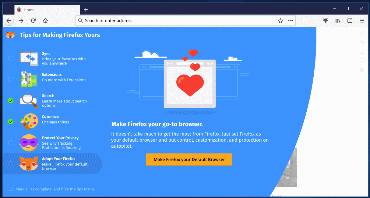
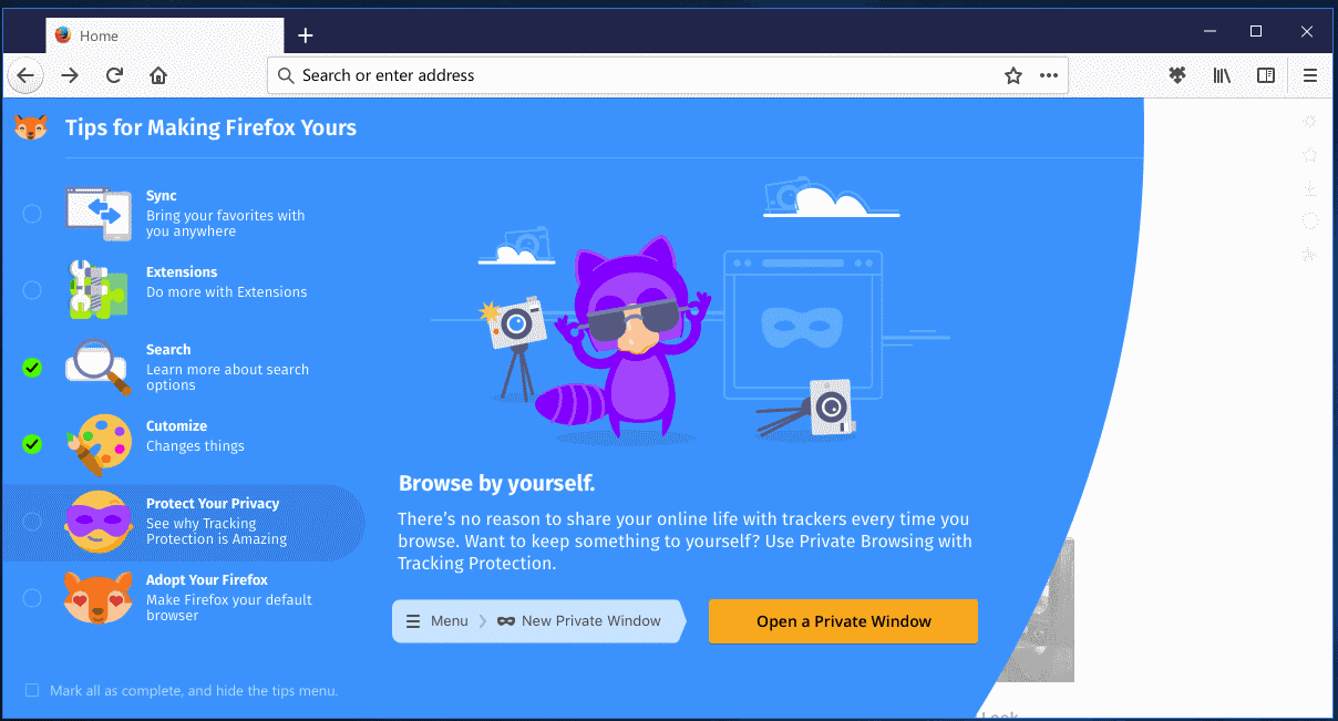
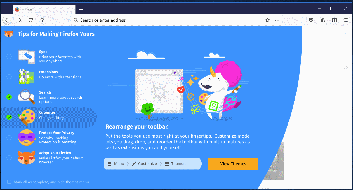
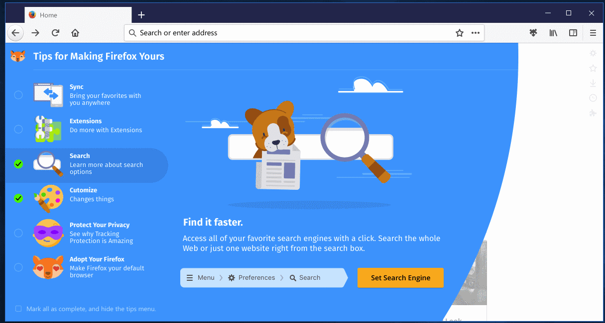
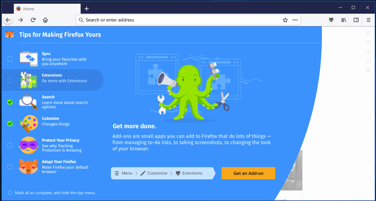
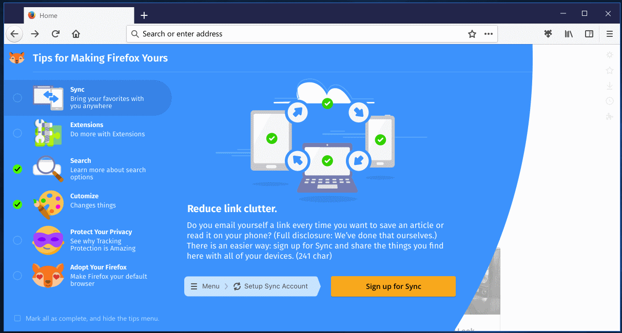
You may check the "mark all as complete, and hide the tips menu" box to hide it on the about:home page.
What's the three-dots menu used for in the address bar? That was a question that I heard more than once after I published the first mockup screenshot last week.
Another mockup, this time on Bugzilla, answers that question.
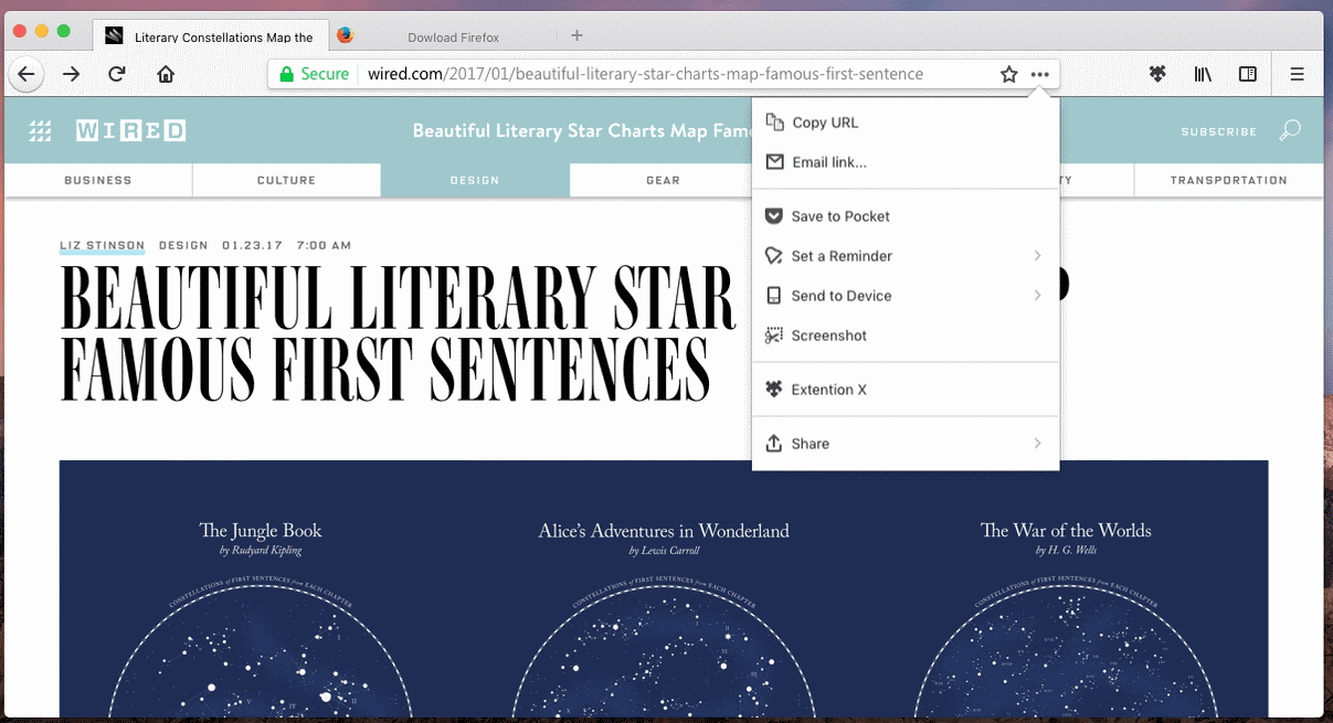
The menu is divided into four sections in the mockup. The first lists copy URL and email link options; these are self-explanatory and don't need further explanation.
The second group lists options to save the page to Pocket (Mozilla acquired Pocket some time ago), to set a reminder, to send the page to another device, and to take a screenshot.
It is unclear right now what "set a reminder" does. It resembles the Snooze Tab Test Pilot project which allows you to hide a tab for a time period.
The third group shows a placeholder for extension entries, and the fourth the share functionality.
All that is been revealed right now is what you see. Information on customization options, for instance removal of options not needed, are not available right now.
Mozilla published several videos highlighting new animations that the organization plans to launch in Firefox 57 for opening closing the arrow panels, downloads, bookmarks, session restore, and awesome bar. (via Sören Hentzschel)
Now You: What's your impression of Photon so far?







Just downgraded from Firefox Quantum and disabled updates. This interface is beyond revolting. It’s totally unusable and insulting to any moderately competent user. Mozilla’s designers should be fired on the spot.
Firefox was my favorite web browser since I first found it on a CD (included in a computer magazine / y2005) because of it’s usefulness and well organized classic(!) GUI…
In the last years the developers were changing the classic design to the idiotic (semi?)mobile look.
Mozilla/Firefox goes on the way of Microsoft (Win10), Ubuntu (Unity/Gnome 3), Google (Android) and some others wasting the space on the screen and sucking the power of the computer.
Nowadays the developers(?) (they like to call themselves software-engineers) are going on a shameful way: a single calculator (with gui) using the four base operations are cca. 7-14MB (7.000.000 to 14.000.000 bytes) because of a lot of totally unused/unneeded code and resources built in them. The same software back in y2000 was only 130 kB (130.000 bytes).
Chrome fans kills Firefox -> another Chrome clone (who need it?)
This is a copy of EDGE, OPERA & SAFARI…
La barra centrada es horrible, para tabletas vale, pero en pc queremos que ocupe todo el espacio!!
Pathetic. Just when you thought they couldn’t get much dumber, they switch stupidity into overdrive. I am of the opinion that google performed a zerg-like infestation of mozilla through cash donations and ‘summer of code’ indoctrinations. Now they want to dumb down the whole world to the level of a mentally challenged 5 year old.
Then there is the ‘we hold your data’ crap, where everything is gradually being taken out of hands and out of our control. The ‘its too dangerous for you have root/admin rights’, you must update constantly or security hazard!! (even though the greatest security failures in history occurred VIA update mechanisms).
Our power and freedom is being steadily chopped away, slice by tiny slice (known as salami tactics), so slowly that most just accept it and move on. This is yet another slice off the salami and there is not much left for them to take away. Every time they do this they lose users, they know they will lose users and they do it anyway, which looks like a deliberate attempt to drive everyone onto chrome. Then we have to register with the google app store, then they have all our details and can track everything we do and decide what we are allowed to see.
I hate it. I never asked for it, and I want it gone. Does anybody know how to get rid of it? If you do, please tell me. I’ve never had a single problem with Firefox until now, and I’ve had Firefox since I was 10 (my parents had Firefox on their old computer).
hello all, this is a great website. if someone wants to try my theme for firefox, really compact style, here are:
https://userstyles.org/styles/119951/firefox-australis-fixed-squared-tiny
They feel as if they arent “innovating” something then they are failing as browser devs. THAT’S BS.
How can anyone honestly sit down at a table and agree this is what people want? Who else here in this comment section hates this? Can someone explain to me like i just got outta high school and got a job at Mozilla.
Honestly this new UI is synonymous with the cell phone version Firefox browser. You know what I blame …Windows 8 and the whole “metro” bullshit and “touch screens” like does anyone else agree that the peripheral “a mouse” will never die out not even in 50 years” this pisses me off to no end. Also whats with the icons on the right going down the side? ANNND the three dot menu crap so useless i mean come one who doesnt know about ctrl c ctrl v a url link?
To sum it all up Mozilla…take it from your power user base here on GHacks…
“change does not equal improvement”
I hope the UI/UX designers responsible for Photon don’t read these comments. Even if there’s any constructive input to be gleaned from this comment section, you’d have to wade through too much insulting, hateful (not to mention downright crazy) garbage for it to be worth the effort.
Speaking as a designer and long-time Firefox user, I’m happy with these mockups. There are some minor issues, but overall it’s clean and unobtrusive, exactly what you’d want the out-of-the-box default for a web browser to be. As always, everyone who is upset about the minimalist approach, missing features and things being “dumbed down” are more than welcome to pop in a theme or over-complicate their UI with as many extensions as they please.
Great job, Photon team! Keep up the good work! I’m looking forward to this update.
Dear Ryan,
Palemoon 27.2.2. i.imgur.com/iLtnYAm.png
As you can see Photon is a DOWNGRADE from this, breaking everything pretty much.
Because you are satisfied with your current mockup does not make you correct about MINE.
You call issues minor, this is FACTUALLY INCORRECT and furthermore, you know it is, or else you have chosen to ignore my (and others) issues straight up.
Just cause you are designer who is recognized don’t mean I (and others) don’t design and HACK too. I choose to NOT have a website since the NDAA 2012 Jan 1st. see..
What I can’t do is control the direction of the browser politically/financially.
You talk about popping things in which don’t exist. VAPOR.
There’s nothing complicated about not wanting insurance company spies (and others) to suck up your data, to be exploited against you financially.
I don’t care what the UI/UX designers responsible for Photon do since they certainly don’t care what I care about. You can say they are right, but that does not make you correct.
Customization and features should be part of the core program and not only available over extensions.
Simple users like you do nothing than insult power users. Same as Mozilla does.
Also Mozilla was the first to offend people, so all the harsh feedback Mozilla and their annoying new corporate identity and corporate design/branding team (UI should only be in a limited way being customizable as it is a trademark which should be recognizable and distinctive) is receiving today are more than valid.
atrocious.
hope waterfox is able to stay the course, swapped to it last week and liking it.
Advertising using children should be prohibited. With photon Mozilla finally shows its true face.
I really do not know what planet you lot are on https://image.ibb.co/kpCAov/modern.png looks like something from win95. How dam old are you well I’m 70 and love the new direction desktops etc are going firefox as well, it lost a lot of ground to the chrome browser why it tried to stay retro to long chrome jumped in with what a majority of users want.
mandog,
First of all answering no, doesn’t grant you authority, nor mean you can just ignore others who chose to do so.
do you code? or compile your browser?
do you have eye problems?
do you use proxies?
do you use userscripts?
do you use full themes?
do you use addons, extensions, or plugins? (we are lumping the pile together here)
do you edit UserChrome.css?
DO you personally hack any addons? (like in palemoon I have to edit them)
do you use tor to REACH blocked sites?
Do you have HEALTH insurance? How about telling world + dog your A1C . Better Pray you aint’ got type II cause your insurance is about to RISE fool. Why cause you let your data be tracked by stupid. But see with TOR or a proxy that stupid medical website can’t say a thing about me since they DON’T KNOW WHO I AM.
Do you use torbutton?
do you use different user agents?
do you block websites?
do you use hosts, iptables and squid on more than one box along with umatix, ublock, abl, abe, abp (whichevers’)
do you scrapbook important data for more than 5 years? Ham radio stuff I do. Electronics stuff I do.
There are more important things than DRAFTS and SPEED.
Picture speak volumes.
Show us your wonderful version of your browser.
I showed you mine
i.imgur.com/iLtnYAm.png
and explained SOME of it’s CAPABILITIES and the WHY the need for.
All I hear from you is I Complain too much.
I hate to break the news, The majority of users are STUPID and NOT CORRECT.
I hope I reach 70. I had a heart attack at 52- I am not 54 and kicking butt, I totally reversed things, starting with my nutrition, and that has been helped by SCRAPBOOK saving recepies which are CARDIO friendly, and much other health information as I got off of DAPT and rebuilt my circulatory system so I don’t get stuck in OBAMACARE!!! so the browser is like Partially LIFE and DEATH to me. Certainly I am getting better about such things as health, but I can’t remember everything. So I scrapbook. I use TOR to hide from Medical data SPIES. Look at Blue shield, and VA, and OPM theres where the security problem is, NOT IN MY BROWSER!
Firefox lost ground because Google is a monopoly plain and simple. Just like Microsoft was in the 90’s-2000’s, History repeats itself. Look at the fucking numbers, The 1st and 2nd most popular websites are owned by Google and most users are coerced into downloading Chrome.
The current heads behind Mozilla are delusional dolts who willingly alienate a ton of developers and users by dumbing down the addons system and copying Chrome UI. For the average user there’s really no point to use Firefox over Chrome and power users like myself are left holding onto an aging legacy that mozilla doesn’t wont any part of. Hurts me to say this but I hope the current Mozilla crashes and burns and a “Phoenix” (original Firefox name) rises from the ashes.
PS; I just discovered there’s already an android browser called “Phoenix”, and it’s owned by a Chinese company. God damn do I need to take a vacation from the internet.
Just switch to SeoMOnkey and i love it 140MB in ram faster than Firefox 64bit, ublock working :) and beautiful theme Modern form netscape :)
https://image.ibb.co/kpCAov/modern.png
I see a single plus compared to Australis: the tabs borders are not at a 45 degree angle anymore. Other than that, it’s bad.
Why is the URL bar so short? I often edit links there to cut out tracking extensions and the shorter the bar the more scrolling I do.
Why is the reload button on the left and the shrink/enlarge/close section on the right? If you want to implement MacOS/Unity UI, do it globally
Why is the top bar so thick?
I’m almost tempted to submit a screenshot of my current setup for consideration….
always a hoot to read the comments….a great group of people!! i have been on Pale Moon for a couple years and its been just soooo relaxing. The changes are slow and well-thought-out and 95% are agreeable with me. I dont need to be cutting edge and have to constantly learn changes just to stay in place. the flat, ugly interface of firefox and chrome turned me off. i guess lots of people like flat and ugly but its just not for me. I can customize Pale Moon easily and have not found any sites that have a problem with it. Its plenty fast for me and milliseconds mean little. I like to have a nice looking browser with a nice skin and tabs on bottom and a separate search bar. works great on my win7 and linux mint dual boot. everyone have a great day!!
honestly I do like palemoon and use it for some specific stuff, for majority of stuff use waterfox now.
both devs and platforms are very useful now chrome…ooops I mean firefox…has decided pastels are the wave of their short future..
It should be called Firefox Edge i guess.
Everything Ok without me except Search bar. I can’t imagine a life without it. I use it with about:config setting “browser.search.openintab”. It keeps me the current tab and search result in other tab instead of open a new tab and search
What to say… an ui designed for the most simple and most minimalist loving users. And another prove that Mozilla only supports Chrome user’s and mimimalist user’s needs.
How pathetic!
Nothing’s perfect!
I actually like the UI in Photon, it looks more minimalist than the last one, I’m sure it won’t be as snappy as firefox once was, but at least it has a look that I’d like to use every day!
Seems, Firefox 57 will be designed for quite young children and all those adults, who have never left that age in mind. Infantile Mozilla.
It looks like Donald Trump created that interface. It’s impossible to say anything worse about anything.
I don’t think you have a clue who your user is or what they want from a browser. You want to steal Chrome users. Good luck! Firefox users want configurable browsers and landed on Firefox for its configurability. I have to think you are out of feet to shoot.
Please let us know when the wake will be held for 57. I’ll attend.
If it’s not broken, don’t fix it!
I have no idea why anyone is complaining here, but I am not seeing any appreciable differences besides a new icon theme and a sligtly different default layout, and it’s not that hard to install a layout theme of your choice. The three dots are a nice touch though. I’m more interested in seeing Servo though, and perhaps GNOME’s Epiphany shipping the Servo engine instead of GtkWebkit.
I’m quitting Firefox with version 56. I’ve used it since it was 1.5. I don’t like where it’s going and I’m studying Vivaldi as a replacement. I don’t like chrome cores, but Vivaldi seems to be O.K. and it’s security rating is high.
It’ll be a cold day in H3ll before cartoons tell me how to use a browser.
“What’s your impression of Photon so far?”
“Photon”: Not everyone can be Einstein apparently.
> Ridiculous, I go back to make sand castles..
I actually don’t mind the new UI, and if you think about it, it’s a smart design decision. When firefox releases servo, if they have a shiny new interface to go along with it, ff will seem new and fast whereas if they launched just servo, most users who do not even comprehend what servo is will not notice any difference in speed despite it actually being faster. This imo, is the only way to bring new people over and keep existing users. Power-users will of course be disappointed but that is not their target audience (since australus)
Firefox 57 (for desktop) and Firefox 57 for Android are going to be almost identical.
I’m shocked. This shows Mozilla doesn’t care about mouse/keyboard/power users. Everything must be adapted for touch and dumbed down.
Every company is developing Mobile First. That’s the right thing to do because that’s where the users are. You’re all living in a mindset where the PC reigns supreme (actually, so do I, but I don’t delude myself into thinking that PCs are still as important than mobile – they’re NOT).
As long as it “functions” and “works” on a desktop, that’s all that matters. If you can develop for mobile and then work upwards using a single codebase, why wouldn’t you? Android and iOS can do real work nowadays with bluetooth keyboards an the like. That’s where users are, not on PCs.
So:
1) The back/forward buttons are separated from the location bar again. Yay! And both are present all the time, instead of that stupid auto-hide feature.
2) The reload button is back on the left side next to the back/forward buttons. Thank god! Whatever retarded numskull decided that it was a good idea to put it all the way on the other side of the fucking screen (and inside the location bar, so half the size of the other buttons) should be shot.
3) The bookmark star is back inside the location bar. Again, yay! Someone realized that putting it as a separate button outside the location bar (and bonded with the dropdown menu) was stupid. While I didn’t care much for the bookmark star when it first showed up, I now find it quite useful, but only when it’s given proper locality to the object being referenced — the site URL.
4) The â‹…â‹…â‹… menu seems good. A number of commands local to the URL of the page you’re viewing. If they hadn’t already created the bookmark star, I’d expect it to have an entry for bookmarking the current page as well. It makes sense. The screenshot command is a particularly nice addition, assuming it’s the version that creates a screenshot of the *entire* page you’re viewing, not just the bits that are showing on the screen. (Said command is available from the developer tools command line right now.) The rest of the commands make sense.
Edit: Extra bonus: it avoids the problem of a proliferation of stupid icons in the location bar that no one wants. You don’t want reader + share + send email link + send to device + screenshot + whatever else cluttering up the bar, so this is a great space saver.
5) The combined search/location bar (given the text shown in the empty space) is making me wary. As I noted in the last post on this, UX designers have a hate-boner for a separate search bar, so mockups never include them. And I can also understand many people not needing the separate search bar. The real question is whether the system can actually handle those who actually do need and use the extra functionality it provides, if they try to merge it. Luckily, I haven’t heard any rumors about it being removed.
6) The tutorial is the tutorial. Such things are always goofy and childish, so who cares. Skip past it and forget it exists.
Overall, it undoes some of the really stupid decisions from Australis, so that makes me happy. The new location bar menu seems useful, and the other unknown icons are the usual bit that you can customize away if you don’t want them. I’d say they’re actually doing a good job this time.
My guess for “Set a Reminder” is for things like auction sites, so that the tab will automatically open, or you will get a notification to open the tab at the given time, or to temporarily bookmark threads that you are interested in on social media sites, to come back and see more comments later, for sites that don’t offer a good notification system.
I think you guys are being way too harsh on the visual appearance. Some of your criticisms are reasonable and may even help Mozilla in the design process. But I get the feeling most of you are just sore about Change ™.
Honestly, I think the UI looks “ok” – not spectacular but at least not terrible. Is it annoyingly predictable in it’s Microsoftesque ways? Yes. Do I care? Not much.
What will really matter to me is the FUNCTIONALITY:
Will I be able to access the features I want without going through a dozen clicks? (Will I be able to access the features I want…?) Will I be bombarded by annoying Mozilla advertisements? Will the menu items be narrow enough to leave me with some usable screen space on my 13″ laptop? Will Mozilla sacrifice user privacy? etc. etc. These are the things that will make or break Firefox 57.
Final thought (I can’t resist): Square tabs!!!!! LOL. How many years have we been moaning about Australis?
Just cause you think your right, does not make you right.
Seriously there is a war going on here, a slow motion destruction of User control if “WE” ever even had it to begin with. Where mozilla wants to push their mobile UI interface, “speed” and the latest drafts being pushed (aren’t these just excuses for arrogant politics deciding the way forward–granted security issues but even these are being BLOWN out of proportion, much stuff can be thrown OUT like POCKET), other people want to be productive and not have constant interruptions with this constant flow of “broken new drafts” which destroy addons and customizations, which are not so apparent to the lowly user who isn’t adept to browser hacking or addons. (most people I noticed don’t know addons, extensions, plugins, Userscripts, UserChrome.css, or full themes, –so mozilla is targeted at “most people” but that doesn’t make MOZILLA right either.)
But this problem has BEEN around since the 90’s as far as I look back with NETSCAPE 3.04g PANZER (yeah you need the wayback for that) it basically hex edits the BUTTONS in netscape 3.04 so you can set them to meaningful things. So there have been a war going here for MANY years now. Basically I have a mirror of my addons locally with EVERY VERSION downloaded. So I Can try that Seamonkey or old FF 3.xx
Since this war started. I’ve learned to compile Palemoon. That’s a big jump I would say. Can I patch for Security — Bzzzzt not… Still though something uplifting about compiling your own–even if all I do is hack away at other peoples existing code.
But at the end of the day I am still just a dummy. I just don’t like being told my Proxy don’t work, or my Scrapbook images are gone or my bookmarks format has been MUNGED into garbage that only GREP , and much time in your favorite Text Editor can clean again. Many more unscheduled maintenance problems from the UPDATES over the years, usually when such things pop up I take it as a personal challenge to put my middle finger right up into the FACE of their decisions.
Consider scrapbooking information for a HEART patient, then getting a nice update that wipes your data. (did I mention I had a heart attack? Yeah well. SO these decisions actually can possibly cause death. Not for me cause I don’t put up with these broken update b******* I am just saying. I have the last to rollback to, because I learned to CLONE my kit at every level I can afford financially and time wise–drive space for copying isn’t a problem these days.)
They may be winning, but they are certainly loosing.
Not keen on look but i guess is okay…
just hoping it allows a bookmarks toolbar with small icons …. I know that takes screen space but it works for me really well without having to rummage menus
I mouse around right handed, so would prefer that reload on the right hand side of the address bar, along with rest of tool icons… we also tend to scan screens in a Z sweep, so having address bar on left fits with that… be nice if it gave the option to position left/right/centre for address bar… so that we could decide ourselves?
hopefully customise will allow for all that
And just like in australis, they insist on the tabless background tabs design!!!…
Cute icons for 10-year old girls. Now can we have the adult version, please ? And while you’re at it, get rid of the smart-alec “jokes” which adorn the home page of the present Firefox edition. They obvisouly come from the same Mozilla department of “We are stupid and childish, and we think our users are like us”.
Your post is a bit harsh but Mozilla deserves MUCH harsher comments. I agree with you 100%. :(
Apart from it being ugly, I do see they finally are putting the navigation buttons grouped together again, instead of having reload/stop glued into the address bar.
That’s literally the ONLY positive thing I see happening here. otherwise it just looks terrible.
Hi Martin thanks for this lovely article.
Lets see how this is implemented and if they are flexible and allow changes that user want’s so see and have.
Do you know when a testing build to try will be made available so can file bug.
Martin the new preference page you wrote about a few weeks ago is live bug feels incomplete, could you update the article and re-post it in the homepage? Most sites do this to let users know about additional stuff and not skip or re write another post(betanews? neowin?)
This design is brought to you by the same Left-lib & LGBT crowd who forced Brendan eich to resign.
Enjoy the new mozilla guys :)
Guess why I’m mostly on Brave now? Thanks Brendan!
If I’m to use a browser with simplistic UI, I might as well use Chrome since it performs much better than Firefox.
I just got used to Australis, recently and now they want to tinker with it more? Sigh.
And who needs this crap? Why is there so much wasted space above the tab? Why is there so much space wasted left of the tab? Why is th address bar so high?
But hey at least it’s FF so we can change this shit back with addo – oh wait. Thank you Mozilla.
GRUESOME
Checked Netmarketshare, Statcounter and W3Counter for February 2017, in 2 of them Edge and IE out number Firefox. FF is approaching dead end land and in November the downward trend likely accelerates. Before too long it will be niche territory and niche products should not copy/simplify but should be bold and risk takers
Why does it look like it is aimed at kids?!
Because it is :) It represents what mozilla is thinking about users.
This UI is almoust copy of chrome and opera :D
My impression is that this is freaking awful.
Reminds me of Microsoft Metro / Modern which I just hate.
The only good thing about this is that I have time until November to find alternatives and escape this.
I quite like it! Has a lot of potential.
Cute. Can you imagine if these people were designing aircraft cockpit controls. “Let’s see, does the pink teddy bear
mean up or down?”
So, after years of experience developing web browsers, this pathetic child-like effort is the best Mozilla can come up with?
How much dumber can they make it?
much much much more as the days go on untill they shut down the whole firefox browser project or call it something else that “isnt” Firefox/
Hate the narrow, location/search merged toolbar item.
The rest isn’t new/news.
Are they trying to copy microsoft edge UI?
The design follows Mozilla’s typical attitude today, catering to the simple users. Everything that looks even remotely advanced or customizable has to go. No difference to Chrome, Edge, Opera, and Safari at all. Pale Moon and Vivaldi will be the power user browsers of the future, I can tell you that. This interface is a badly designed, childish looking shadow of what Firefox once was. Everyone still supporting Mozilla should reconsider now.
Waiting for a certain someone to do damage control here…
Vivaldi is a disgusting Chromium based browser. Pale Moon is ok but it gets more and more outdated as time is moving forward.
Otter-Browser with the new Annulen webkit fork is the best option on my opinion. Supporting Chromium is supporting Google’s dominance. And no matter if Vivaldi has unique features, using a Chromium based browser is what no one should do.
Even Edge or IE 11 should be used before even thinking of using a Chromium based browser….
@Lord Lestat, I don’t know what “people” means. I know individuals. My opinion is that maybe 1% of us all is as or is close to what you describe, that another percent is close to the heavens, and that the remaining are neither evil nor angels, or both, alternatively or not, depending on several parameters.
What I’m absolutely convinced of is that hating hatred is more than a paradox : it’s incoherent. You’ve got to break the vicious circle and the only way to do that is to keep on lovin’, always and always. There is no alternative. Doesn’t mean you have to be a sucker.
Anyway….
Instead of applying logical, honorable and above all, morally superior beliefs (for this, one must be willing to use the brain instead of the stomach) the so-called intelligent human is only following his ego and resulting out of it – an extremely selfish and uncaring reality is hitting all the one’s around him.
And this leads in combination with many other puzzle-pieces into the discrimination of other products or competitors, the destruction of the environment by unscrupulous cold-blooded and abominable habitat-executors and the exploitation of fellow human beings and even disgusting child labor.
People and their abominable pseudo-order couldn’t be more repugnant or more damnable.
This world and its selfish, arrogant and omnimpotent inhabitants are simply pitiful in the best and despicable in the worst of all possible cases!
Appster and you make the mistake to think that stuff like that – http://beta.html5test.com is the same like that here – http://kangax.github.io/compat-table/es6
ECMA script section is what counts, not HTML5. Check out the differences of supported drafts and standards in the ES6 section and in the one afterwards of Pale Moon and Chrome.
The Pale Moon project has the issue they can’t just port forward that terrible – yet necessary – new drafts and standards. If you can’t support the latest of that shinies, you are running into serious problems. And that is the reason why Pale Moon is only an acceptable browser but no real solution.
Also the concept of Brave is to insert a fair advertisement model, where you can give pages which you visit money on the long run, while you can block most ads on other pages. That concept IS good. Granted, as it is Chromium, the browser still sucks.
No, Vivaldi is still amateurish. Because Brave team manages to build a browser only with the Blink core and cherry-picked API and doing the rest on their own and Vivaldi team was only able to grab whole Chromium package and hide elements they do not want and build over the whole Chromium skeleton their browser. This is amateurish. Same way as Classic Theme Restorere is amateurish.
Ok, in one point i can agree with you, that Open Source is not a 100% solution, but still it should be taken into account when possible.
Also i would more say Google Chrome is the new IE. Pushing standards and drafts forward which discriminates other browsers. I rather would use Safari before i would use Chrome btw.
Using Chrome/Chromium is openly supporting a mono-culture which inflicts discrimination! Google crap should not be used at all. Because Google (and Mozilla) are the mortal enemies of the free web. And because most people are ignorants and do not care we are in the situation like now where a single company can influence what other companies implement or how they destroy their own products to become similar.
Linux is a success, VLC rocks and many other Open Source products are state of the art – there are many examples for successful projects from the Open Source sector.
@Lord Lestat: You are seriously misinformed when it comes to Pale Moon. Things like GamePad support, DRM count into the overall HTML5 score!!! Unless you are a gamer or need DRM-protected content why does it matter? Seriously, I have never encountered breaking sites using Pale Moon up until now. Claiming that a multitude of sites are broken with this browser is ridiculous really, as the current Pale Moon version is derived from Gecko 38 which is the same one Firefox 38 uses. And do sooo many sites break in Firefox 38? Of course not.
This is not to say that I don’t know or acknowledge the challenges Pale Moon is facing, given the project is in the hands of a single man. But claiming that sites are breaking with the current Pale Moon on any scale worth mentioning is totally unfounded.
Regarding Otter: Lacking MSE support is a dealbreaker to begin with. That aside, it also uses a WebKit-alike engine, so you don’t leave its sphere entirely. But Blink has changed so much when compared to WebKit that it is fair to call it a separate engine. WebKit the way Apple (the main WebKit benefactor) implements it is holding back development. Safari is the new IE6, trust me. Google split off because WebKit’s development was too slow. And on this basis the Otter browser is built? Good luck with that.
Vivaldi having a virtual UI has its reasons, there are enough write-ups by the exceptionally talented von Tetzchner (Opera founder by the way, so no “amateur” LOL). Honestly, I’ve got no problems with that as long as the final product is perfectly usable. XUL is also not native on most operating systems, and nobody ever bothered. Anyway.
IE and Edge? Have they finally got an AdBlock extension? No, thanks.
As much as I have once respected Brendan Eich Brave just doesn’t appeal to me. Seriously, a browser replacing ads woth other ads? And that is marketed as good? Again: No, thanks.
Furthermore I don’t get all this shenanigans when it comes to Open Source. Seriously, Open Source is waaaaaaay down my priority list. Is Open Source indicating an actual feature I could use? No. It’s nothing more than dogma. My priority list is along those lines:
1) standard support, performance
2) customizability
3) market adoption, support given
…
…
…
99) the shape of the bookmark star
100) Open Source
So, you got the notion. Open Source is nothing I personally need or value so much. Tell me this: Which Open Source project ever has become a widespread success? Yeah, Android. And who is behind Android? Google. The most commits actually come from Google itself and paid developers working at Samsung, Sony, Huawei etc. So, apart from this pseudo Open Source OS nothing has ever become a success. Firefox never managed to completely break IE’s dominance. Chrome would never have become a success without Google’s backing once more and so on and so forth…
Even Brave has a way brighter future as compared with Vivaldi, as that developers have more understanding of how to do things and they are way more skilled.
Also, Vivaldi is no real Open Source. Brave has an open Github account where you can post code and help them in an active way. Also Brave team is not against the implementation of customization features, only right now they have different priorities.
Still, also Brave is garbage as it is Chromium and not recommended at all. But if you REALLY have the need for a Chromium based browser, i would uninstall Vivaldi and install Brave instead, as that one offers tons of security fixes and features.
https://github.com/brave/browser-laptop
https://brave.com/
Compared with the people over at Brave, Vivaldi guys are just average skilled amateurs in all possible ways.
Otter has even more ECMA-script support than Pale Moon and gets updated with latest Webkit patches, so it becomes more and more standards compatible. Webkit, even if it QTWebkit is no obscure engine, it is the father of Google’s Blink and capable enough of standing proud on it’s own.
The only issue is that under Windows it offers no MSE video support which limits video playback a bit. Still, it is a great alternative and works very good.
https://github.com/annulen/webkit – As you see, there is much progress going on and constantly bugs are fixed and new features are going to be implented.
Also, even IE 11 and Edge are more capable than Pale Moon in terms of supported standards and drafts.
The Vivaldi crew has good ideas, that for sure. But still if there are alternatives around to Firefox and Chrome/Chromium/Chromium based browsers, people should give them a try.
Anyway, i have used Vivaldi long enough to have realized what for a garbage it is. It is a couple of css code smashed over the Google UI to hide it and it is a damn messy product. More or less between 8-10 MB bundled own code with Chromium. This is basically nothing more than Classic Theme Restorer for Firefox and like Mozilla, Google can easily pull the plug for them – Which means Bye Bye features for Vivaldi if that ever would happen.
Nothing which i would have on my harddisk!
@Lord Lestat: You know that both of us are in the same boat, but I still don’t get your hatred towards Vivaldi. Jon von Tetzchner and his team are actually listening to the users, something which can’t be said about Mozilla. They are adding features instead of removing them.
Regarding the Blink monopoly, well… Blink is already dominating 70%+ of the market, which makes it the driving force of the Internet. And this is not surprising at all, since Chrome offered vastly superior performance and standard support at the time of its inception – and continues to do so. Honestly, it doesn’t matter whether Blink has 70%, 80% or even 90% market share as long as people are content with it. Windows, MS Office, and Android are also de facto monopolies in their respective field, why bother? In general I support competition, but I think it’s too late when it comes to browsers.
Today I’d rather use a browser that suits my needs instead of being spat on by Mozilla or using buggy, non-standard compliant IE or Edge. Seriously, I have only one life and don’t want to clutter it with inconveniences if not absolutely necessary or unavoidable.
And NO, Otter and its obscure rendering engine no website maintainer has in mind is of course not an option. Have fun with non-functional, breaking websites. I will never use something that has not at least 10% market share or is derived from a product that has. Is that understood?
Ugly Win 10 look but with childish icons. I always despised the search and address bar being combined. My set up separates them. All that plus the loss of Add-ons = the end of FF on my PC. My birthday is in November. Guess I’ll be getting the newest version of Pale Moon for a present.
Terrible. What is it with UI’s and massive vertical space wasters?
I also hate vertical space wasters. They thing everyone has large 25″ screens. Everyone with a laptop has huge horizontal space and crammed vertical space.
Why is there a huge square of blank unused tab bar in the top left real estate sitting there unusued…i mean its fucking obvious, right?
I fricking hate gui designers…evidence: Windows 8/10 and many other atrocities.
Please leave Firefox alone if you cant do anything but make it worse
Tired of gui “prettiness” bullshit, are all gui developers 13 year old girls or something, GUI’s are meant to be functional, not covered in glitter….for fucks sake….
>Why is there a huge square of blank unused tab bar in the top left real estate sitting there unusued…i mean its fucking obvious, right?
They should never have gotten rid if “Hide Tab Bar with One Tab”. Bring that back. That would have taken care of that.
I’m not thrilled with the mockup either, but I don’t want a return to a butt ugly, primitive IE6 style, either. There has to be some kind of happy medium in there somewhere.
Yeah, that empty space annoys me too. But I notice in the Mac mockup the space is used for the max/min buttons. I suspect the developers have cornered themselves and are unsure how to handle Microsoft and Mac elements in their new UI.
+1 to this.
All I want is a stable, functioning, and non-RAM-hogging browser. We can find eye candies from websites, not the browser itself.
I hope this “Tips” menu won’t land in any “live” form because visually is cringeworthy – like it would be created for complete idiots or 5-10yo kids; or maybe that’s how Mozilla perceives its users nowadays?
Not mention from UI/UX point of view it’s not a real menu but some hover modal box like those you can find while browsing pages, with either suggestions on newsletter subscriptions. promotions, warning about adblockers being harmful to business/illegal/whatever-else or any other message that interrupts reading. And it also seems it has “check points” which you either have to complete otherwise you’ll be annoyed by this menu reappearing/bouncing with icon on new tab or be clever enough and check the most bottom hiding option.
Top sites, Highlights are most likely aimed at datamining with their partners, again; the shortcuts to the “most useful” browser options present on the right side just below hamburger menu are redundant, because these are placed in that menu. Spacing in main toolbar between buttons and centred address bar is way too big and I don’t like that there’s only combined address+search bar – I don’t find it as useful as regular search box and I hope it would be possible to drag it onto toolbar again. But here we are again: knowing their attitude towards customization and user control, in this vision there’s no customization at all and user is condemned to what devs consider as “tasteful” which is copying Chrome.
Also, I hope Mozilla won’t go by Microsoft stupid idea and won’t turn Firefox into ebook reader (2nd icon on right side of the window would suggest that) by integrating such feature; sure, PDF previewing is cool but let’s not turn browsers into multi purpose bloated programs like Nero Burning Rom.
One thing I do like, are the squared tabs which are way more “attractive” than current rounded one design.
Looks like a sad love-child between Chrome and Safari, and I don’t like it very much.
Reminds me of Safari. I don’t care as long as Mozilla allows a menu bar. New is not necessarily better.
Easy boy! Chrome, down boy! Good boy! Oh,no… this is Firefox! (facepalm)
Firefox going the way of Microsoft in implementing a Mobile UI in Desktop Environment.
I dont get the mentality of the developers. If you are really that lazy to code for each platform , better drop that platform , someone will pick up the torch.
Great point, Naveen. Flat, boring with plenty of wasted screen space seems to have been the fad for a while. The new generation of coders will re-discover 3D and what’s old will be new again, I hope.
I agree – This is quite ugly, I can’t imagine using such an interface for browsing…
I hope I’ll be able to keep my current browser layout [https://imgur.com/FqcHiDo] on FF57+.
Otherwise, I also will start looking to alternatives. Wait & see !
That looks just like photon with the tab bar and buttons hidden.
>That looks just like photon with the tab bar and buttons hidden.
Yeah it does, doesn’t it. It looks a little too streamlined for my tastes.
I too don’t want mobile features integrated into a desktop.
Not ugly, more like INSULTING. “Click the purple puppy if you want to feel safe. Purple puppy loves you…”
idiocracy rules the Day
Exactly. Insulting for everyone who is able to use his brain quite a bit beyond basic instincts.
Absolutely horrible. Mobile UI on desktop. I guess I’ll start moving to SeaMonkey in the upcoming months..
Yuliya.
No you are going to start moving to Palemoon in the upcoming months..
I bailed recently from FOXDIE (my all time favorite in the entirety of *fox (including palemoon cyberfox whatever to date)
Now I use this, which is a combination of…
a slightly modified global Userscript called Midnight Surfing (this is giving my Killbang wow! looks I modified it to NOT BE GLOBAL by doing individual url-prefix())
Chromeedit+ and some palemoon UserChrome.css hacking
Thread On that. – forum.palemoon.org/viewtopic.php?f=19&t=4540&sid=38bc2aec85f37c2422508f9490640adb
Darkmoon 1.6.0
i.imgur.com/iLtnYAm.png
Oh yes that’s Proxy Select/aka Proxysel still running in there.. You see it themed too?
I have SeaMonkey too but it’s not as fun.
i.imgur.com/gyrROdl.png
Yuliya what you provided in your screenshot is outdated and ugly.
This is what more demanding users want. They want more bars and more settings.
But there is one downside: It is way too bright and the yellow background from the url bar is ugly indeed. Using some nice black CSS theme override and killing that yellow would make it quite attractive!
Windows 10 is fugly. On 7 it looks good. But more importantly it’s functional, compact and customisable.
What has this mockup to do with “mobile UI”? There is nothing “mobile”, it’s a desktop UI. Please explain your comment.
As much as Yuliya’s comment was provocative, in the base of it he was not wrong. The past few years have seen a terrible direction of desktop UI development, mainly because mobile and semi-desktop (detachable tablets for example) devices have become an ever larger market. It’s only natural that other methods of interactions coupled with new modes of input would require a different UI design to get the most out of it, but I’m very disappointed to see so much of this be integrated into the desktop versions of applications.
For the life of me I cannot understand why developers want to create desktop applications that are inspired by mobile usage methods, when they are in fact more difficult and less comfortable to use with the default mouse + keyboard operation. It’s not like Mozilla is the only one who does that, so the blame cannot lie with them alone. It would be so much easier if they would separate their UI to desktop on the one side and UWP for non-traditional input methods on the other side.
Gary D, thanks for comment. Your joke about children’s book did my day!
Mozilla, if you read this, please, please you should fire your designers. Your designers are useless.
Yuliya, thank you for your excellent summary of the difference between Desktop and Mobile UIs.
Who needs Tips that look like they’ve been copied from a children’s story book ?
Any day now, we will see grinning paper clips re-appearing. Perhaps in Win 10?
>it’s a desktop UI
Hah hah, lol. You know, desktops have this awesome thing, it’s called a mouse. And this mouse has a button called click 2 or right click, it’s the same, regardless of how you call it. When you press it, it brings a neat little menu, which is called contextual menu. I know, unbelievable. You don’t need that hamburger bullshit that is on the right of the address bar. Not only that, but the menu it brings has an obscene amount of padding, eight entries take like half a laptop’s screen’s height. You call that “desktop UI”? Because I don’t, unless it’s some highschooler’s first attempt at making a UI it’s not excusable.
And the items that menu has.. “Set a reminder”? What reminder? Where?? I don’t know what desktop you’re using, but mine doesn’t have all that stuff in it. My Nexus 4 does indeed have “Reminders” functionality though, which further proves that it’s a mobile feature.
Don’t even get me started on “Tips for making Firefox yours” nonsense. I initially didn’t pay attention to the contents of those screenshots, I mostly looked at window’s chrome and was left terrified. They advertise stuff like extensions and customization. Absolutely loltastic.
This is how you do desktop UI: imgur com/a/M2N9i
I don’t need to travel kilometres with my mouse to reach from one end to the other of a menu. Australis already does it wrong, thankfully I can dodge it and not interact with it at all. But Photon tales it to a whole new level of inconvenience.