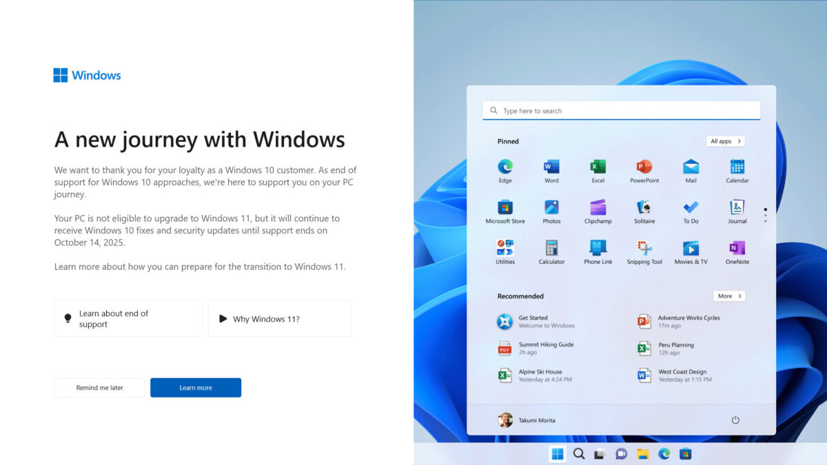
Help us test the new Ghacks theme

You have probably read about it already: we are planing to release a new theme for Ghacks soon.
Since this is a rather delicate thing to do, not only to avoid angering or irritating users of the site, but also making sure that functionality is retained, that everything loads fine, that there are not any breaking issues, and that the site will do fine SEO-wise just like before, it is important to test the new theme thoroughly before release.
I'd like to ask you to give it a try, and let me know what you think of it. Also, please let me know of any bugs or issues that you encounter, as well as improvements that you would like to see.
To test the site using the new theme, use the following URL: https://www.ghacks.net/?theme=ghacks
Please note that you need to append ?theme=ghacks manually to URLs as it is not carried over to pages that you open.
Here are four links, one to the homepage, one to an article page, one to a page, and one to a category page for your convenience:
- https://www.ghacks.net/?theme=ghacks
- https://www.ghacks.net/2017/03/09/microsoft-releases-yet-another-botched-driver/?theme=ghacks
- https://www.ghacks.net/best-chrome-extensions/?theme=ghacks
- https://www.ghacks.net/category/windows/?theme=ghacks
What I'm particularly interested in:
- If the fonts used, new article width, and other article related changes work for you.
- If a page does not load or looks problematic in one way or the other (e.g. sidebar not on the right, but below the article).
- If you encounter any issues while browsing the side, e.g. stuttering, images not displaying, comments not working properly.
- The loading time on your end (faster, slower) If slower, help us out by pressing F12, and checking the network tab of the Developer Tools to find the elements that took the longest to load.
- Your overall opinion on the theme and the change.
- If you are proficient when it comes to SEO, if you notice any issues related to that (e.g. nofollow links, robots text incorrectly configured, redirects, missing tags, bad use of headlines, aso).
Why a new theme?
You are probably wondering why I have decided to launch a new theme. We have used the old one for a couple of years now, and while it works fine, it is not suitable anymore for a number of reasons when it comes to the tech it uses.
First, it is rather heavyweight, with lots of scripts and CSS code that prolongs load times and is heavier on the resource side of things than it should be.
The new theme has been designed from the ground up, by Daniel Pataki, a former Ghacks author, to be modern in regards to technology, and super efficient when it comes to the use of images, JavaScript and CSS.
It is much leaner than the old one using fewer requests, fewer JavaScript libraries, fewer images, and the loading time should be a lot better because of this.
I wanted a theme that retains the overall feel of the site however. I know, as a user, that new designs that change everything around are not liked a lot. We tried to retain much of the look and feel of the old site.
Some things are different of course, but the changes are, in my opinion, not overly drastic or problematic.
I also wanted to move the main ad displayed underneath the title. This is an experiment right now. I don't really like the location of that ad at all. It depends however on whether the new placement for the ad -- in the rightmost header area -- works earnings wise. I'm prepared to accept a dip in earnings, but if the dip is too large, I will have to move it back to the original location.
I'd like to thank each and everyone of you who will help me test the site.
Issues that we are aware of:
- The comment form does not show up if there is no comment yet.


Looks great overall, one concern though. The content is too large. I’m on a 1920px computer screen, not on a gadget phone, so seeing more than 2 excerpts per page would be great.
How much I’m tired by these design trends: “the user is stupid, he barely can read, let’s put full-page images and 3 lines of 20px text”. You are far from this point, but let’s not deviate this way ;) Content is king, compactness serves great content. You are not fooling the user by serving garlands only, you are providing great content, show it.
I tweaked locally by reducing the thumbnails size, the title and excerpt font sizes, and some margins accordingly. And yeah, it’s much better IMHO.
i guess going from perfect to less than that is the new direction technology is going so why should your website be any different? thats why i still repair old things rather than buy the cheap crap they build today. newer is not always better…just look at Firefox to see that.
No, leave the font size exactly the same.
1. The font is to large; the old size was better; the rest is OK
2. all elements look OK
3. no problems
4. the same or faster in some cases
5. it’s a progress; the comment section is much more readable; the ‘summary’ it’s OK, but the ‘about author section’ looks wierd: it’s not different from the article layout – I suggest a different background or different font style
6. no opinion
Can we have also a dark theme? I tweaked some colors with CSS/Stylish but a native dark theme will be much better
Agreed on the font size: I’d go down 1 point. At least it’s not as large as some sites have gotten in recent years.
Rick, for both the current and probably the future ghacks.net , for Chrome: you can selectively change the colors and font by installing the extension “Change Colors”. I use my chosen preferences on other sites as well where appropriate, but certainly don’t recomend it for all domains. Combine this with the proper zoom for you.
First I will admit I do not like change, so it will be easier for me to state what I do not like about the new look than what I do.
Like everyone else said. Everything is cut off on the left which is very distracting. On the right is far too much white space, and it doesn’t make any difference whether my browser is using full screen or not. On one page it’s very nearly half. The larger print takes up too much space unnecessarily. I wonder why you chose such a humongous font. On the page about Chrome extensions, the scrolling became so tiring I gave up long before I got to the halfway point.
What do I like? Uh, well . . . I like that you took the trouble to ask us for input and that you will probably read our comments. Thanks.
First, I love the new theme. Cleans and simple, yet more professional looking than the current theme. Great job!
When viewed at the full screen width there is a lot of empty space on the right. If you could adjust the CSS to move everything over to the right you could fill some of that empty space while avoiding the truncated images that appear when not viewed at full screen width.
Again, great theme and awesome new look!
My opinions are, overall i like it. One thing is https is slower than http but i’m sure you’ll fix that.
My ideas that i think would make it better are:
1. i would like a darker background, either just a darker background or even white text on a black background. There’s a website that has a small paint brush button on the left of the website at all times and if you click on it, it expands slightly to a slider that you can adjust the theme of the website between Light, Mixed or Dark at anytime and anywhere on the website. i can tell you the website if you like, just ask, but in advance it’s a gore website so you’ll eventually see some things that you might be squeamish to. Just use an ad-blocker because i think there’s pop ups. Hate to bring this up but i thought you might like to see the slider in action.
2. Don’t crop off the image on the left. Show the whole image and you also have plenty of space to the right.
3. Let us pick to subscribe to all comments or just replies when we post our comments but you already fixed that for us !
I like it but the content width is reduced = more scrolling also is there a reason why you use Google Analytics over Piwik?
On https://www.ghacks.net/support/?theme=ghacks the donate button is huge and pixelated.
I do like the new theme but the one thing I don’t like about it is the color scheme. The current color scheme is much better on the eyes for me.
Greater contrast between text colour and background please the light grey text is quite difficult to read in subdued lighting.
Very clean theme and still familiar – I liked it a lot.
I also get truncated images on the left and a lot of white space on the right, using cyberfox and also on chrome.
At my age I need to increase the font size. When I do, I cut off half of the illustrations on the left margin. Otherwise, things are looking good. I am an constant reader who does not contribute because I currently reside in Venezuela (no legal currency exchange), but this will change when I move to the U.S. in a few months. Keep up the good work.
I like it, looks good.
Just make sure that the site still functions withough javascript enabled.
Cutting off half an image is a pointless gimmick which confuses people and removes potentially useful information. Quality is the greater virtue, not originality. In graphic design we strive for beauty, legibility and a layout that facilitates effective communication.
Narrow layouts are a constant irritant for those of us who primarily use big desktop monitors rather than phones, smart watches, rings or dermal implants! ;)
Count me in with @Jozsef.
I do not like the Preview half image. To me, it makes me think that I have something wrong with my browser.
Checkboxes on https://www.ghacks.net/ghacksnet-feed-list/?theme=ghacks under “Sign-Up To Our Free Newsletters!” don’t work for me. I just see white boxes. No tick marks.
how many years did this take to make? 😂
… well it sure look a hell lot like the old one
I like it
The new homepage only shows half the picture next to the article title for me.
I do not like the new theme.
It is way too monochromatic.
You have basically 2 colors: white, dark gray, black (which in design is often considered as 1 color depending on its application as you have done in the new theme) and then 3 VERY slight orange accents (color #2) via your logo, the search button, and external link colors.
Most designers will tell you this is not enough. Unless you are going for a very specific style of ascetic aesthetic your page reads very spartan because of the color distribution on the page.
The dark grey bar at the top (which is the only place it’s used) makes the page feel top heavy. The blank dark grey also accentuates that it is completely wasted space making the page feel even more spartan.
The toolbar has much improved visibility.
Your article title font weight doesn’t hold up to the heaviness of the dark grey bar. Increasing the font size of the body’s text without increasing the weight has also increased the amount of white space on the page by increasing the blank surface area around each letter and by lengthening the page. Simply put, there is now a disproportionate amount of white to black and the page feels more tedious to read.
The orange accents comprise less than 1% of all the non-neutral color of the new theme – so essentially your new theme is black & white. Once I scroll down 3 lines and the header is gone from view, your brand identity is lost – I could be on any basic information website. This is in stark contrast to the current theme where the subtle but omnipresent creamsicle background always reassures me I’m reading ghacks.
The gray backgrounds for each individual comment feels way too light. My eye is focusing on the glaring orange reply button to define the space for each individual comment rather than the separate gray background boxes.
I like clean and uncluttered but I think the new theme has gone overboard.
Recommendations:
1) Move the search bar back to the right side of the title bar.
2) Increase the weight of the title font. Change the body text size back to current theme size or increase it’s weight. I vote for smaller size because your articles are not typically short and i’m having to scroll ALOT just to skim for content.
3) Incorporate ghacks signature color more into the main body somewhere. Maybe a small margin running down the left side? or maybe the background of the table right of the main body?
4) Make the comment backgrounds darker. use “creamsicle” for the reply buttons. The focus should be on the comments, not the button.
Hope this helps – I appreciate that you are trying to improve.
Generally I like the “cleanness” of the new theme. Nicely done Daniel Pataki!
Will you allow me to make an unsolicited suggestion? :)
Right now there is a checkbox under the comment entry box to “Notify me of followup comments”. This will email the user every time a comment is posted. Is it possible to turn this checkbox into a radio button, adding a second option to “Notify me only of responses to my own comments”? This feature is available in the user subscription page but not on the article pages themselves. With really popular articles, the comment section sometimes becomes so busy that you’ll get dozens of email notifications and it quickly becomes overwhelming.
@Jason – i’ve been meaning to ask Martin about this for awhile now, but haven’t. i didn’t know if it would be to much trouble for him to do something about it. But hell yeah, “quick service” !
Jason, I just checked and the only option is a menu. I have enabled it now. The default is not to subscribe, but you can select to subscribe to all comments, or only replies to yours.
Now that’s what I call quick service! Thanks, it’s great.
Does not respect vertical bars, using All-in-One Sidebar the images at the left are not fully displayed + so much white space at the right: https://postimg.org/image/w0upyhshd/ And yes I came back to http, https is too sloow.
why do images for articles appear cropped?
in vivaldi (1.7.735.46 (Stable channel) (64-bit)) with the bookmarks bar open i see 1/2 and image, close bookmarks bar closed, and image still appears cropped but can see more of it.
just looks weird
neil
http://imgur.com/a/chFbK
off-centered here
FF52 Win10
Need a dark theme. Period.
Ever try reading dark text on a thin piece of white paper with an intensely bright light behind it? That’s what your typical webpage looks like, except now so many sites are trying to make the text thinner and lighter and even more difficult to read (because it’s “fashionable”?). It’s much, MUCH easier to see and read light text on a dark background.
Hi Martin,
In Waterfox – Opening the Bookmarks sidebar clips the article images on the left. In other words, the page does not center correctly with the sidebar open. Could be a browser glitch, but I have not seen this behavior before on any other sites. I can resize the sidebar (narrower) to eliminate this problem. The page is shifted off-center to the left.
In IE11 – No article images are displayed. I have no blockers installed. Oops! Refreshing the page (F5) brought up the images. Pinning the favorites bar to the left clips the article images (much worse than in Waterfox). I can resize the sidebar (narrower) to eliminate this problem. The page is shifted off-center to the left.
In Edge – Works perfectly except for the off-center display.
In all three browsers the page is rendered way to the left. Maybe one inch left margin compared to maybe four inch right margin. My monitors are 23″ diagonal.
It loads quickly at my end. Nice, clean layout. I like it! :-)
Richard
The half-crop preview thumbnails are really bad because:
– It makes the page extremely unbalanced if the sidebar isn’t flush with the right edge (which needs to be done imo)
– It’s not obvious that the cropping is intentional, or whether there is more detail in the thumbnail image. (Once I realized that it was only half a thumbnail, I tried hovering over it in the hopes that it would slide into view, which didn’t work.)
– The right half of the thumbnail is often useless: just look at the one for “Microsoft releases yet another botched driver” which only has two lines of unreadable text. Text in these thumbnails is important, and the vertical format makes it hard to get useful thumbnails.
– Their placement (floating along the left edge with no visual connection or consistent alignment to the title/blurb) means it’s possible to mistake them for ads.
(There are also super-shrunk thumbnails (scroll down the Windows category page) which are even more pointless. If you’re making thumbnails at this size, you may need to do the cropping and resizing manually.)
overall I like it however everything is pushed way left and make everything off center. I tend to want to scroll left to get the full image.
Same issues as described above;
Too much white space to the right
Preview picture cropped off to the left
Looks good Martin, I like it. But…as previously mentioned, the homepage has the elements on the left edge that are being cut off. I’m using a Dell 24″ 1920×1200 monitor and all of my browsers are being used not maximized. I have the width set to 1640px which still gives me empty space on the sides of every webpage that I can remember visiting on any website and most pages are configured with a 105-110% zoom. Also seeing the same thing with Chrome. The article page looks fine:
New theme: https://postimg.org/image/l3cb8lm35/
Old theme: https://postimg.org/image/dt01ugacp/
I do not like that the left side of the screen appears chopped off. On some pages it appears that far too much of the right side of the screen is blank but could have been used to extend text to the right (maybe, but I don’t really understand whether this is possible) to reduce the number of lines of text.
My monitor is 10″ X 17″ running at 1600 x 900. Running current (GA) levels of Chrome, Firefox, Edge and IE11 on current (GA) W10 64bit Home desktop PC.
For those wanting a dark theme for gHacks, see the following link.
https://userstyles.org/styles/139395/simple-modern-dark-ghacks-2017
You need to be using the stylish addon for the browser (Chrome, Firefox, Pale Moon, other?).
The change is impressive.
Stylish on Chrome at your own risk:
https://www.ghacks.net/2017/01/04/major-stylish-add-on-changes-in-regards-to-privacy/
Next best option for a stylish fork on chrome/Opera/Vivaldi with none of the new privacy issues, is ‘Stylus’, look it up. Even has the backup styles and restore option.
https://chrome.google.com/webstore/detail/stylus/clngdbkpkpeebahjckkjfobafhncgmne
Thank You! I’m not a fan of the green and will change it but much appreciated!
Thank you!
Looks good to me. Please remember to keep the font black and not light faded gray. It makes it much easyer for us old folks that need readers to see small text.
I don’t use my browser (opera Developer) full screen, so the images on the left…are only half shown. If I use the browser full screen, all is OK. As soon as I return it to it’s ‘normal’ size..the images are half shown again
I have a wide screen (using 1680×1050). On Chrome, the main page leaves a lot of wasted space on the right. The central column (the articles) should be wider (dynamic?) to compensate for this.
I’d get rid of the images.
Just my 2 cents.
Looks good. Although the images on the left-hand side of the page are cut off if you use browser scaling. Here’s a screenshot with browser scaling set to 125%:
https://s3.postimg.org/wdv5yre2p/Untitled.png
NB: They look cut off in the article screenshot too.
reTim : yes– mine are the same set on 1440 x 900 [cut off]
.
On https://www.ghacks.net/category/windows/?theme=ghacks everything is to the left too far. Only half of the images that scroll down the left-hand side are shown. I’m on an HP laptop, screen resolution is 1366×768, windows 10, Chrome x64 up to date. I see this problem also occurs when I use MS Edge. Also, I JUST installed Firefox x64 specifically for this article, and everything is still TOO FAR LEFT.
http://kjvdaily.com/ghacks1.jpg
http://kjvdaily.com/ghacks2.jpg
With everything to the left, only partially visible, I would not continue to use the site.
I agree. The half-shown thumbnails are annoying, not so much that I would leave the site, but they’re bad.
The preview thumbnails are designed to show up this way. We may reconsider it if it proves to be too unpopular or confusing.
I would agree with others about the screenshots looking cut off and too far left. It looks ugly that way. I DO however like the larger font and screen shots.
My only suggestions would be to move everything to the right a bit and perhaps use a slightly darker background.
The images are too big. It should be the headline (and snippet) that catches the eye, IMHO. Though the font doesn’t have to be that big either…
I’m sorry Martin but the use of white space on the right and the images hiding and progressively appearing on the left (depending on your screen resolution) needs to be addressed. Here at my home pc, I’ve got 2 screens 1680×1050, the other 1920×1200, and the left-handed images only fully display on the largest screen. The right-hand side of the page holds nothing but whitespace.
I can upload more screenshots if you’d like. But really, the layout needs be defined better so all things are centered.
I’m all for better fonts. The current font/color (current/old theme) is really difficult for me to read.
I find the font to be a little too large, both for the article and comments. I think maintaining the old size would be better.
Also section name and section text (I don’t know how to call it), for instance where it says:
About Martin Brinkmann
Martin Brinkmann is a journalist from Germany who founded Ghacks ..
At a quick glance it’s difficult to realise one is the title of that section. Same where it says “Responses To: Help us test the new Ghacks theme”. Maybe back to bold and lower caps would be better for its title.
For the comments section, I think the reply button should be on the lower part of the comment. Just as a quick test to see how it works I clicked Reply to a comment and the reply box appeared way bellow, just to realise that I clicked reply to the bellow comment that I initially intended.
Oh and also for comments I think you should maintain the colorisation of odd numbered ones. Even something as subtle as #F2F2F2 helps a lot for differentiating one comment (and its responses) from the other.
Overall I really like it, but as it is right now, it makes reading a little more difficult compared to the current theme.
Looks good overall, but as pointed out by others, the cutoff images on the left look wrong, and almost make me think I need to scroll left.
Maybe centre the page – a lot of wasted white space on the right.
What BD said. The images have no left margin/padding and arguably more importantly are larger height than width, why?
Clean and simple, but I would like a darker option too. I use Stylish to use darker themes on almost every website I usually visit.
PS: Since you request feedback, I noticed that the site loads slower on HTTPS. On HTTP it loads instantly, but on HTTPS it stays 2-3 seconds and then the site loads. Every time. Is it just me? It happens on every browser I tested it, all updated.
No, you’re not the only one; on https the loading time is much too long…
I have the new theme positioned to the left (0px left margin, wide margin on the right).
The background color is neat, IMO, neither too dark nor too lite. Overall first impression is positive. Having the background color fill the entire screen gives a feeling of wideness. Looks nice and comfortable.
hello, there are some things i notice, please give an email to send you some screenshots.
I also can help with speed and seo
Girgios, please use martin@ghacks.net for that. Thanks!
I like the currently active layout more than the new one, altough the current one would need some CSS edits to make to fix some paddings and change the gradient to solid on buttons and the navbar.
Maybe limit the max-width of the body on the new one and set it to the center, otherwise it tends to go too wide and “mentally confusing”
I like the new layout, except for the truncated preview images on the left, which I find annoying, but easily ignored. Tested under Windows 10 x64 Home with latest stable Chrome, Firefox, IE11, Opera, and Edge.
“which I find annoying”
Yeah, me too. It’s not a big deal but I keep thinking that the page has not rendered correctly, whereas in fact it is rendering exactly as I think it’s meant to do.
Hi, Martin!
I like the new theme. Simple and clean.
The new theme will fix the problem with comment section that doesn’t show up while is in mobile interface?
Not this one, but the mobile theme will.
He probably thinks that there is less articles to show (because of bigger images, more scrolling).
https://i.imgur.com/HWQRZy6.png
Hey martin also the new desktop theme only shows 3 articles on home page,
compared to 6 shown now. So can we get a dense view? on mobile too?
The material design waste of space is a turn off.
Rest of the site looks great , eagerly waiting for mobile theme (tomorrow?)
Hi, what do you mean only three articles are shown on the homepage? you mean at the same time?
dark background = win much more easy to read this is the way i read ghacks ugly but easy to read
http://i.imgur.com/o9D5j0G.png
A background a bit darker would be even better (I’m fond of darker UI) but it’s very clean, I like it a lot!
There is no comment count link.
One of the first things I noticed, too.