The features of the Windows 10 start menu

Microsoft announced Windows 10 yesterday during a media briefing in San Francisco and surprised the world with that name.
The company has uploaded video footage of the briefing to YouTube for everyone to see. One of the features of the new operating system that got demoed quite a bit during the briefing was the new start menu that the company plans to integrate into Windows 10.
As you may recall, Microsoft removed the start menu from Windows 8 and put a basic one back into the system when Windows 8.1 launched.
The Windows 10 start menu is not identical to the Windows 7 one. While both share similarities, there are also differences which this guide explores.
All information come from the recording of the event which you can watch below. The start menu demo begins at around 13:07 and the presentation of that part ends at about 17:00.
The first thing you will notice is that Microsoft added Start Screen tiles to the menu. You get apps and programs listed on the left and tiles on the right. This leaked during the Build conference earlier this year and should not surprise anyone who took note of the event back then.
The left part of the start menu displays pinned apps and programs, frequently used programs and an all apps button which lists all programs and apps available on the PC that are installed on it.
The tiles on the right are handled just like Start Screen tiles which means that they can be resized, moved, uninstalled or removed from Start.
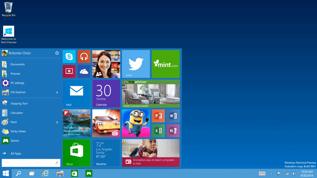
It appears that it is possible to remove all tiles from the start menu. Note that this has not been demonstrated but since unpin options are displayed, it seems likely. Today's preview release of Windows 10 may confirm that.
Another interesting option is the ability to change the height of the start menu. You can resize the start menu so that it takes up more or less room on the screen when opened.
The run and search box has been updated as well. It brings the Windows 8 search experience to the operating system which means that results will be divided into programs at the top and other finds below that, and that additional results such as web results may be displayed as well in the results.
Closing Words
The return of a start menu is a good thing as it was one of the things that Microsoft got criticized for a lot when Windows 8 launched. While it is not identical to the Windows 7 menu, it improves that start menu without removing any core functionality.
Users who don't use apps or tiles seem to be able to remove those from the start menu so that they don't get in the way at all.
Now You: What's your take on this start menu? Good? Bad?


Wow I’m very happy with this it has everything I wanted for Windows 8 and more. It looks like Microsoft has made a winner here. Truthfully I was starting to worry about the direction they seemed to be going with Windows.
Correction: It was one of the things that Microsoft got criticized for a lot ‘before’ Windows 8 launched.
This move isn’t as drastic as it may seem. It is very typical of MS to phase out older products by truncating their functions in newer version until there is nothing left but an empty husk. The Metro tile deal was okay if you use a touch device, but for mouse bound desktop users, it was annoying at best.
As well MS seems adamant in dictating PC hardware limitations by putting caps on various o/s limits which is how earlier versions and basic versions can’t breach 512-1024-3076-4096 megabyte limitations as dictated by Microsoft. Which is why I will make the final 100% jump to Linux when my current Windows 7-64b ends support come 2017.
please please please let the “metro” section be able to reflect a windows fone in the future…. That would be awesome.
Anyway, I am digging this set up because the metro tiles are useful for seeing calendar appointments or any app data pinned.
I don’t really see any benefit pinning app shortcuts there though if they don’t have live tiles.
i like the changes since it’s a much saner and much more practical approach to what metro on desktop should have been from the beginning.
i can understand if one choses to unpin all the tiles to end up with a more win7-style start menu, but in small and optional doses i actually like to have some “metro” on my desktop.
you could almost get the feeling that MS is intentionally shocking us with every second windows version, just to bring out a much more sensible and workable solution for the OS-craving masses not long after.
If I can natively configure 10 to look and feel exactly as 7, then I’ll consider the upgrade. I don’t want web results from my search bar either.
The store and apps offer nothing (except another vector for hackers and cash for MS) over conventional software installs. As an earlier poster mentioned, the resisable start menu is just a ruse to nudge you back towards the 8-like tile shenanigans that you fools failed to appreciate. I also don’t want (another) online account to manage as part of my daily desktop experience either.
I’m with you on the search. When I do a search in Windows, I expect it to search my hard drive. If I want to do a web search, I’ll do it in my browser. Why on earth would I want to search the web for a file on my hard drive? The “Windows 8 search experience” leaves me mystified.
I don’t have a opinion jet because one of the main partitive for me will be or I can go (ferry) easily deep into the system commands and in this post I cant find anything about this feature.
Honestly, I think the new start menu looks ugly. And this is coming from someone who loathed the “TileWorld” Windows 8 Metro/Modern interface’s functionality, but never really had anything bad to say about its *looks*. All that purple was easy on the eyes, right? It had a certain style. I mean, it never belonged on a desktop PC, but if I had a Windows tablet, hey, I could hang it on my wall and call it modern art.
This thing though is just weird. It’s not full-screen, but it’s not a discreet “3rd of the screen” start menu, either. It’s big, and it’s off-center, and it sort of makes me dizzy. I’m not really digging the Facebook-blue, either.
One interesting question is, just how big can the start menu get? Could you actually keep adding tiles and raising the height until it was full-screen, replicating the look of the Windows 8 interface?
as the article says, you can resize the menu as you wish and maybe even opt for the whole start screen, if they leave in this option. also i’m sure you will be able to change the colours, so i don’t really see much wrong with this implementation.
on win7 you only had the start menu, on win8 you only had the start screen. on win10 it seems you can chose either or – and anything in between. what’s not to like then?
I do like it more than having to switch between desktop and start screen, but can do without the apps in the start menu as I don’t use them on the desktop (other than for reviews or a killer app that still has to appear).
In the video of yesterdays Windows 10 keynote speech, Joe Belfiore showed that the edges of the Start Menu can be dragged so the user can resize the Start Menu if they want to. You can also see it’s possible to just unpin all the tiles on the right-hand side of the menu.
And, in the WinFuture “Windows 9: Das neue Startmenü in Aktion” YouTube video, near the end it shows you can right click the taskbar to go to ‘Taskbar and Start Menu Properties’ and check/uncheck ‘Use Start Menu instead of Start Screen’ for those who want to continue using the full screen menu with Mouse/Keyboard.
To me it looks good. But I have to admit that I hold no grudge against Win 8. Using it on my desktop I see the tiles as a large substitue for the start menue which is more adjustable than the menue was. On my tablet win 8 works just fine. I even like the charm bar ;-) Therefore I am looking forward to Win 10.
I will remove the tiles if that is possible as I don’t have any use for them. If I’d be using a touch-based device, I’d probably leave them be though.
My understanding is if Windows 10 is on a touch-based device like a tablet — no mouse or keyboad in other words — you get a full-screen tile-based Windows 8-style interface, with no start menu. But I could be wrong. :)