What you can do if a web page does not fit the browser window

Some websites and pages that I visit throughout the day are broken if I load them in a browser window that is half the total screen size of the monitor. I use a 1920x1200 monitor and tend to display two browser windows side by side.
A prime example of this is the WordPress Plugin directory. When I open it, I see the left sidebar but no main content at all. The whole content area is blank, and I have to scroll down to find it below the fold.
A tiny bit of resizing to increase the window width does the trick and the content is displayed in its correct location.
That's annoying, as resizing the window means that it overlaps the second browser window.
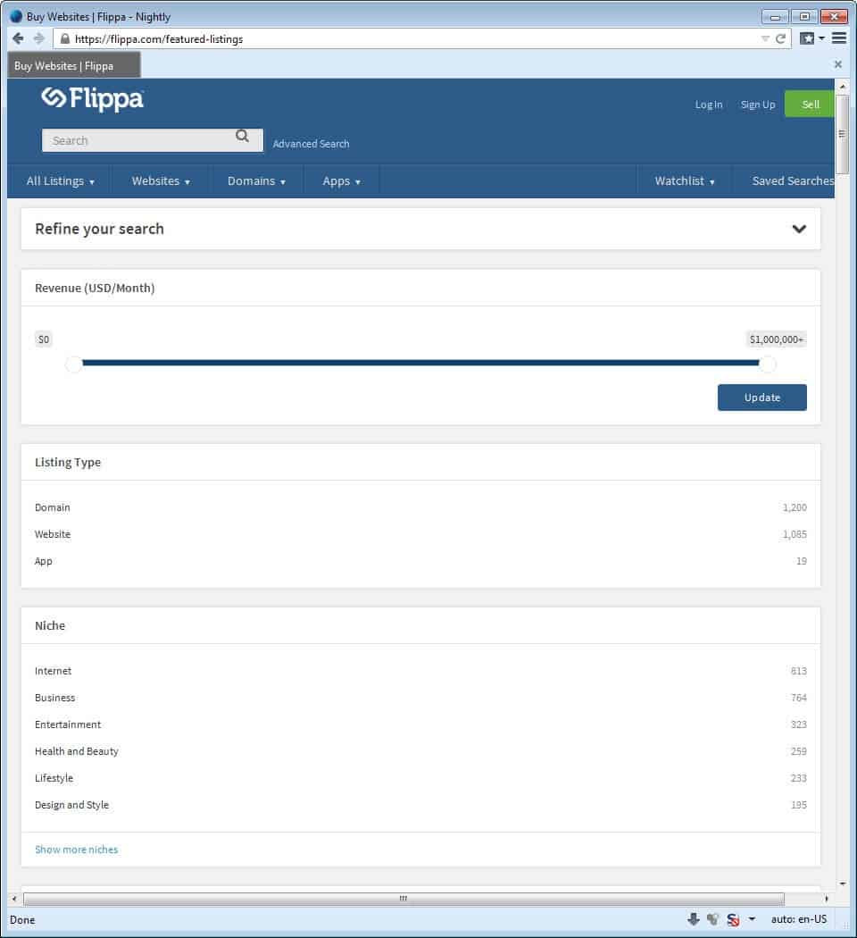
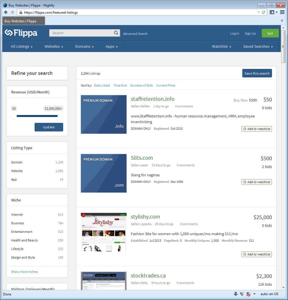
It is not the only website or web page that is broken though. When I open the web brokerage site Flippa in Firefox for example, I only see the refine your search sidebar menu above the fold.
For some reason, it is displayed in full width here, and the actual websites are displayed below the fold as a consequence. Now, this appears to be a issue only in Firefox and not in Google Chrome, as the layout works fine in Google's browser.
I first thought that I had somehow changed the page zoom on those pages, but that turned out not to be the case. I moved Firefox's Page Zoom widget to the toolbar and it displayed a zoom level of 100% for each of them.
Fixing the problem
Here are a couple of suggestions that allow you to fix those display issues without changing the size of the browser window.
1. Change the Page Zoom level
This is without doubt the easiest option. All you have to do is hold down the Ctrl-key on your keyboard and move the mouse wheel up or down to change the zoom level of your browser.
All modern browsers apply the level only to the domain you are on, and not to other domains and sites that you open.
A single flick down is usually enough to display the page just fine in your browser of choice.
Note that contents will display smaller as a consequence.
2. Extensions
Firefox users can install the excellent Zoom Page extension which ships with a "fit to page" option that you can make use of to fit any page to the browser window in just one click.
To use it, simply hold down the Shift-key on your keyboard and click on the icon the add-on places in one of the browser toolbars.
Chrome users can use the Zoomy extension instead which changes the zoom level based on the size of the browser window and resolution.
3. Fix the CSS
You can make permanent changes to most websites with the help of the browser extension Stylish or comparable add-ons.
The issue is elegant, as it won't change the text font size. The downside is that you need to know CSS to make use of it.
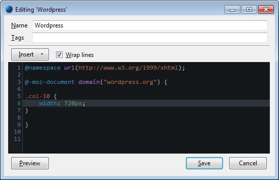
To fix the WordPress Plugin Directory site in Firefox for instance, you would do the following:
- Install Stylish.
- Open the WordPress Plugin Directory and hit F12 to open Firefox's Developer Tools window.
- Either go through the code manually, or use the Inspector to click on the element that is not displayed properly. In the case of this site, it is the main body area. (click on the "Pick an element from this page" button in the Developer Tools window for this.
- You will find .col-10 eventually which has a size of 772px. If you change the value to 720px, you will notice that the page displays fine now.
- Now that you know what to change, click on the Stylish icon and select Write New Style --> For WordPress.org.
- Here you simply copy the style information and save the new style afterwards.
The changes are applied to the web page whenever you load it for as long as you keep Stylish installed and the new style loaded.
Stylish is also available for Google Chrome.
Advertisement


Thank you so much. How easy it was to hold the ctrl key down and move my mouse. I had been working on this for over a week. I will not forget this solution
Of course, site visitors should not have to do any of these things. The problem is entirely the thoughtlessness — nay, recklessness — of the site designer.
Designers buy big, wide monitors…
…but they don’t stop to think that not everyone who visits their site will have monitors as large as do they. Some of these designer have monster monitors that are over 2500 pixels wide; yet many — most I dare say — of the visitors to the sites they design have monitors no wider than around 1900 pixels; some of them only around 1400 pixels; and many still only around 1200 pixels. The very notebook computer on which I’m not typing this has a monitor width of 1280 pixels…
…which is all the wider are even many high-end smartphone (and even tablet) displays when in landscape orientation. It is an arrogance — and a reckless one — for website designers to not take that into consideration.
We saw the same thing in the days when 768Kbps and 1.5Mbps broadband was becoming more common, yet the vast majority of Internet users out there were still using 56Kbps dial-up (which, of course, was a myth; the actual fastest that anywone could typically dial-in was around 38Kbps to 48Kbps); and so if the site designer top-loaded the site with flash and bit-heavy graphics, the site was basically unusable by the vast majority of Internet users. That, too, was a reckless arrogance on the part of designers who were blessed with fast both machines and broadband.
Anyone who’s ever developed serious software for public both personal and business use knows to always design for the lowest common denominator. Mostly-Mac-using, creative-right-brained, non-technical website designers who subscribe to all the fancy dancy design blogs where things are more about eye candy than functionality refuse to understand this problem; or to even acknowledge that it exists. If a techno-geek gets in there and tries to explain it to them, they just write him off as a ham-handed, left-brained Windows user. Most of them wouldn’t know a pixel from a potato; and couldn’t explain “aspect ratio” with a gun to their heads.
They’re the ones who are recklessly (yes, I keep using that word because that’s what it is) making websites which take-up about two-thirds of their monitor width, no matter how many pixels that ends-up making things. They should, instead, take a lesson from the people who to such as, for example, the CNN website: they have always understood this problem, and only recently finally allowed their site to widen-out to around 1024 pixels (actually a little less). Prior to that, no page on it was ever allowed to be wider than around 920 to 960 pixels.
And when I talk about width, here, I mean minimum width: The width at which, if you grab the right edge of your browser window and drag it to the left, will cause the horizontal scroller to suddenly pop-up across the bottom of said browser window. To see the minimum width of any site, drag the right edge of the browser window either left or right until you find that sweetspot; that point just to the immediate right of where the horizontal scroller across the bottom of the browser window appears or disappears.
Do it on the CNN site, for example: First, make sure you’re viewing it in a window, not full screen. Then notice if there’s a horizontal scroller across the bottom; and if there is, then left-single-click-and-hold on the browser windows right edge and drag it to the right, slowly, until you hit the point where the horizontal scroller across the bottom disappears, then release the left mouse button. Or, if there’s no horizontal scroller when you first hit the CNN site, then then left-single-click-and-hold on the browser windows right edge and drag it to the left, slowly, until you hit the point where the horizontal scroller across the bottom appears, then release the left mouse button. Grab-and-drag the right edge in much smaller — pixel-at-a-time if you can — increments until you’ve really fine-tuned it and have gotten the right edge of the browser window just a pixel or two to the right of that sweetspot point where the horizontal scroller disappears.
At this writing, by my measurement using the pixel ruler in PicPick, that’s a minimum browser width of right at 1,000 pixels, give or take. Of course, that’s a weird, not-divisible-by-8 number; and so were I making the decision, I’d just make it 1024 pixels, but, hey… that’s just me.
Yes, because modern sites use DIVs and CSS to define box sizes and the width of things (instead of the old days, when tables were used for layout), CNN’s site will expand wider than its minimum 1000-or-so pixels (whereas the content area of older sites made with tables would just remain the same width, and more of the background would show on either side if the browser was dragged wider), and it still looks good. But the minimum 1000-or-so-pixel width is hard-coded into the page so that even smaller screens may access it properly.
The bottom line, in any case, is that CNN gets it: it *GETS* that screens narrower than, say, 1280 pixels (still common on notebooks/netbooks) — actually, at 1000 pixels, CNN’s site can be viewed quite nicely on a now-old 1024-pixel-wide screen — need to be able to access the CNN website wtihout the site visitor having to either zoom or horizontally scroll. CNN understands something about web design standards and, most importantly, USABILITY of the type that this amazing guy…
Jakob Nielsen
http://bit.ly/PjHMsJ
…has been writing about since the worldwide web part of the Internet was in mere beta test in the early 1990s (and he was writing about computer usability before that, since 1986!). His remarkable contribution to the body of knowledge on the subject has been mostly free, via his famous “Alertbox” usability series, which is still available here…
Alertbox | Usability by Jakob Nielsen
http://www.nngroup.com/articles/
…still being added to, and archived back to beyond the 1994 release-to-the-public of the Internet’s worldwide web component. Nielsen first got my attention in 2003 with this article…
PDF: Unfit for Human Consumption
SEE | http://bit.ly/WLzvJG
…which was true then, and remains true to this day; and I’ve been a both subscriber and disciple ever since: 11 years, now. I’ve also attended one of his paid seminars, but, honestly, I’ve gotten much more from his freely-available and quite-complete Alertbox articles.
In my opinion, every web designer should be REQUIRED BY LAW to read every single one of Nielsen’s articles, and then be tested on them; and to also have a certain minimum level of technical expertise so that s/he can grasp the nature of this whole getting-worse-by-the-minute, too-wide-websites problem; and also so that s/he will embrace the best practice of always designing to the lowest common denominator, as the CNN site does.
The user having to jump through any hoops at all to see the entire width of a web page without…
a) having to zoom; or,
b) having to horizontally scroll; or,
c) having to put the browser into full-screen mode,
…is unconscionable. Every web usability study ever done shows that while no site visitor has a problem with veritcally scrolling (we’ve all been doing it since the beginning of Internet things), virtually *EVERY* site visitor loathes horizontally scrolling.
Shame, then, on every web designer who is so arrogantly thoughtless — nay, I say, again, reckless — that s/he just cavalierly designs web pages based on how they look on the luxuriously-wide monitor for which s/he has been able to pay with his/her web design profits (but which we mere users may not necessarily have) with no regard, whatsoever, for how it will look on anyone’s screen but his/hers.
A pox on his/her house, I say. Shame, I repeat.
Kudos, though, to CNN; and to every other site (which would appear to include this one) whose designers/maintainer truly *GET* it!
__________________________________
Gregg L. DesElms
Napa, California USA
gregg at greggdeselms dot com
Veritas nihil veretur nisi abscondi.
Veritas nimium altercando amittitur.
It’s amazing that none of the browser today have the fit to width function present on old opera for, well, forever. That promising Otter browser can’t come soon enough.
Yeah what about it by the way, have not heard anything about it for a while now.
Yeah Stylish is very handy for making web sites look the way you want. Element Hiding Helper addon also hides almost anything on page. GHacks has a black background color, white text, yellow links, and lime visited links.