Google introduces compact menu on YouTube: merges size, quality and annotation button

Slimming down and compacting seems to be the main trend on the Internet these days. If you look at web browsers, you notice that they try to get rid of as many user interface elements as possible. The culmination here was the release of Opera Coast which shipped with no visible UI at all.
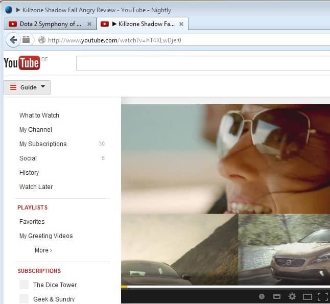
If you have visited YouTube in the last 24 hours you may have noticed a change on the popular video hosting site that you may or may not like.
The video player has been revamped slightly, by compacting the options that are displayed to you when you play videos.
A single button is now displayed on the player's toolbar instead of individual buttons for changing the player's size, the video's quality or toggling annotations on or off.
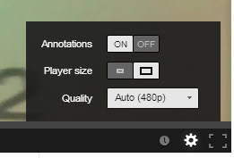
A click on the button displays all three options in a menu that opens up. Annotations and player size can be changed with a single click here on the option that is currently not selected. The video quality menu comes with its usual pulldown menu displaying all levels of quality the video is available in.
Note: the annotations and player size buttons are toggle buttons. You can click anywhere on them to toggle the value.
If you are using at least one of the features regularly, you will notice that you will click at least twice as much as before to do so.
The player toolbar itself displays the following options now directly:
- Play/Pause button.
- Volume to change the volume of the video.
- Current time and overall playtime of the video.
- The Watch Later icon.
- The new combined menu that displays annotations, player size and quality.
- The full screen window icon.
Browser Add-ons, extensions or scripts that you use on YouTube are not affected by the change at all. So, YouTweak or Unique YouTube skin are not affected and can be used as before.
You are probably wondering why these three options have been combined, and why others, like the watch later button, are still displayed on the toolbar directly.
I do not have an answer for that. Google states the new player offers improved captions control and a cleaner look. It is likely that the company has looked at usage stats and based its decision on that, but I'm not really convinced that the watch later or fullscreen functionality is used more often than the quality menu or the player size.
What's your take on the change?
Closing Words
The player interface may look simpler or cleaner now as Google puts it, but it hides features that at least some YouTube users have been making use of behind a new menu making things more complex than before.
Advertisement


sir
some time not displayed quality setting button, that time how to change quality video, and same vidio quality button displayed another system displayed.
I’m finding that for every video I play I must once again turn the annotations OFF. Every time. I play a 5 minute video and start another immediately after and the annotations are back on. Every fucking time. This is while I am not logged in (not that it should matter). I have no reason to log in since the Google+ integration. I’m not signing up for a G+ account just to leave comments on an entirely different website. And no, I don’t use Facebook either, so this is not just a bias issue for me. It’s shit I don’t want or need.
Player-size is the one I use the most. I liked the previous layout better. What’s crazy is that one day I have the old layout, the next day it’s the new one and it keeps changing back and forth!!!
Indeed, congratulations to them for following the Windows 8 model and making it take more actions to do what you want to do…Christ.
Guys you don’t get it. They did this because they don’t want people to change those settings. For one, it’s possible that many people were switching the quality to HD because it was easy to do so, even if they weren’t watching fullscreen thus wasting Google’s bandwith. Also they want their Creators to know that 99% of the people who watch their videos will see the Subscribe button hovering over the image, and the channel logo hovering over the image, and the recommended video by the same user hovering over the image. It’s just basic crowd control.
Well, it’s not like we can’t change to HD now, and what’s the point of offering to upload and watch videos in HD, if they don’t want us to use it? All it achieves is pissing people off!
Much better. Before I had to do one whole entire click to turn off annotations or change the screen size. Now it’s a mere three steps. :P
I’m pretty sure originally you could hover over the gear to see the current quality then click once to change it. So…
Old interface = 1 click
New improved = 3 clicks
Also I’ve noticed the new quality dropdown shows as a 1px high dark bar in Firefox, making it nigh-on impossible to open.
Way to go Google!
I agree with thophilus, never increase the number of clicks.
I used the middle sized screen size all the time, now I have to open the settings, select that size and close the settings – 3 clicks instead of one.
It’s a retrograde step.
I hate the changes and agree with the guy who said it adds unnecessary clicks. If only I could choose my own default…
Please check a VEVO video if you want to find a REALLY compact surprise! Can somebody reply to me for confirmation? I may be dreaming.
Where is this DUDE that thought he was so bright. Get him here, and bring him to my office…
I want my settings BACK!
*sigh* when will we ever get competitors for this increasingly dumb company?
Google (youtube) did the same sh*t with gmail : less usability for more “aesthetics”
It would be one thing if it actually saved the settings. But no… You have to click the cog, click the quality, click the size and then click to close the stupid box when you’re done. EVERY single time you watch a video.
Why the f*** can’t they leave well enough alone.
Every change they’ve made in the last year has been more and more frustrating. And that’s just on a PC/Mac. I won’t even mention the ios issues they’ve added.
Changes always cause distress at first. I really don’t want to relearn or retrain my web surfing habits anymore. The bottom line is to turn the (generally) annoying annotations off, it now takes two clicks instead of one. To lower quality so I can play a video (which I have been forced to do lately) now takes three clicks instead of two. This violates web design 101.
Furthermore, believe it or not, I know many users who never noticed that gear icon to control quality, so once again it appears Google is striving to keep annotation (which many times are spammy and distracting) as the standard rule.
I’d say, why don’t we all chip in some $$$ for youtube to get new web designers/developers?
Maybe a fresh developer’s mind would know how to script an action “hover over the cog button and then, open the damn menu!”. That would be 1 click less, effortlessly.. :p
Need an extra click for changing resolution and 2 extra clicks for changing player size. So lame, Google/Youtube.
However, I like the new page loading animation under the Firefox search address though. Looks slick.
Forget about a “cleaner look.” What I want is functionality, and excessive clicking is obnoxious. It’s also a violation of the Americans with Disabilities Act.
http://userscripts.org/scripts/show/114002
Forgot to mention the script I’m using. The guy supports it extremely well on all browsers -even as direct addon/extension.
Google is being so stupid in their changes. Web design 101: NEVER INCREASE THE NUMBER OF CLICKS FOR AN ACTION, KEEP ACTIONS TO HAVE AS LOW NUMBER OF CLICKS AS POSSIBLE.
Yet the geniuses at google added yet another click needed to change video quality.
Old way to change video quality:
1. Click quality number button
2. Click a quality
New improved design:
1. Click gear settings button
2. Click quality number button
3. Click a quality
Why add yet another click? I have noticed they have added clicks for other parts of the site as well in the last major update, just needlessly adding clicks.
The google designer for youtube needs to get fired and replaced with a guy with common sense
You’re wrong!!! An extra click is needed to close the gear menu, unless you want it to stay there covering your video. You have to close it yourself. That’s an extra click that didn’t exist before.
So it’s 2 clicks versus the new 4.
Theophilos’s post sums up my thoughts as well
yet another useless update that trades usability for aesthetics.
Youtube president:
How can we “improve” youtube? I know, let’s make users click more. Then they’ll have more time to enjoy our lovely ads.
It’s indeed, extremely stupid. Only with a good userScript I can stand YouTube. The simply option to chose your initial resolution, no matter fullscreen or not ain’t there.
I just use 720p with “Direct” mode for all videos. Setting direct mode means HWA accelerated decoding/rendering on both modes, normal and fullscreen. Changing normal to fullscreen is smooth as silk.
All I’m trying to say, YouTube is missing simple useful options as long as I remember.
Now let’s all wait for a Firefox extension that will make youtube usable again. The closes I’ve found is SmartVideo For Youtube but it seems to only work with ONE youtube tab opened. when the user opens some more they’re not affected.
YouTube player needs brightness and contrast control.
Majority of videos are too dark.