The new Google+ (May 2013). What you need to know

So Google made a ton of announcements today, some great, some not so much. One of the announcements concerned the company's Google+ social networking service. It got a complete redesign from head to toe, and I'd like to use the opportunity to walk you through the new layout.
What you will notice immediately is the new two column layout which puts the focus on the content. If you increase the width of the screen enough, you will notice that additional columns are added to the screen.
While it puts focus on the content, it makes it difficult in my opinion to browse through posts quickly as you will always have to move from column to column, and since they do not necessarily start at the same height on the page, it appears to be a rather frustrating experience.
While it is possible to switch to a single column layout, by clicking on More > Stream layout on top, it is not really a viable solution in most cases as the width of the single column is severely limited.
Google is not the first company to use this layout, Pinterest for instance uses a similar layout on its website as well.
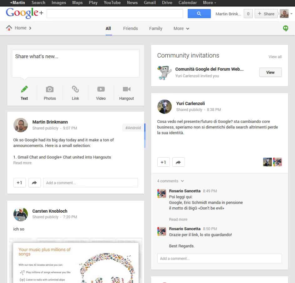

The next change that you will notice is that the left menu is gone. It has been moved to the top where it be expanded when you hover over the Home link at the top right. The menu links to all the pages that were listed in the previous menu here.
On the right of that are groups that you have configured on the site. You can switch to some directly, while the rest is listed under the more link.
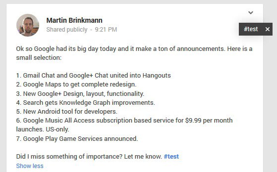
When you look at new posts, you will notice that hashtags are automatically added to them by Google.
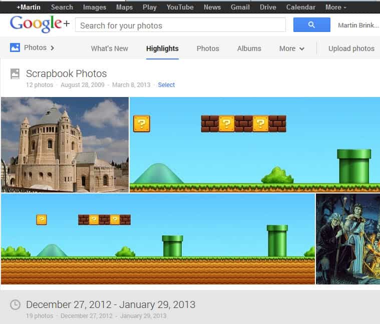
The photo view has changed as well. You are taken to a highlight page automatically which displays "what Google believes to be" important photos to you. It is possible to switch to a full photo stream or an albums view, or use the more link to access auto-backup photos and photos that you have used in the stream.
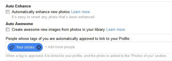
Google has added a new auto enhance filter to photos which is a one-click solution to accentuate details on the photo. You find the option in the photo editor and in the settings.
Another new feature is the ability to create animated versions of your photos if you upload multiple photos that look similar.
The new unified chat is now also available on Google+. Basically, use apps or web services to communicate via text, voice or videochat with each other.
Have you tried the new Google Plus yet? If so, what is your impression of the features?
Advertisement


This is a good script that reduces the wasted space in single-column mode, and tweaks a few other things as well: http://userstyles.org/styles/87602/improved-google-plus-single-column
It does require installing the Stylish extension (available for both Firefox and Chrome), though. Unlike some styles, it reportedly does not work under Greasemonkey
IS it loading faster than previous version?
Both versions load pretty fast on my end, can’t really see a difference in loading time.