Google to remove the black navigation bar?

To be totally honest, I can't really say how many times Google changed the layout of its homepage in the past two years. And that is not even including the experiments the company ran regularly in that time on the front page.
When you open google.com right now you see a black horizontal bar at the top that is linking to various other Google services including Google+, Search, Images or Gmail.
The company is currently running yet another experiment that may very well end the black bar's reign on the page.
The new layout gets rid of the color black and the navigation bar for that matter. Instead, a single menu button is displayed on top next to the sign in button.
Currently, this looks like on the screenshot below.
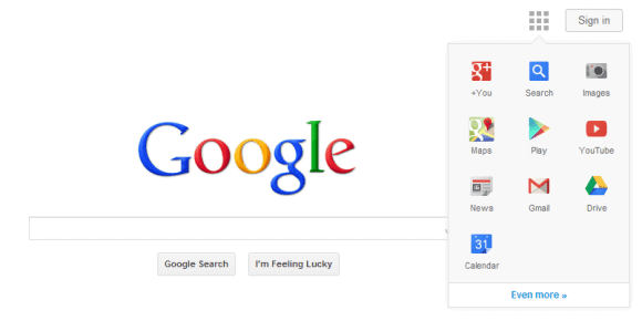
To access the service list, you need to click on the button to pick one of the featured services from the menu. Not all services that Google provides you with are listed here prominently though, and you may need to click on the even more link in the menu to open the full list of available services. It looks like a 1:1 copy of the services listed in the black navigation bar right now.
This is not the first time the company has been testing a single button interface for navigational items. The new design looks similar to the Chrome App Launcher, even though the functionality offered is different. The app launcher displays the applications you have installed from the Chrome Web Store while Google's Search layout experiment displays fixed links to Google services only.
The new layout improves touch navigation on Google which is probably one of the core reasons why Google is trying to replace the black bar with a one button menu.
Google unfortunately does not seem intent to provide users with customization options concerning the service icons made available at this point in time.
As far as I'm concerned, I rarely ever use the links in the black navigation bar currently because it is usually faster to open the service I want to load directly using the browser's address bar.
It is not really clear right now if Google will go through with the design change, or if it will pull the one button experiment again as it did last year.
What is your take on this? Are you using the navigation bar on Google's homepage? (via)
Advertisement


I think the black bar is totally annoying – try as I might I cannot change it
PLEASE I LOVE GOOGLE SEARCH. . . I USE GOOGLE TOOLS, I LOVE GOOGLE . . . CLEAN NOT ADVERTISING MORE THAN WHAT I HAVE . . . BUT MY SCREEN IS TO SMALL TO HAVE BLACK GOOGLE BAR THAT I DON’T USE BECAUSE IS NOT CUSTOMIZED OR WAY TO HIDE OR MAKE IT TRANSPARENT. . . IS NOT INSTALLED IN CONTROL PANEL . . . GOOGLE LIE TO US. . . IS NOT THERE TO “UNINSTALLED” !!! THE ONLY THERE IS GOOGLE CHROME THAT I USE AS ALTERNATIVE FOR MY INTERNET EXPLORER IE8 AND SUBMIT BLUE BUTTON IN SUPPORT.GOOGLE.COM/TOOLBAR/ANSWER IS NOT WORKING SINCE TOOLBAR IS INSTALLED I HAVE SO MANY VIRUS AND POPUPS AND REDIRECTED WEBSITES IN MY SEARCHS. . . PLEASE STOP GOOGLE BLACK BAR !!!!
I WANT THE BLACK NAVIGATION BAR BACK (PERIOD) END OF DISCUSSION!!! I DON’T NEED TO GIVE REASONS! JUST BRING BACK THE BLACK NAVIGATION BAR… IT WORKED JUST FINE DON’T KEEP TRYING TO FIX SOMETHING THAT’S NOT BROKEN!!!
One temporary workaround is to spoof the user agent.
This will work until G desides to remove the navigation bar from the all its sites
(because the bar is there, but G decided to meke it invisible for users of the latest Chrome/Chromium builds)
So, here it is:
install “User-Agent Switcher for Chrome” into Chrome or Chromium,
https://chrome.google.com/webstore/detail/user-agent-switcher-for-c/djflhoibgkdhkhhcedjiklpkjnoahfmg?hl=en-US&gl=US
create a custom user agent, for example I copied my current string
from the latest Chromium build, and changed the 28 to 25 ,
creating this (remove quotes):
“Mozilla/5.0 (Windows NT 6.1; WOW64) AppleWebKit/537.36 (KHTML, like Gecko) Chrome/25.0.1458.0 Safari/537.36”
You can either use this fake user-agent permanently, for any site,
or just for the Google sites,
by going to the extension settings,
Permanent spoof list, and add, the above user-agent for
domain (remove quotes) = “google.*”
…………..
you can see your current string visiting this site with various browsers:
http://whatsmyuseragent.com/
I use the bar all the time, it does save me time when I just need to search images or read news.
What’s got me really annoyed is that the bar is missing in Chrome (which I really like) but it’s there in Firefox (which I don’t as much anymore).
Customizing the black bar would be a great feature.
And letting users know you’re going to make a change would be nice too.
Google cloud is horrible now. Just send documents over an email and print the attachment, do not spend money for the google cloud. Just email yourself websites and documents.
also, Google + is horrible. I have no use for it. I hate that educational things will be lost behind a pile of 1 “up’d” tardy cat picture.
Yeah, MS W8 has been simplified to the point of practically being useless for somethings some of us relied on since the inception of Windows as if they suddenly decided, ‘people are stupid ~ people are sheep ~ we’ll remove the start menu`, while other things became more complicated.
A simple restart or power off is not as simple anymore especially those of us without touch screen monitors. And even with touch screen it’s still the same motion of tapping the corners of the screen I believe to access the new options which do not always pop-up. Sometimes it appears when we didn’t mean it to, and other times it takes it’s sweet time appearing.
Like Windows 7, the file explorer has become even stupider and even less features than the previous version. Most things don’t even work the way we’re used to even Windows Media Player. Though it is installed, it’s not the default player and their player can’t play DVD’s natively without adding a patch. ARGH !!!
Is Google going backward? To improve the interface, they need to reduce the number of clicks, not add more (like Microsoft’s Windows 8).
I didn’t mind the ribbon, but wishes it was customizable. Before my current option, I’d often open the more button to access other google services, or end up making bookmarks and shortcuts of my own. Personally I’d love to see a fully customizable Speed Dial type interface. Both Firefox and Chrome have quite a few add-ons/ extensions for Speed Dial start pages we can customize. I myself use a multi-tab Speed Dial of 24 (4×6 grid) dials on 13 tabs (One tab is devoted to Google services).
Firefox: http://speeddial.uworks.net/
Chrome: https://chrome.google.com/webstore/detail/fvd-speed-dial-3d-wall-sy/llaficoajjainaijghjlofdfmbjpebpa?hl=en
Firefox version is more stable than the Chrome one which crashes too often but looks prettier =P
I like the bar but the new one looks even more interesting but functionally, I certainly want flexibility like the one available with Big G Blackbar Sorter Extension and may be the Apps also. It may be somewhat clumsy but that’s just fine.
I happen to like the bar, however, if it needs any changes it should be a tad wider so that you don’t have to be so exacting to activate an app. I don’t mean a ribbon! Ugh!!
Ugh! to the new trial too.
Might as well comment on the search results that I have been getting lately. They are coming back with a lot of crap (technical word) instead of information. Slowly moving to DuckDuckGo because of this…..
Since they also provide quick link above the search result (which I only use to access news) thus making the black bar redundant, this is a welcome change.
As other users I teak Google search pages with css and javascripts.
What surprises me always is that screens are wide nowadays, hence the scheme should be focused on “horizontality” with quick access on side and not on top.
As for Google and their eternal quest of the nicest dress for dancing, I think it wouldn’t be ridiculous if they thought for themselves rather than apparently trying to find the best ad-equation between serving ads and being pleasant to the ever changing tastes of the user.
Look at DuckDuckGo : simple. You can make the layout yours, et voila. No fuss.
I can’t recall a Google interface change that was useful to me. Each time I have to find a way to work around their “improvements”.
Yes, I use the navigation bar and I’m quite pi**ed that in the future I’ll likely have to click three times to open Google Reader instead of one (when that link was still in the main bar) and currently two times (More/Reader). In the future it’ll apparently be Menu/Even More/Reader.
This menu seriously needs to be customizable so that I can replace icons that I’m not using with ones that I need often.
My take is that I HATE UI experiments of last years, including Google’s new web interfaces, and what I see on screenshot makes me scream dirty words. I’d prefer to have Google and Gmail interfaces as they were 3 years ago, I dislike all changes made to them since then, and this new project too. The most soft words I can call “1-button” interfaces with are “stupid” and “dumb”.
@rpwheeler
Same here. The changes Google have made over the last couple of years have been a step backwards and just an annoyance. Especially removing the ability to turn off Image Search filtering.
If it wasn’t for Google’s ability to search by dates (particularly ‘custom date range’), I’d have moved to another search engine by now.
Here is a very simple way to get the black navigation bar back to use!
https://www.youtube.com/watch?v=NxT6J7py8MU
Never use the Google Black toolbar. In fact, I use Stylish to CSS it out. Saves vertical real estate on the pages of all Google services. Created my own Google folder on the bookmarks toolbar to dropdown with the Google services. Then use Bookmark Favicon Changer to give the folder the characteristic “G.”