Google Search: left sidebar moves to the top
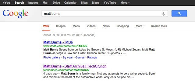
Google according to several sources in the US is currently rolling out a layout change for Google Search that is moving the left sidebar to the top of the results page. The left sidebar was introduced several years ago by the company to provide users with advanced search filtering options. It was a controversial move at the time as it was one of the first major changes to a search results page that was left untouched for the most part otherwise.
Available on the sidebar are links to different product searches, e.g. video, images and maps, as well as a listing of search tools that Google visitors can make use of to define a data range for their search or filter search results by factors such as reading level or location.
Moving the sidebar to the vertical spot just above the search results can only be the first step in a bigger redesign for a number of reasons:
- The left sidebar is now displaying lots of whitespace, and we have seen in the past that Google usually has plans to later fill that whitespace with content
- The new vertical toolbar lists several links that are also available on the top of the screen on the blackbar. Search, images and maps for instance are all also displayed there.
Here is what is likely going to happen. Since Google is working on becoming the one and only stop for all things search and beyond, the company is moving additional modules on to the search pages. We have seen that with Google Knowledge Graph for instance which is displaying encyclopedic information about certain search terms on the right sidebar on the search results page.
That in turn reduces the space available for advertisement, Google's core income source. A likely scenario therefor will be that Google will move some of the ads from the right side to the space where the left sidebar was positioned before. Moving ads from the right to the left would be huge, as it would surely improve ad revenue for the company even further as advertisement would be more visible on the page.
Since the change is currently being rolled out, it may take a while before you see the change on your computer. How do you think will the final page look like when Google has completed the redesign? (via Techcrunch)
Advertisement













Moving the search tools to the top of the screen to pander for the teensy-weensy screen on mobiles is up there at the top of “DUMB DECISIONS OF ALL TIME”. If sites like the BBC News site can determine the device that the browser is on and format the search result page accordingly then why the hell can’t Google? Or perhaps they lack the tech savvy on how to do this?
I see it at the top, but can’t find the tab to search discussions or to sort results by date. Am I looking in the wrong place, or have those options been removed?
The bar now being on the top, as I asume it’s finished.. is extremely annoying..
For one, if I want some wallpaper on specific size for my desktop, I used to fill it in on the left.. now, not even a “exact size” option is at the top.. nor any “larger then …”..
All in all, if it’s still being worked on, add more options, otherwise stay with those fail brain ideas off from the search setting bar..
Is this change geared towards increasing numbers of tablets? I don’t have a tablet, but if touch screen zooming in on page to centre is easier than zooming to left then whats on the sides might not matter so much.
We do not know yet for certain, but will certainly see in the coming weeks what Google has in mind. My personal bet are ads.
I suspect you’re right…. I’m surprised they haven’t yet moved the preview link function to the left so that it reveals over the search results, and keeps ads visible for longer
So I see two horizontal navbars, with at least one duplicate among their options. Beyond annoying. Surely they are still thinking it through???
Finally I don’t have to use another script to remove that annoying sidebar!
Just wait until Google fills that space with ads or other contents that you do not want or need.
As most resolutions on laptop are widescreen, reducing more the height is very unappropriate. We are going to lack more and more screen space.
Browser are making efforts to reduce height clutter (tabs in the title bar, etc.), and Google is doing the complete opposite…
At the end Google Search will be an advertisement page where — how lucky ! — search results will be displayed as a bonus.
I’m slightly exaggerating, but observing the changes so straightforwardly motivated by a better catch of ads is IMO phenomenal!
Well, scripts will catch up, as always, and a big thanks by the way to all those who accept or even appreciate advertisement, as they allow all to continue to get the essence of many services, blogs, pages of quality.
What a beautiful world, in its diversity :)