Newsmap, A Google News Visualization

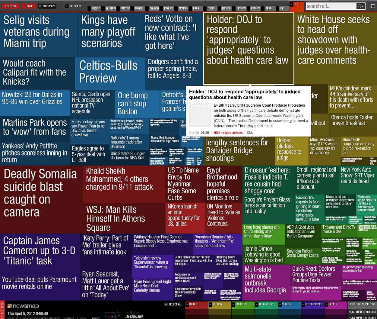
Newsmap is a visualization mashup for Google News. When you visit the site, you will be greeted with a colorful display of news items posted in various sizes on the frontpage of the service. This may look messy at first, but if you spend a minute or two on the site, you will understand the underlying concept and maybe start to appreciate it.
The first thing that you will realize is that the different colors related to different news niches. Red means world news, blue sports, and yellow national. The different shades of the same color visualize the actuality of the news item, with the lightest color indicated news that have been posted less than 10 minutes ago, the medium shade more than 10 minutes ago, and the darkest share more than 1 hour ago.
But that is still not all of it. The larger a rectangle, the more popular the story is on Google News.
Filters are available at the bottom of the page to hide news from being displayed on the page. If you are not interested in entertainment and health, you can disable those two to make room for the other news instead.
That's still not all that you can do on the page. A country selector at the top lets you switch from U.S. news to news of more than a dozen other countries including the United Kingdom, Spain, Canada, India and Brasil. Switching takes a couple of seconds before you see news from the selected country displayed on the screen. If you do that, you will notice that dominant news types differ depending on the selected country. For the U.S. it is sports followed by national news, in the U.K. it is world news followed by entertainment, sport dominating everything in Canada, and world news the rest in India.
While this is only a momentary snapshot, I wonder if it can be used to analyze news in different countries of the world.
All in all a nice service. Only drawback that news do not get updated automatically, and that the developers have not posted an update to their service since 2010.
Advertisement


Martin, just so you know, Marcos Weskamp launched Newsmap in March 30, 2004 (It was first slashdotted on April Fool’s Day eight years ago.), so it is understandable that the last time he updated the aggregator was two years ago.
> I wonder if it can be used to analyze news in different countries of the world.
Actually, it is its objective. To quote Marcos’s description of newsmap:
Cheers!
Interesting, thanks.
I am using this website now for some time and I really like it.