New Google Sign-In Page
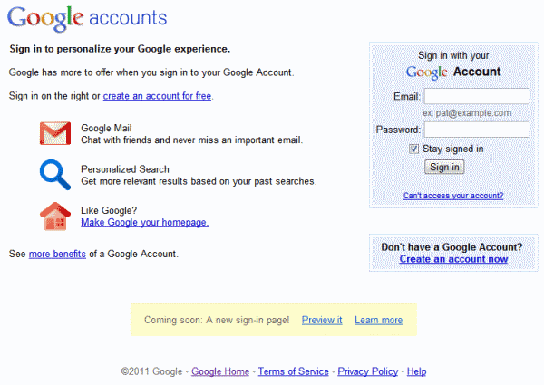
Google users who want to sign in with their Google account on the Google website see currently a highlighted announcement on the page.
The announcement reads "Coming Soon: A new sign-in page!" with options to preview the new page or to learn more about it. The change to the sign-in page is part of a larger redesign of Google products according to a help page on Google.
Lets take a look at both the old and new Google Sign-In page before we take a closer look at the differences. First the old sign-in page:

And now the redesigned new Google sign-in page:
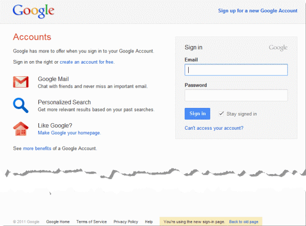
The pages look very similar but there are several key differences. When it comes to re-designs in recent time, Google seems to make fonts and page elements larger. This could be part of optimizing Google products for small screen resolutions such as smartphones or netbooks, and for touch based devices which will become more popular in coming years.
The two sign-in pages have pretty much the same functionality, some screen elements however have been moved around on the page to place them more or less prominently on the screen. This is for instance true for the "don't have a Google Account? Create an account now" element which has been moved from below the sign-in form to above.
The footer links which were placed right below the page contents on the old Google accounts page have now been moved to the end of the page instead, which will surely impact their reach. One benefit here is that the other elements get better exposure.
Google users who switch to the new sign-in page may see the old page pop up on some Google product websites. This happens when users switch web browsers or IP addresses, and if a Google property has not updated yet with the new sign in page.
Users who do not like the new Google sign-in page can switch back to the old one for a limited amount of time. Google will however shut down the old sign in page in the near future.
Google does not introduce new functionality on the new sign-in page. Some users might not even notice that they are using a new page to sign-in.
What's your take on the recent design changes on Google product pages?
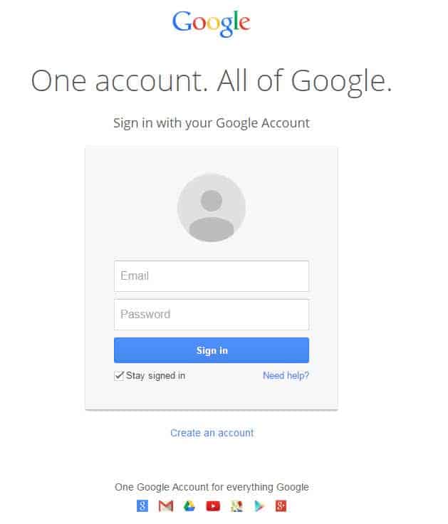
Update: Google has changed the sign in page again removing lots of information from it in the process. Take a look at the current page used to sign in to Google Accounts.
As you can see, most of the text has been removed from the page.







hcdhfdfhefjeueurh
I really like new Google sign in page, it looks much nicer than before
I like the new font, does anyone know what it is?
New design is very cool. I like it
Yes. i have
I like the changes. This is also another step to get all Google products to have the same look. Also on different OS-ses because of their own versions of buttons etc.
Also Google Calendar finally have some better design since a week. When they change the look to the new ‘+1’ look it was very bad. I think only 2 appointments fit per day. After the change the calendar changes according to your screen / browser size. Now 4 appointments fit per day :)
The primary difference I see is that they have reduced the contrast in almost all elements: the blue boxes and the icons are faded to paler shades, and the text is now varying shades of grey instead of black. I find the new version significantly harder to read because of this. Sadly, it is a practice that I have seen growing in applications and websites over the last several years.
Also, you stated that they are making the fonts larger. If you look more closely, you will see that although they have made heading fonts larger, the body text is actually smaller in the new version. In the current version, “Google Mail” and “Chat with friends…” are the same size; in the new version they are distinctly different. Again, reducing the size of the body text makes it significantly more difficult to read.
looks like you got your screenshot sometime ago
i’ve just tried the new preview and here’s how it looks like
http://i.imm.io/8jKm.jpeg
the noticeable change is in (Create an account area )