YouTube Redesign Cosmic Panda Now Available

A YouTube redesign is something that could backfire tremendously.
We have seen it happen before with slight design changes done to core products such as Gmail, Search or YouTube that Google has been heavily criticized for.
That's probably the main reason why the new Cosmic Panda design is offered as an alternative to the default YouTube design and layout.
Users who would like to switch can open the Cosmic Panda page to do so. And if they do not like the new theme they can switch back to the default design.

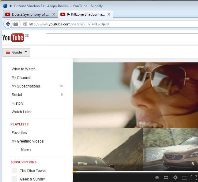
So what is in store for users who make the switch? A new look and feel everywhere, improved design and tools and the option to watch videos in Chrome while navigating on YouTube. You will see many of the changes once you open a video page on YouTube.

The new video page has a wider, clearer design. Especially the comment, description and video suggestion section has been overhauled. Video suggestions have been moved down to make room for the video and an ad that is showing up on the right side of the video. The video is automatically moved to the left of the screen if an ad is loaded.
That's probably the biggest point of criticism that I personally have. Especially if the ad on the right is not static. That's a lot of ad use next to or on videos.

What I like is the ability to change video sizes on the fly, the wider video previews on the same page and the new suggested videos page which is now making use of the full width of the space below the video.

YouTube Channels are looking a lot better, cleaner and more professional than before.

The bigger video thumbnails on the other hand add to the vertical size of the page which means that users need to scroll more to see the same amount of videos.
Everything is a lot clearer on the channel page. Chrome users will benefit from the new "keep watching" feature. The video that is currently playing is displayed at the top of the screen if the user navigates in Chrome to another page while playing a video.

That's handy to add more items to a playlist or navigate the video portal while listening and watching (albeit in a tiny screen) to the current video.
Is the new YouTube a step in the right direction. The site looks more professional and cleaner now. Google did away with the old templates and added four modern, but very similar looking, templates to the site of which the channel owner can select one. It is furthermore possible to change the background color of a channel's page and upload a logo for branding purposes.
One of the new features that has not been mentioned yet are avatars that users can upload. It is likely that many userscripts and some browser extensions will stop working if the new design is activated. It will however be only a matter of time until the developers publish updates that work with the new YouTube design.
Have you played around with the new YouTube design yet? If so, what is your impression of it so far? (via)


Oh boy. The yoot oob dung beetles are getting nicer brooding chambers.
Now we can get on with the less important things in life…
Better than most redesigns, I suppose, in that it didn’t really change my experience all that much. In my internet travels, I’ve had plenty of favorite sites that were absolutely ruined by (mostly unecessary) redesigns. Sites that I subsequently abandoned and never looked back. I’m pretty neutral about this one. Rarely does a redesign offer true improvements rather than just “something different”.
Does it work on Youtube Live? This part of the site does need a facelift, and some categories.
im already using it since yesterday, best things for me:
black background, customizable video size and the option to change between coments and related videos… i can just click one button and skip all the comments.
Wow, Cosmic Panda is cute! I don’t think I’m going back to the old interface again. The ad doesn’t bother me as I use Adblock. I used to use a userscript named “YouTube Enhancer” to manually widen the player size without changing the video quality and have a dark background. I guess I won’t need it anymore.
This year is turning out to be a year for Google. They’ve come up with a lot of cool stuffs lately. And I’m not contented yet. Waiting for more!
Yuck. Tried it out, and tried to view a video, but it just kept trying to reload it. If I had to guess, I’d say it doesn’t like the fact that I’m using adblock (which prevents the aforementioned stupid ads). It could be any one of a number of extensions causing this though.
On top of that, it makes all of the favs on my channel FULLY MAXIMIZED and looks ridiculous. My custom theme is all but destroyed.
Eh, I can darken it and whatever else using Greasemonkey scripts. I can see most users liking this, but being a power-user, I say to hell with it.
Appreciate the heads up though.
Time will tell whether this change is good for Google or not.Personally first impression for me is not bad, not bad at all.
I like it better as well, even despite the new ad unit at the top.
beautiful
I really like the redesign, I’ve been looking for that dark themed player that seem to randomly come and go for the past few days. I’ll be keeping this for a while, though I do hope we can move that feedback button.