Firefox 4 Minefield Now With Improved Add-Ons Manager
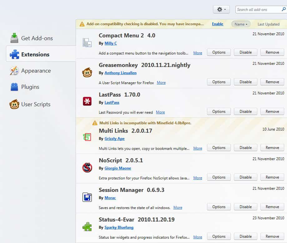
One of the design elements that I did not like in the development builds of Firefox 4 until now was the add-ons manager. I have reviewed it in detail in the article How To Uninstall Add-ons In Firefox 4. Basically, what I did not like was that it looked kinda messy, hard to read and out of place.
The latest snapshot of Firefox 4 that was released today introduces a new and improved add-ons manager. Time to take another look at it to see what has changed.
The first obvious change is the different color scheme of the add-ons manager. Incompatible add-ons are now displayed in a lighter color scheme instead of the irritating green color that was used before.
What's even more important is the addition of a removal button next to each add-on listing. Before that a tiny x was displayed at the end of each row, which was easy to overlook.
The only thing that remains is the tiny removal message that appears after clicking on the remove button in the add-ons manager.

The color scheme has been changed which makes it slightly easier to locate the Restart Now and Undo links. Still, it would be better if the developers would improve the layout further, maybe by moving the message to the very top of the add-ons manager, or to the sidebar where enough free space is available.
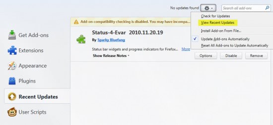
Users who click on the icon next to the search form can enable a new listing in the sidebar. A click on View Recent Updates enables the new entry in the sidebar. This new menu lists the most recent add-on updates, which can be very handy for troubleshooting browser issues.
In related news, it is now possible to remove userscripts from the add-ons manager. I do not know if this was a problem on my end or if other Greasemonkey users experienced it as well. I previously was not able to remove userscripts from Firefox (other then deleting them manually from the Firefox profile directory). This has been fixed as well.
What's your take on the new add-on manager's design? Let me know in the comments.
Advertisement






Scrolling and page rendering in Get Add-ons tab is sluggish. it must be resolved.
File a bug.
1. They should add a checkbox on the left side for each add-on, allowing you to enable/disable an add-on by marking the checkbox.
It would be easy then to look down a long list of add-on’s and see which ones were enabled or not.
And this would be useful when you are trying to isolate which add-on(s) might be a problem.
2. It would also be nice to add the size of the add-on code, similarly to that script I pointed you to a while back. Seeing the size might encourage better coding on the part of the developer.
3. Last, they should find a way to be able to enable/disable w/o restarting the browser each time. Again, useful in debugging.
I am running beta 7. I don’t understand how all the update options work. If you goto Tools > Options > Advanced > Update and deselect add-ons it is still active in the add-ons manager when you click on the Options button. Why is that?
Also, if you click on More for an add-on there are 3 options, Default, On and Off. What the hell is default?
Also, this means that there are 3 different places where you can set the update options for your add-ons, and they seem to clash.
Also, in the screenshot you show here there is More link and an Options button. What is the difference?
More displays information about the add-on, while options leads to the add-on options where you can configure the add-on.
Mostly I like the change, however, the font size for the extension title is too large.
Personally I now use scriptish as opposed to greasemonkey, I just hope it keeps being updated…